人気フォント セクションへようこそ。ここでは「よくダウンロードされ、よく使われている」実績ある書体をまとめています。 ロゴ、Web、SNS のどれにも使いやすい、外さない選択肢が見つかります。
どの トップフォント も、バランス・可読性・汎用性で高評価です。 モダン・サンセリフ、エレガントなスクリプト、ヴィンテージなセリフ、ミニマルなディスプレイなどを厳選しています。
-
( Fonts by Mica Asato - Personal-use only. For commercial use please contact owner. )
A bold, expressive handwritten font with a brush-like appearance.
 ダウンロード 524 ダウンロード数@WebFont
 -
( Fonts by Dieter Steffmann )
A bold, calligraphic font with flowing strokes and dramatic curves.
![Kohelet Regular フリーフォントのダウンロード]() ダウンロード 524 ダウンロード数@WebFont
ダウンロード 524 ダウンロード数@WebFont -
( Fonts by Woodcutter Manero - www.woodcutter.es - Personal-use only. For commercial use please contact owner. )
A bold, 3D font with strong shadow effects and geometric shapes.
![Documenta フリーフォントのダウンロード]() ダウンロード 524 ダウンロード数@WebFont
ダウンロード 524 ダウンロード数@WebFont -
( Fonts by Mohammad Azmil Bahar )
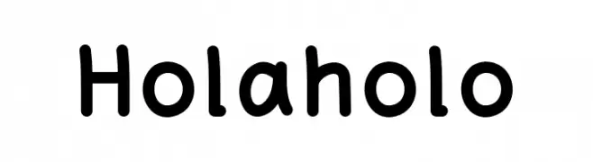
A playful, rounded font with smooth curves and a friendly vibe.
![Holaholo フリーフォントのダウンロード]() ダウンロード 524 ダウンロード数@WebFont
ダウンロード 524 ダウンロード数@WebFont -
( Fonts by Levi Szekeres - Personal-use only. For commercial use please contact owner. )
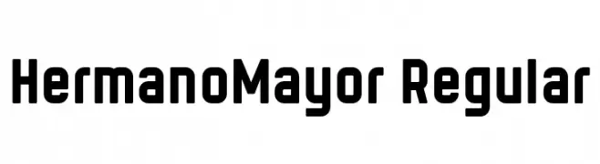
A bold, modern font with geometric lines and strong presence.
![HermanoMayor Regular フリーフォントのダウンロード]() ダウンロード 524 ダウンロード数@WebFont
ダウンロード 524 ダウンロード数@WebFont -
-
( Fonts by Zetafonts - Personal-use only. For commercial use please contact owner. )
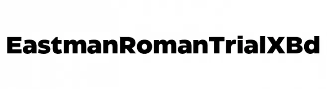
A bold, modern font with thick, uniform strokes and tight spacing.
![Eastman Roman Trial XBd フリーフォントのダウンロード]() ダウンロード 524 ダウンロード数@WebFont
ダウンロード 524 ダウンロード数@WebFont -
![sg フリーフォントのダウンロード]() ダウンロード 524 ダウンロード数@WebFont
ダウンロード 524 ダウンロード数@WebFont -
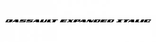
( Fonts by Daniel Zadorozny - www.iconian.com - Free for personal use )
A bold, expanded italic font with a modern, dynamic style.
![Dassault Expanded Italic フリーフォントのダウンロード]() ダウンロード 524 ダウンロード数@WebFont
ダウンロード 524 ダウンロード数@WebFont -
![Bevel'sAdvocateMono Regular フリーフォントのダウンロード]() ダウンロード 524 ダウンロード数@WebFont
ダウンロード 524 ダウンロード数@WebFont -
![SF Movie Poster Condensed Italic フリーフォントのダウンロード]() ダウンロード 524 ダウンロード数@WebFont
ダウンロード 524 ダウンロード数@WebFont


今のトップフォントは?
は、クリーンな造形と広い適用範囲で支持を集めています。 ブランディングからランディングページ、ポスターまで活躍します。
ロゴで人気のフォントは?
幾何学系の サンセリフ(例: Poppins、Gotham 系のファミリー)は、スケーラブルでクリーンな印象に最適。 親しみやすさを出すなら スクリプト や手書き系も定番です。 見出しは力強く、本文はニュートラルに──この組み合わせが認知とバランスを高めます。
人気リストはどのくらいの頻度で更新される?
ダウンロード数やエンゲージメントに基づき定期的に更新します。 こまめにチェックして、次に流行るフォントを先取りしましょう。
💡 ヒント: このページをブックマークしておくと便利です。トレンドは速く、今のトップが明日のリブランディングを導くこともあります。