人気フォント セクションへようこそ。ここでは「よくダウンロードされ、よく使われている」実績ある書体をまとめています。 ロゴ、Web、SNS のどれにも使いやすい、外さない選択肢が見つかります。
どの トップフォント も、バランス・可読性・汎用性で高評価です。 モダン・サンセリフ、エレガントなスクリプト、ヴィンテージなセリフ、ミニマルなディスプレイなどを厳選しています。
-
( Fonts by Zetafonts - Personal-use only. For commercial use please contact owner. )
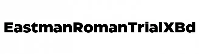
A bold, modern font with thick, uniform strokes and tight spacing.
 ダウンロード 520 ダウンロード数@WebFont
 -
( Fonts by Manfred Klein - manfred-klein.ina-mar.com )
A classic Blackletter font with bold, ornate characters and high contrast strokes.
![FlyingHollander フリーフォントのダウンロード]() ダウンロード 520 ダウンロード数@WebFont
ダウンロード 520 ダウンロード数@WebFont -
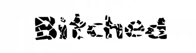
![Bitched フリーフォントのダウンロード]() ダウンロード 520 ダウンロード数@WebFont
ダウンロード 520 ダウンロード数@WebFont -
( Fonts by www.gliphmaker.com. Personal-use only. For commercial use please contact owner. )
An ornate blackletter font with intricate details and historical elegance.
![Lombardia フリーフォントのダウンロード]() ダウンロード 520 ダウンロード数@WebFont
ダウンロード 520 ダウンロード数@WebFont -
( Fonts by Gatonegro - www.ekkiicat.com OFF SITE )
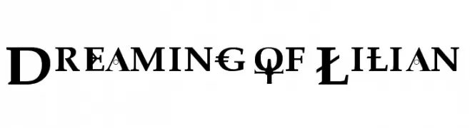
A decorative serif font with intricate details and a modern twist.
![Dreaming of Lilian フリーフォントのダウンロード]() ダウンロード 520 ダウンロード数
ダウンロード 520 ダウンロード数 -
-
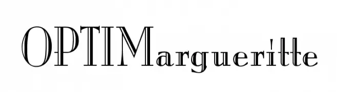
( Fonts by Castcraft Software - opti.netii.net - check the website before use )
An elegant, high-contrast font with decorative elements and artistic flair.
![OPTIMargueritte フリーフォントのダウンロード]() ダウンロード 520 ダウンロード数@WebFont
ダウンロード 520 ダウンロード数@WebFont -
![Tena フリーフォントのダウンロード]() ダウンロード 520 ダウンロード数@WebFont
ダウンロード 520 ダウンロード数@WebFont -
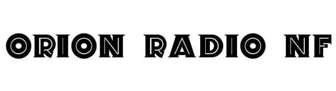
( Fonts by Nick Curtis - www.nicksfonts.com )
A bold, vintage-inspired font with high contrast and geometric shapes.
![Orion Radio NF フリーフォントのダウンロード]() ダウンロード 520 ダウンロード数@WebFont
ダウンロード 520 ダウンロード数@WebFont -
( Fonts by Fachranheit )
A playful, pirate-themed font with bold, whimsical characters.
![PirateKids フリーフォントのダウンロード]() ダウンロード 520 ダウンロード数@WebFont
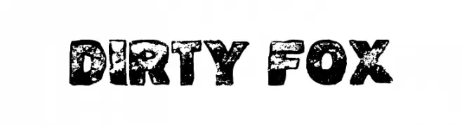
ダウンロード 520 ダウンロード数@WebFont -
![Dirty Fox フリーフォントのダウンロード]() ダウンロード 520 ダウンロード数@WebFont
ダウンロード 520 ダウンロード数@WebFont


今のトップフォントは?
は、クリーンな造形と広い適用範囲で支持を集めています。 ブランディングからランディングページ、ポスターまで活躍します。
ロゴで人気のフォントは?
幾何学系の サンセリフ(例: Poppins、Gotham 系のファミリー)は、スケーラブルでクリーンな印象に最適。 親しみやすさを出すなら スクリプト や手書き系も定番です。 見出しは力強く、本文はニュートラルに──この組み合わせが認知とバランスを高めます。
人気リストはどのくらいの頻度で更新される?
ダウンロード数やエンゲージメントに基づき定期的に更新します。 こまめにチェックして、次に流行るフォントを先取りしましょう。
💡 ヒント: このページをブックマークしておくと便利です。トレンドは速く、今のトップが明日のリブランディングを導くこともあります。