人気フォント セクションへようこそ。ここでは「よくダウンロードされ、よく使われている」実績ある書体をまとめています。 ロゴ、Web、SNS のどれにも使いやすい、外さない選択肢が見つかります。
どの トップフォント も、バランス・可読性・汎用性で高評価です。 モダン・サンセリフ、エレガントなスクリプト、ヴィンテージなセリフ、ミニマルなディスプレイなどを厳選しています。
-
 ダウンロード 508 ダウンロード数@WebFont
 -
( Fonts by ingoFonts. http://www.ingofonts.de )
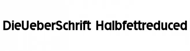
A bold, clean sans-serif font with geometric shapes and uniform strokes.
![DieUeberSchrift-Halbfettreduced フリーフォントのダウンロード]() ダウンロード 508 ダウンロード数@WebFont
ダウンロード 508 ダウンロード数@WebFont -
( Fonts by Nick Curtis - www.nicksfonts.com )
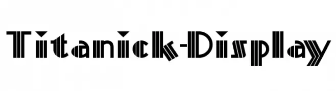
A bold, geometric font with strong vertical lines and sharp angles.
![Titanick-Display フリーフォントのダウンロード]() ダウンロード 508 ダウンロード数
ダウンロード 508 ダウンロード数 -
( Copyright 2019 The Tomorrow Project Authors (github.com/MonicaRizzolli/Tomorrow) )
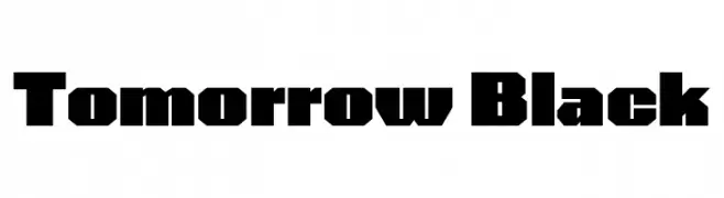
A bold, geometric font with a modern, industrial style.
![Tomorrow Black フリーフォントのダウンロード]() ダウンロード 508 ダウンロード数@WebFont
ダウンロード 508 ダウンロード数@WebFont -
( Fonts by Fachranheit )
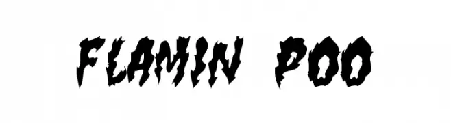
A bold, sketch-style font with a hand-drawn, comic book aesthetic.
![BREAKING SPAWN DEMO フリーフォントのダウンロード]() ダウンロード 508 ダウンロード数@WebFont
ダウンロード 508 ダウンロード数@WebFont -
-
( Fonts by Daniel Gauthier )
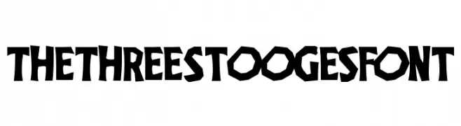
A bold, playful font with jagged, hand-drawn edges and a cartoonish style.
![TheThreeStoogesFont フリーフォントのダウンロード]() ダウンロード 508 ダウンロード数@WebFont
ダウンロード 508 ダウンロード数@WebFont -
( Fonts by www.kimberlygeswein.com - Kimberly Geswein )
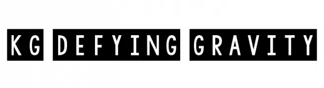
A bold, modern font with geometric lines and uniform spacing.
![KG Defying Gravity フリーフォントのダウンロード]() ダウンロード 508 ダウンロード数@WebFont
ダウンロード 508 ダウンロード数@WebFont -
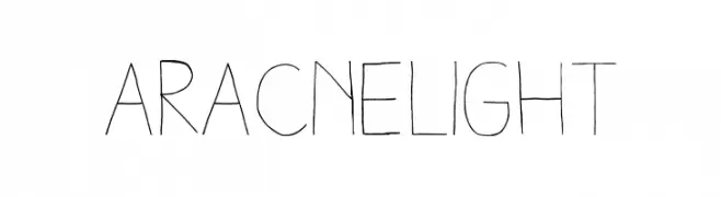
フォント by antipixel. For commercial use please contact the owner.
![AracneLight フリーフォントのダウンロード]() ダウンロード 508 ダウンロード数@WebFont
ダウンロード 508 ダウンロード数@WebFont -
![SuperBefok フリーフォントのダウンロード]() ダウンロード 508 ダウンロード数@WebFont
ダウンロード 508 ダウンロード数@WebFont -
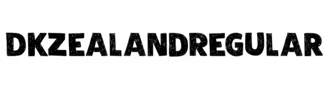
( Hanoded - David Kerkhoff - www.hanodedfonts.com )
A bold, textured font with a rustic, hand-drawn appearance.
![DK Zealand Regular フリーフォントのダウンロード]() ダウンロード 508 ダウンロード数@WebFont
ダウンロード 508 ダウンロード数@WebFont

今のトップフォントは?
は、クリーンな造形と広い適用範囲で支持を集めています。 ブランディングからランディングページ、ポスターまで活躍します。
ロゴで人気のフォントは?
幾何学系の サンセリフ(例: Poppins、Gotham 系のファミリー)は、スケーラブルでクリーンな印象に最適。 親しみやすさを出すなら スクリプト や手書き系も定番です。 見出しは力強く、本文はニュートラルに──この組み合わせが認知とバランスを高めます。
人気リストはどのくらいの頻度で更新される?
ダウンロード数やエンゲージメントに基づき定期的に更新します。 こまめにチェックして、次に流行るフォントを先取りしましょう。
💡 ヒント: このページをブックマークしておくと便利です。トレンドは速く、今のトップが明日のリブランディングを導くこともあります。