人気フォント セクションへようこそ。ここでは「よくダウンロードされ、よく使われている」実績ある書体をまとめています。 ロゴ、Web、SNS のどれにも使いやすい、外さない選択肢が見つかります。
どの トップフォント も、バランス・可読性・汎用性で高評価です。 モダン・サンセリフ、エレガントなスクリプト、ヴィンテージなセリフ、ミニマルなディスプレイなどを厳選しています。
-
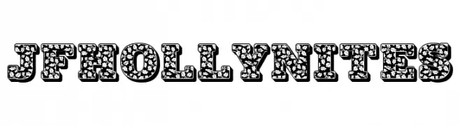
( Fonts by Jester Font Studio )
A bold, decorative font with intricate, festive patterns.
 ダウンロード 496 ダウンロード数@WebFont
 -
( Fonts by StereoType - Clément Nicolle - Personal-use only. For commercial use please contact owner. )
A lively and expressive handwritten font with dynamic strokes.
![Yellowstone フリーフォントのダウンロード]() ダウンロード 496 ダウンロード数@WebFont
ダウンロード 496 ダウンロード数@WebFont -
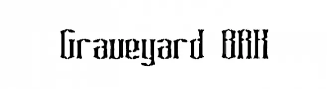
![Graveyard BRK フリーフォントのダウンロード]() ダウンロード 496 ダウンロード数@WebFont
ダウンロード 496 ダウンロード数@WebFont -
![similes フリーフォントのダウンロード]() ダウンロード 496 ダウンロード数@WebFont
ダウンロード 496 ダウンロード数@WebFont -
フォント by joorgemoron. For commercial use please contact the owner.
( Free for personal use )
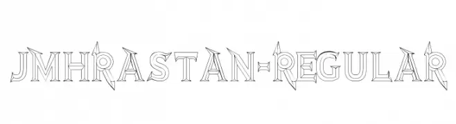
A bold, decorative font with intricate geometric details and sharp angles.
![JMHRastan-Regular フリーフォントのダウンロード]() ダウンロード 496 ダウンロード数@WebFont
ダウンロード 496 ダウンロード数@WebFont -
-
( Fonts by Fontfabric - Svetoslav Simov - Personal-use only. For commercial use please contact owner. )
A bold, modern sans-serif font with clean lines and uniform strokes.
![Mont Blanc-Trial Black フリーフォントのダウンロード]() ダウンロード 496 ダウンロード数@WebFont
ダウンロード 496 ダウンロード数@WebFont -
![Juiz de Fora フリーフォントのダウンロード]() ダウンロード 496 ダウンロード数@WebFont
ダウンロード 496 ダウンロード数@WebFont -
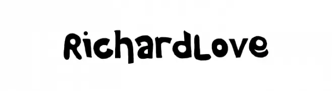
( Fonts by fhammadiq std )
A bold, playful font with rounded, hand-drawn characters.
![Richard Love フリーフォントのダウンロード]() ダウンロード 496 ダウンロード数@WebFont
ダウンロード 496 ダウンロード数@WebFont -
( Copyright (c) 2014, Indian Type Foundry (info@indiantypefoundry.com). )
A modern serif font with clean lines and a classic touch.
![Halant Regular フリーフォントのダウンロード]() ダウンロード 495 ダウンロード数@WebFont
ダウンロード 495 ダウンロード数@WebFont -
( Copyright (c) 2011 Alejandro Paul (sudtipos@sudtipos.com) )
A dynamic and flowing script font with elegant cursive letterforms.
![Mr Bedfort Regular フリーフォントのダウンロード]() ダウンロード 495 ダウンロード数@WebFont
ダウンロード 495 ダウンロード数@WebFont


今のトップフォントは?
は、クリーンな造形と広い適用範囲で支持を集めています。 ブランディングからランディングページ、ポスターまで活躍します。
ロゴで人気のフォントは?
幾何学系の サンセリフ(例: Poppins、Gotham 系のファミリー)は、スケーラブルでクリーンな印象に最適。 親しみやすさを出すなら スクリプト や手書き系も定番です。 見出しは力強く、本文はニュートラルに──この組み合わせが認知とバランスを高めます。
人気リストはどのくらいの頻度で更新される?
ダウンロード数やエンゲージメントに基づき定期的に更新します。 こまめにチェックして、次に流行るフォントを先取りしましょう。
💡 ヒント: このページをブックマークしておくと便利です。トレンドは速く、今のトップが明日のリブランディングを導くこともあります。