人気フォント セクションへようこそ。ここでは「よくダウンロードされ、よく使われている」実績ある書体をまとめています。 ロゴ、Web、SNS のどれにも使いやすい、外さない選択肢が見つかります。
どの トップフォント も、バランス・可読性・汎用性で高評価です。 モダン・サンセリフ、エレガントなスクリプト、ヴィンテージなセリフ、ミニマルなディスプレイなどを厳選しています。
-
( Fonts by Apostrophic Lab )
A bold, narrow serif font with strong vertical emphasis and consistent stroke width.
 ダウンロード 484 ダウンロード数@WebFont
 -
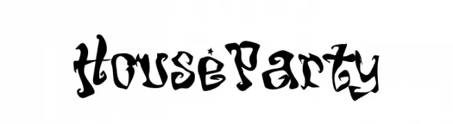
フォント by NicholasJudy456. For commercial use please contact the owner.
![HouseParty フリーフォントのダウンロード]() ダウンロード 484 ダウンロード数@WebFont
ダウンロード 484 ダウンロード数@WebFont -
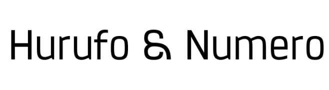
( Fonts by a Situjuh Nazara - c7n1.wordpress.com. Personal-use only. For commercial use please contact owner. )
A modern, geometric sans-serif font with balanced character spacing.
![Hurufo & Numero フリーフォントのダウンロード]() ダウンロード 484 ダウンロード数@WebFont
ダウンロード 484 ダウンロード数@WebFont -
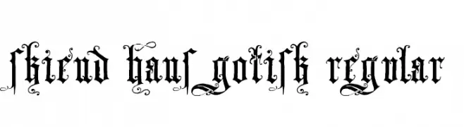
![Skjend Hans Gotisk Regular フリーフォントのダウンロード]() ダウンロード 484 ダウンロード数@WebFont
ダウンロード 484 ダウンロード数@WebFont -
( Fonts by Southype )
A bold, outlined font with a retro, disco-inspired design.
![Discoteque St フリーフォントのダウンロード]() ダウンロード 484 ダウンロード数@WebFont
ダウンロード 484 ダウンロード数@WebFont -
-
( Fonts by Mr. Typeman )
A playful handwritten font with dynamic strokes and a casual flair.
![Burston フリーフォントのダウンロード]() ダウンロード 484 ダウンロード数@WebFont
ダウンロード 484 ダウンロード数@WebFont -
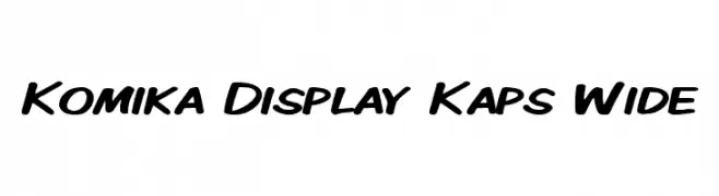
( Fonts by Apostrophic Lab )
A bold, playful font with a handwritten style and wide, rounded letters.
![Komika Display Kaps Wide フリーフォントのダウンロード]() ダウンロード 484 ダウンロード数@WebFont
ダウンロード 484 ダウンロード数@WebFont -
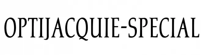
( Fonts by Castcraft Software - opti.netii.net - check the website before use )
A classic serif font with elegant, elongated strokes and subtle curves.
![OPTIJacquie-Special フリーフォントのダウンロード]() ダウンロード 484 ダウンロード数@WebFont
ダウンロード 484 ダウンロード数@WebFont -
![hardcore_pen フリーフォントのダウンロード]() ダウンロード 484 ダウンロード数@WebFont
ダウンロード 484 ダウンロード数@WebFont -
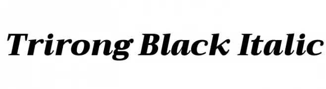
( Copyright (c) 2015, Cadson Demak (info@cadsondemak.com) )
A bold, italic serif font with high contrast and elegant style.
![Trirong Black Italic フリーフォントのダウンロード]() ダウンロード 484 ダウンロード数@WebFont
ダウンロード 484 ダウンロード数@WebFont


今のトップフォントは?
は、クリーンな造形と広い適用範囲で支持を集めています。 ブランディングからランディングページ、ポスターまで活躍します。
ロゴで人気のフォントは?
幾何学系の サンセリフ(例: Poppins、Gotham 系のファミリー)は、スケーラブルでクリーンな印象に最適。 親しみやすさを出すなら スクリプト や手書き系も定番です。 見出しは力強く、本文はニュートラルに──この組み合わせが認知とバランスを高めます。
人気リストはどのくらいの頻度で更新される?
ダウンロード数やエンゲージメントに基づき定期的に更新します。 こまめにチェックして、次に流行るフォントを先取りしましょう。
💡 ヒント: このページをブックマークしておくと便利です。トレンドは速く、今のトップが明日のリブランディングを導くこともあります。