人気フォント セクションへようこそ。ここでは「よくダウンロードされ、よく使われている」実績ある書体をまとめています。 ロゴ、Web、SNS のどれにも使いやすい、外さない選択肢が見つかります。
どの トップフォント も、バランス・可読性・汎用性で高評価です。 モダン・サンセリフ、エレガントなスクリプト、ヴィンテージなセリフ、ミニマルなディスプレイなどを厳選しています。
-
 ダウンロード 480 ダウンロード数@WebFont
 -
( Fonts by BrandSemut )
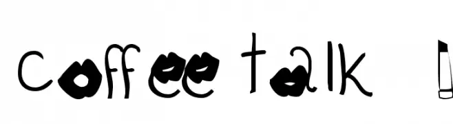
A playful, whimsical font with exaggerated serifs and a hand-drawn look.
![Rainies フリーフォントのダウンロード]() ダウンロード 480 ダウンロード数@WebFont
ダウンロード 480 ダウンロード数@WebFont -
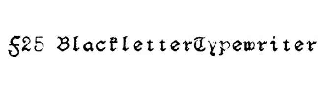
![F25 BlackletterTypewriter フリーフォントのダウンロード]() ダウンロード 480 ダウンロード数@WebFont
ダウンロード 480 ダウンロード数@WebFont -
( Fonts by Castcraft Software - opti.netii.net - check the website before use )
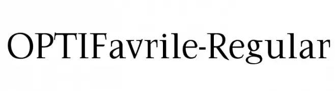
A classic serif typeface with elegant, flowing lines and refined proportions.
![OPTIFavrile-Regular フリーフォントのダウンロード]() ダウンロード 480 ダウンロード数@WebFont
ダウンロード 480 ダウンロード数@WebFont -
( Fonts by Brittney Murphy Design )
A playful, bold, and hand-drawn style font with rounded characters.
![SuburbanFlamingo-Regular フリーフォントのダウンロード]() ダウンロード 480 ダウンロード数@WebFont
ダウンロード 480 ダウンロード数@WebFont -
-
( Darcy Baldwin Fonts - darcybaldwin.com )
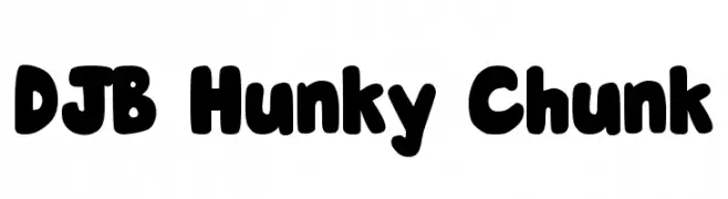
A bold, playful font with thick, rounded letters and a friendly style.
![DJB Hunky Chunk フリーフォントのダウンロード]() ダウンロード 480 ダウンロード数@WebFont
ダウンロード 480 ダウンロード数@WebFont -
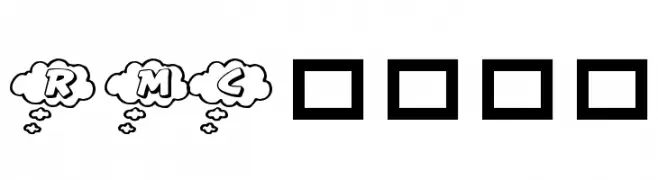
![RMCloud フリーフォントのダウンロード]() ダウンロード 480 ダウンロード数@WebFont
ダウンロード 480 ダウンロード数@WebFont -
( Fonts by www.junkohanhero.com )
A bold, distressed font with a grunge aesthetic and dynamic character shapes.
![Jadefedga[08] フリーフォントのダウンロード]() ダウンロード 480 ダウンロード数@WebFont
ダウンロード 480 ダウンロード数@WebFont -
( Fonts by Situjuh Nazara - 7ntypes.com - Personal-use only. For commercial use please contact owner. )
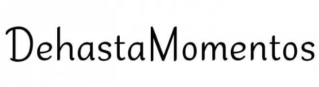
A playful, handwritten font with smooth curves and a casual style.
![Dehasta Momentos フリーフォントのダウンロード]() ダウンロード 480 ダウンロード数@WebFont
ダウンロード 480 ダウンロード数@WebFont -
( Copyright (c) 2010, Barry Schwartz (chemoelectric@chemoelectric.org) )
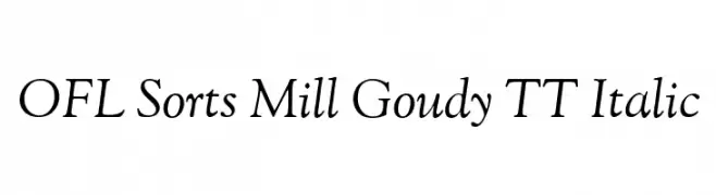
An elegant italic serif font with a classic and sophisticated style.
![OFL Sorts Mill Goudy TT Italic フリーフォントのダウンロード]() ダウンロード 480 ダウンロード数@WebFont
ダウンロード 480 ダウンロード数@WebFont


![Jadefedga[08] フリーフォントのダウンロード](https://d144mzi0q5mijx.cloudfront.net/img/J/A/Jadefedga-08.webp)
今のトップフォントは?
は、クリーンな造形と広い適用範囲で支持を集めています。 ブランディングからランディングページ、ポスターまで活躍します。
ロゴで人気のフォントは?
幾何学系の サンセリフ(例: Poppins、Gotham 系のファミリー)は、スケーラブルでクリーンな印象に最適。 親しみやすさを出すなら スクリプト や手書き系も定番です。 見出しは力強く、本文はニュートラルに──この組み合わせが認知とバランスを高めます。
人気リストはどのくらいの頻度で更新される?
ダウンロード数やエンゲージメントに基づき定期的に更新します。 こまめにチェックして、次に流行るフォントを先取りしましょう。
💡 ヒント: このページをブックマークしておくと便利です。トレンドは速く、今のトップが明日のリブランディングを導くこともあります。