人気フォント セクションへようこそ。ここでは「よくダウンロードされ、よく使われている」実績ある書体をまとめています。 ロゴ、Web、SNS のどれにも使いやすい、外さない選択肢が見つかります。
どの トップフォント も、バランス・可読性・汎用性で高評価です。 モダン・サンセリフ、エレガントなスクリプト、ヴィンテージなセリフ、ミニマルなディスプレイなどを厳選しています。
-
 ダウンロード 1639 ダウンロード数@WebFont
 -
( Fonts by Alit Design )
A dynamic and flowing script font with elegant, cursive strokes.
![Raph Lanok Future フリーフォントのダウンロード]() ダウンロード 1638 ダウンロード数@WebFont
ダウンロード 1638 ダウンロード数@WebFont -
![Bigdey Demo フリーフォントのダウンロード]() ダウンロード 1638 ダウンロード数@WebFont
ダウンロード 1638 ダウンロード数@WebFont -
![Vacer Sans Personal Fat フリーフォントのダウンロード]() ダウンロード 1638 ダウンロード数@WebFont
ダウンロード 1638 ダウンロード数@WebFont -
( Fonts by Jonathan S. Harris - www.tattoowoo.com. Personal-use only. For commercial use please contact owner. )
A bold, textured font with a rugged, prehistoric aesthetic.
![Dinosaur フリーフォントのダウンロード]() ダウンロード 1638 ダウンロード数@WebFont
ダウンロード 1638 ダウンロード数@WebFont -
![Happy Birthday フリーフォントのダウンロード]() ダウンロード 1638 ダウンロード数@WebFont
ダウンロード 1638 ダウンロード数@WebFont -
![Aovel Neo Ultralight フリーフォントのダウンロード]() ダウンロード 1638 ダウンロード数@WebFont
ダウンロード 1638 ダウンロード数@WebFont -
( Fonts by backpacker.gr )
A modern, dotted font with a playful and digital aesthetic.
![BPdots フリーフォントのダウンロード]() ダウンロード 1638 ダウンロード数@WebFont
ダウンロード 1638 ダウンロード数@WebFont -
![CD Esoteric Plain フリーフォントのダウンロード]() ダウンロード 1638 ダウンロード数
ダウンロード 1638 ダウンロード数 -
![Safrole フリーフォントのダウンロード]() ダウンロード 1638 ダウンロード数@WebFont
ダウンロード 1638 ダウンロード数@WebFont -
![Electric Toaster 76 フリーフォントのダウンロード]() ダウンロード 1638 ダウンロード数@WebFont
ダウンロード 1638 ダウンロード数@WebFont -
( Fonts by Hanoded )
A bold, playful font with rounded letters and a unique double-decker bus symbol.
![Doubledecker DEMO Regular フリーフォントのダウンロード]() ダウンロード 1637 ダウンロード数@WebFont
ダウンロード 1637 ダウンロード数@WebFont -
( Fonts by Adien Gunarta - fontasticindonesia.blogspot.com )
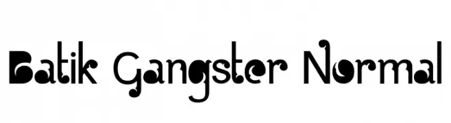
A bold, decorative font with playful curves and circular motifs.
![Batik Gangster Normal フリーフォントのダウンロード]() ダウンロード 1637 ダウンロード数@WebFont
ダウンロード 1637 ダウンロード数@WebFont -
( Fonts by Florian Bambhout - www.bambootypes.net )
A bold, playful font with rounded, geometric letterforms and a retro vibe.
![Mignone フリーフォントのダウンロード]() ダウンロード 1637 ダウンロード数@WebFont
ダウンロード 1637 ダウンロード数@WebFont -
( Fonts by The League of Moveable Type - theleagueofmoveabletype.com )
A classic serif font with elegant and refined letterforms.
![Linden Hill フリーフォントのダウンロード]() ダウンロード 1637 ダウンロード数@WebFont
ダウンロード 1637 ダウンロード数@WebFont -
( Fonts by dartcanada.tripod.com - Darren Rigby )
A modern sans-serif font with clean lines and balanced proportions.
![Tin Birdhouse フリーフォントのダウンロード]() ダウンロード 1637 ダウンロード数@WebFont
ダウンロード 1637 ダウンロード数@WebFont -
( Fonts by StringLabs Creative Studio )
A playful, bold handwritten font with rounded letterforms.
![HIROKUDA フリーフォントのダウンロード]() ダウンロード 1636 ダウンロード数@WebFont
ダウンロード 1636 ダウンロード数@WebFont -
( Fonts by AZ Std )
Hand-drawn, marker-style decorative doodle font.
![Uncle House Extra フリーフォントのダウンロード]() ダウンロード 1636 ダウンロード数@WebFont
ダウンロード 1636 ダウンロード数@WebFont -
( Thirtypath - www.thirtypath.com )
A fluid and elegant script font with smooth, connected strokes.
![Amigos フリーフォントのダウンロード]() ダウンロード 1636 ダウンロード数@WebFont
ダウンロード 1636 ダウンロード数@WebFont -
( Fonts by Galdino Otten - galdinootten.com )
A distressed, textured font with a vintage, industrial feel.
![Thin Press フリーフォントのダウンロード]() ダウンロード 1636 ダウンロード数@WebFont
ダウンロード 1636 ダウンロード数@WebFont -
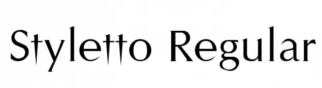
![Styletto Regular フリーフォントのダウンロード]() ダウンロード 1636 ダウンロード数@WebFont
ダウンロード 1636 ダウンロード数@WebFont -
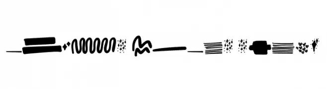
![accion dingbat tipografia フリーフォントのダウンロード]() ダウンロード 1636 ダウンロード数@WebFont
ダウンロード 1636 ダウンロード数@WebFont -
( Fonts by Manfred Klein - manfred-klein.ina-mar.com )
A clean, modern sans-serif font with geometric structure and balanced spacing.
![MankSans フリーフォントのダウンロード]() ダウンロード 1636 ダウンロード数@WebFont
ダウンロード 1636 ダウンロード数@WebFont -
![Beurk フリーフォントのダウンロード]() ダウンロード 1636 ダウンロード数@WebFont
ダウンロード 1636 ダウンロード数@WebFont -
![Font Color フリーフォントのダウンロード]() ダウンロード 1635 ダウンロード数@WebFont
ダウンロード 1635 ダウンロード数@WebFont -
( Fonts by Hanoded )
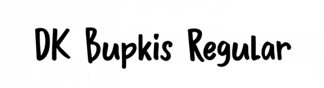
A playful, bold handwritten font with rounded, casual letterforms.
![DK Bupkis Regular フリーフォントのダウンロード]() ダウンロード 1635 ダウンロード数@WebFont
ダウンロード 1635 ダウンロード数@WebFont -
( Fonts by Arkandis Digital Foundry )
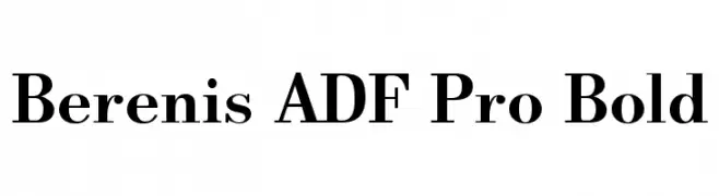
A bold serif typeface with high contrast and classic elegance.
![Berenis ADF Pro Bold フリーフォントのダウンロード]() ダウンロード 1635 ダウンロード数@WebFont
ダウンロード 1635 ダウンロード数@WebFont -
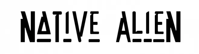
( Fonts by Daniel Zadorozny - www.iconian.com - Free for personal use )
A bold, futuristic font with angular, alien-like characters.
![Native Alien フリーフォントのダウンロード]() ダウンロード 1635 ダウンロード数
ダウンロード 1635 ダウンロード数 -
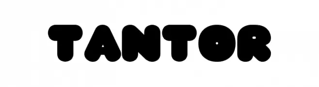
( Fonts by www.fenotype.com )
A bold, rounded font with a playful and modern aesthetic.
![TANTOR フリーフォントのダウンロード]() ダウンロード 1635 ダウンロード数@WebFont
ダウンロード 1635 ダウンロード数@WebFont -
( Fonts by www.DigitalDreamDesign.net )
A bold, geometric font with a modern, industrial aesthetic.
![D3 Egoistism フリーフォントのダウンロード]() ダウンロード 1635 ダウンロード数@WebFont
ダウンロード 1635 ダウンロード数@WebFont -
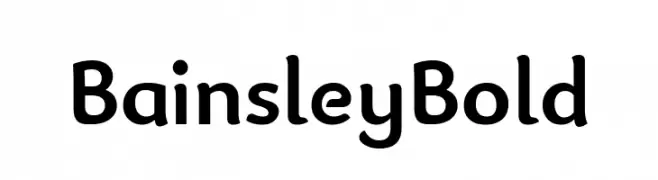
( Fonts by Paul Miller )
A bold, rounded font with a playful and professional style.
![Bainsley Bold フリーフォントのダウンロード]() ダウンロード 1634 ダウンロード数@WebFont
ダウンロード 1634 ダウンロード数@WebFont -
![Out Of My League Regular フリーフォントのダウンロード]() ダウンロード 1634 ダウンロード数@WebFont
ダウンロード 1634 ダウンロード数@WebFont -
( Fonts by Jovanny Lemonad - typetype.ru - Personal-use only. For commercial use please contact owner. )
A modern, rounded sans-serif font with a clean and approachable design.
![Matias フリーフォントのダウンロード]() ダウンロード 1634 ダウンロード数@WebFont
ダウンロード 1634 ダウンロード数@WebFont -
( Fonts by Misti`s Fonts - mistifonts.com - Personal-use only. For commercial use please contact owner. )
A playful, rounded font with a friendly and approachable style.
![Mf Hug Me Tight フリーフォントのダウンロード]() ダウンロード 1634 ダウンロード数@WebFont
ダウンロード 1634 ダウンロード数@WebFont -
( Fonts by site.xavier.edu/polt/typewriters/ - Richard Polt )
A vintage, typewriter-style font with a bold, worn appearance.
![Remington Noiseless フリーフォントのダウンロード]() ダウンロード 1634 ダウンロード数@WebFont
ダウンロード 1634 ダウンロード数@WebFont


今のトップフォントは?
は、クリーンな造形と広い適用範囲で支持を集めています。 ブランディングからランディングページ、ポスターまで活躍します。
ロゴで人気のフォントは?
幾何学系の サンセリフ(例: Poppins、Gotham 系のファミリー)は、スケーラブルでクリーンな印象に最適。 親しみやすさを出すなら スクリプト や手書き系も定番です。 見出しは力強く、本文はニュートラルに──この組み合わせが認知とバランスを高めます。
人気リストはどのくらいの頻度で更新される?
ダウンロード数やエンゲージメントに基づき定期的に更新します。 こまめにチェックして、次に流行るフォントを先取りしましょう。
💡 ヒント: このページをブックマークしておくと便利です。トレンドは速く、今のトップが明日のリブランディングを導くこともあります。