人気フォント セクションへようこそ。ここでは「よくダウンロードされ、よく使われている」実績ある書体をまとめています。 ロゴ、Web、SNS のどれにも使いやすい、外さない選択肢が見つかります。
どの トップフォント も、バランス・可読性・汎用性で高評価です。 モダン・サンセリフ、エレガントなスクリプト、ヴィンテージなセリフ、ミニマルなディスプレイなどを厳選しています。
-
( Fonts by Omnibus Type )
A bold, modern font with a friendly and dynamic style.
 ダウンロード 1581 ダウンロード数@WebFont
 -
( Lukas Gerber - www.lukas-gerber.ch/ )
A bold, high-contrast stencil-style font with dramatic and artistic flair.
![FEMORALIS Regular フリーフォントのダウンロード]() ダウンロード 1581 ダウンロード数@WebFont
ダウンロード 1581 ダウンロード数@WebFont -
( Fonts by www.studiotypo.com - Personal-use only. For commercial use please contact owner. )
A modern, geometric font with smooth, rounded edges and balanced spacing.
![Magettas DEMO フリーフォントのダウンロード]() ダウンロード 1581 ダウンロード数@WebFont
ダウンロード 1581 ダウンロード数@WebFont -
( Copyright (c) 2015, Cadson Demak (info@cadsondemak.com) )
A modern, clean font with a friendly and approachable design.
![Pridi Medium フリーフォントのダウンロード]() ダウンロード 1581 ダウンロード数@WebFont
ダウンロード 1581 ダウンロード数@WebFont -
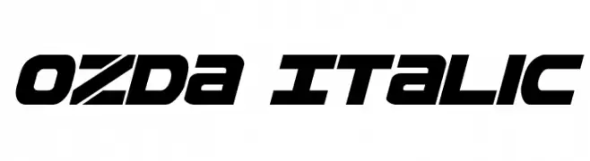
( Fonts by Daniel Zadorozny - www.iconian.com )
A bold, italicized font with a futuristic and dynamic style.
![Ozda Italic フリーフォントのダウンロード]() ダウンロード 1581 ダウンロード数@WebFont
ダウンロード 1581 ダウンロード数@WebFont -
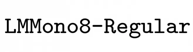
( Fonts by www.gust.org.pl )
A monospaced slab serif font with uniform width and consistent stroke weight.
![LMMono8-Regular フリーフォントのダウンロード]() ダウンロード 1581 ダウンロード数@WebFont
ダウンロード 1581 ダウンロード数@WebFont -
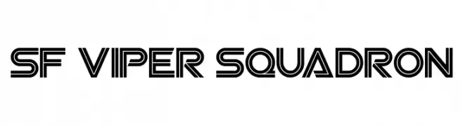
![SF Viper Squadron フリーフォントのダウンロード]() ダウンロード 1581 ダウンロード数@WebFont
ダウンロード 1581 ダウンロード数@WebFont -
( Fonts by Digital Graphics Labs - www.digitalgraphiclabs.com )
A bold, geometric font with sharp angles and an outlined, futuristic design.
![Eddie フリーフォントのダウンロード]() ダウンロード 1581 ダウンロード数@WebFont
ダウンロード 1581 ダウンロード数@WebFont -
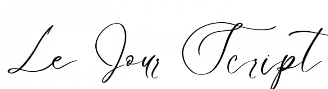
( Fonts by Din Studio - Donis Miftahudin - Personal-use only. For commercial use please contact owner. )
An elegant script font with fluid, sweeping strokes and graceful curves.
![Le Jour Script フリーフォントのダウンロード]() ダウンロード 1580 ダウンロード数@WebFont
ダウンロード 1580 ダウンロード数@WebFont -
( Kyle Hathcoat )
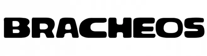
A bold, rounded font with a modern and friendly appearance.
![Bracheos フリーフォントのダウンロード]() ダウンロード 1580 ダウンロード数@WebFont
ダウンロード 1580 ダウンロード数@WebFont -
( Haris Purnama - creativemarket.com/RitsType )
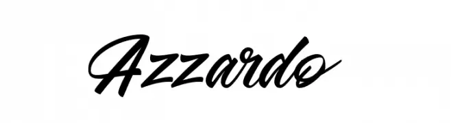
A dynamic and flowing script font with elegant, cursive letterforms.
![Azzardo フリーフォントのダウンロード]() ダウンロード 1580 ダウンロード数@WebFont
ダウンロード 1580 ダウンロード数@WebFont -
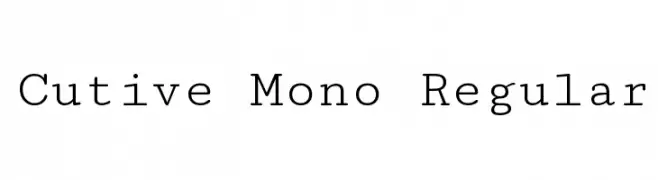
( Copyright 2012 The Cutive Project Authors (vern@newtypography.co.uk) )
A monospaced, typewriter-style font with a clean and structured appearance.
![Cutive Mono Regular フリーフォントのダウンロード]() ダウンロード 1580 ダウンロード数@WebFont
ダウンロード 1580 ダウンロード数@WebFont -
( Fonts by junkohanhero )
A bold, distressed font with a rugged, vintage look.
![Gsubadaslowly フリーフォントのダウンロード]() ダウンロード 1580 ダウンロード数@WebFont
ダウンロード 1580 ダウンロード数@WebFont -
( Copyright (c) 2014, Indian Type Foundry (info@indiantypefoundry.com). )
A modern, geometric sans-serif font with a clean and compact design.
![Khand フリーフォントのダウンロード]() ダウンロード 1580 ダウンロード数@WebFont
ダウンロード 1580 ダウンロード数@WebFont -
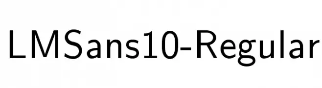
( Fonts by www.gust.org.pl )
A clean, modern sans-serif font with excellent readability and balance.
![LMSans10-Regular フリーフォントのダウンロード]() ダウンロード 1580 ダウンロード数@WebFont
ダウンロード 1580 ダウンロード数@WebFont -
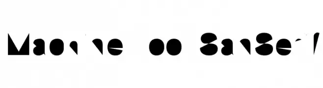
![Machine Tool SanSerif フリーフォントのダウンロード]() ダウンロード 1580 ダウンロード数
ダウンロード 1580 ダウンロード数 -
![Sira フリーフォントのダウンロード]() ダウンロード 1580 ダウンロード数@WebFont
ダウンロード 1580 ダウンロード数@WebFont -
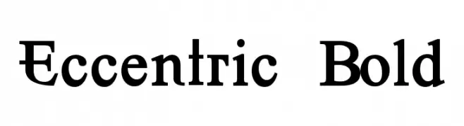
![Eccentric Bold フリーフォントのダウンロード]() ダウンロード 1580 ダウンロード数@WebFont
ダウンロード 1580 ダウンロード数@WebFont -
![Cocktail フリーフォントのダウンロード]() ダウンロード 1580 ダウンロード数@WebFont
ダウンロード 1580 ダウンロード数@WebFont -
( Fonts by Rich Gast - www.greywolfwebworks.com 商用 フォント )
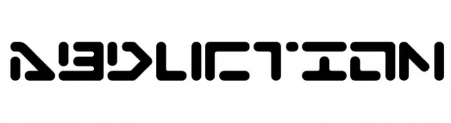
A futuristic, geometric font with bold, rounded shapes and cut-out sections.
![Abduction フリーフォントのダウンロード]() ダウンロード 1580 ダウンロード数
ダウンロード 1580 ダウンロード数 -
フォント by CannotIntoSpaceFonts. For commercial use please contact the owner.
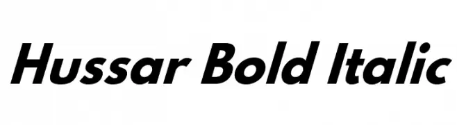
![Hussar Bold Italic フリーフォントのダウンロード]() ダウンロード 1579 ダウンロード数@WebFont
ダウンロード 1579 ダウンロード数@WebFont -
( Fonts by Adien Gunarta - fontasticindonesia.blogspot.com )
A geometric, modern font with a bold and structured design.
![Awesome South Korea フリーフォントのダウンロード]() ダウンロード 1579 ダウンロード数@WebFont
ダウンロード 1579 ダウンロード数@WebFont -
( Fonts by Ingo Zimmermann - www.ingofonts.com )
A modern, italic font with clean lines and a professional appearance.
![Absolut Pro Book Italic reduced フリーフォントのダウンロード]() ダウンロード 1579 ダウンロード数@WebFont
ダウンロード 1579 ダウンロード数@WebFont -
( Fonts by Dieter Steffmann )
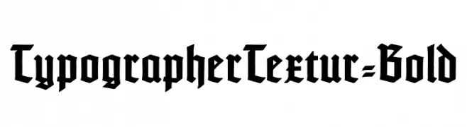
A bold, blackletter font with sharp, angular strokes and a Gothic aesthetic.
![TypographerTextur-Bold フリーフォントのダウンロード]() ダウンロード 1579 ダウンロード数@WebFont
ダウンロード 1579 ダウンロード数@WebFont -
( Copyright (c) 2010, Igino Marini (mail@iginomarini.com) )
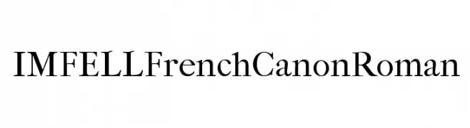
A classic serif font with high contrast and sharp serifs, exuding elegance and sophistication.
![IM FELL French Canon Roman フリーフォントのダウンロード]() ダウンロード 1579 ダウンロード数@WebFont
ダウンロード 1579 ダウンロード数@WebFont -
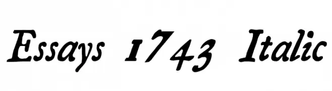
![Essays 1743 Italic フリーフォントのダウンロード]() ダウンロード 1579 ダウンロード数@WebFont
ダウンロード 1579 ダウンロード数@WebFont -
![Chloe Confetti フリーフォントのダウンロード]() ダウンロード 1579 ダウンロード数@WebFont
ダウンロード 1579 ダウンロード数@WebFont -
( Fonts by Syaf Rizal - www.creativefabrica.com/ref/53/ - Personal-use only. For commercial use please contact owner. )
A bold, playful script font with smooth, flowing curves and rounded edges.
![Beloved Daughter フリーフォントのダウンロード]() ダウンロード 1578 ダウンロード数@WebFont
ダウンロード 1578 ダウンロード数@WebFont -
( Personal-use only. For commercial use please contact owner. )
A modern, semi-bold sans-serif font with clean lines and balanced proportions.
![Railway-Semibold フリーフォントのダウンロード]() ダウンロード 1578 ダウンロード数@WebFont
ダウンロード 1578 ダウンロード数@WebFont -
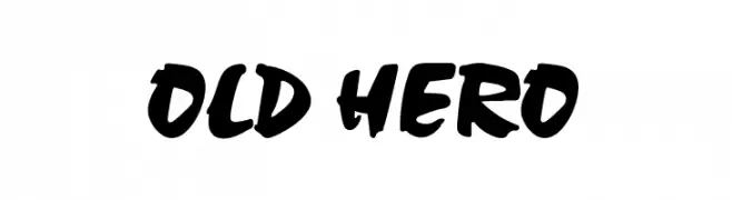
![Old Hero フリーフォントのダウンロード]() ダウンロード 1578 ダウンロード数@WebFont
ダウンロード 1578 ダウンロード数@WebFont -
( Fonts by Erico Lebedenco - www.ericolebedenco.com )
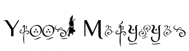
A whimsical serif font with decorative and magical elements.
![Yellow Magician フリーフォントのダウンロード]() ダウンロード 1578 ダウンロード数@WebFont
ダウンロード 1578 ダウンロード数@WebFont -
( Fonts by Graham Meade - GemFonts )
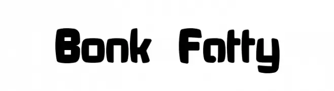
A bold, rounded font with a playful and chunky style.
![Bonk Fatty フリーフォントのダウンロード]() ダウンロード 1578 ダウンロード数@WebFont
ダウンロード 1578 ダウンロード数@WebFont -
( Fonts by Nick Curtis - www.nicksfonts.com )
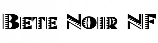
A bold, zigzag-patterned decorative font with Art Deco influences.
![Bete Noir NF フリーフォントのダウンロード]() ダウンロード 1578 ダウンロード数@WebFont
ダウンロード 1578 ダウンロード数@WebFont -
( Fonts by share font )
A bold, outlined font with a playful, three-dimensional effect.
![Comedo フリーフォントのダウンロード]() ダウンロード 1577 ダウンロード数@WebFont
ダウンロード 1577 ダウンロード数@WebFont -
( Fonts by Arkandis Digital Foundry )
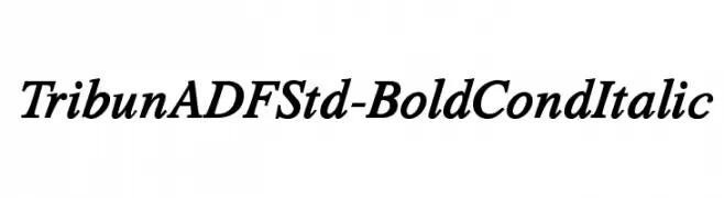
A bold, italic serif font with a modern and dynamic style.
![TribunADFStd-BoldCondItalic フリーフォントのダウンロード]() ダウンロード 1577 ダウンロード数@WebFont
ダウンロード 1577 ダウンロード数@WebFont


今のトップフォントは?
は、クリーンな造形と広い適用範囲で支持を集めています。 ブランディングからランディングページ、ポスターまで活躍します。
ロゴで人気のフォントは?
幾何学系の サンセリフ(例: Poppins、Gotham 系のファミリー)は、スケーラブルでクリーンな印象に最適。 親しみやすさを出すなら スクリプト や手書き系も定番です。 見出しは力強く、本文はニュートラルに──この組み合わせが認知とバランスを高めます。
人気リストはどのくらいの頻度で更新される?
ダウンロード数やエンゲージメントに基づき定期的に更新します。 こまめにチェックして、次に流行るフォントを先取りしましょう。
💡 ヒント: このページをブックマークしておくと便利です。トレンドは速く、今のトップが明日のリブランディングを導くこともあります。