人気フォント セクションへようこそ。ここでは「よくダウンロードされ、よく使われている」実績ある書体をまとめています。 ロゴ、Web、SNS のどれにも使いやすい、外さない選択肢が見つかります。
どの トップフォント も、バランス・可読性・汎用性で高評価です。 モダン・サンセリフ、エレガントなスクリプト、ヴィンテージなセリフ、ミニマルなディスプレイなどを厳選しています。
-
 ダウンロード 435 ダウンロード数@WebFont
 -
( Fonts by NubeFonts - nubefonts.blogspot.com - Personal-use only. For commercial use please contact owner. )
A playful, hand-drawn font with a whimsical and informal style.
![Soul フリーフォントのダウンロード]() ダウンロード 435 ダウンロード数@WebFont
ダウンロード 435 ダウンロード数@WebFont -
( Fonts by Apostrophic Lab )
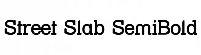
A bold slab serif font with strong, block-like serifs and a balanced appearance.
![Street Slab SemiBold フリーフォントのダウンロード]() ダウンロード 435 ダウンロード数@WebFont
ダウンロード 435 ダウンロード数@WebFont -
( Fonts by Khurasan )
A bold, rounded, and playful font with a hand-drawn appearance.
![Request Coffee フリーフォントのダウンロード]() ダウンロード 435 ダウンロード数@WebFont
ダウンロード 435 ダウンロード数@WebFont -
( Fonts by Misti's Fonts )
A playful, handwritten font with a casual and friendly style.
![Lazy Spring Day Demo フリーフォントのダウンロード]() ダウンロード 435 ダウンロード数@WebFont
ダウンロード 435 ダウンロード数@WebFont -
-
( Fonts by www.kimberlygeswein.com - Kimberly Geswein )
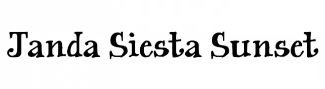
A whimsical, hand-drawn font with playful, uneven characters.
![Janda Siesta Sunset フリーフォントのダウンロード]() ダウンロード 435 ダウンロード数@WebFont
ダウンロード 435 ダウンロード数@WebFont -
( Fonts by Iordanis Passas )
A bold, distressed font with a grunge texture for an edgy, vintage look.
![Baston-Regular フリーフォントのダウンロード]() ダウンロード 435 ダウンロード数@WebFont
ダウンロード 435 ダウンロード数@WebFont -
( Fonts by Ana Sanfelippo )
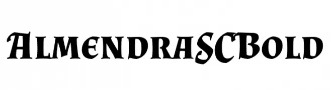
A bold serif font with sharp serifs and high contrast, ideal for impactful headlines.
![Almendra SC Bold フリーフォントのダウンロード]() ダウンロード 435 ダウンロード数@WebFont
ダウンロード 435 ダウンロード数@WebFont -
![jb_hell フリーフォントのダウンロード]() ダウンロード 435 ダウンロード数@WebFont
ダウンロード 435 ダウンロード数@WebFont -
( Fonts by a Typeface Leone - www.tipografialeone.net. Personal-use only. For commercial use please contact owner. )
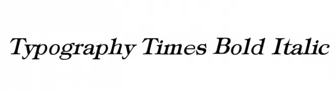
A bold, italic serif font with a classic and elegant style.
![Typography Times Bold Italic フリーフォントのダウンロード]() ダウンロード 435 ダウンロード数@WebFont
ダウンロード 435 ダウンロード数@WebFont


今のトップフォントは?
は、クリーンな造形と広い適用範囲で支持を集めています。 ブランディングからランディングページ、ポスターまで活躍します。
ロゴで人気のフォントは?
幾何学系の サンセリフ(例: Poppins、Gotham 系のファミリー)は、スケーラブルでクリーンな印象に最適。 親しみやすさを出すなら スクリプト や手書き系も定番です。 見出しは力強く、本文はニュートラルに──この組み合わせが認知とバランスを高めます。
人気リストはどのくらいの頻度で更新される?
ダウンロード数やエンゲージメントに基づき定期的に更新します。 こまめにチェックして、次に流行るフォントを先取りしましょう。
💡 ヒント: このページをブックマークしておくと便利です。トレンドは速く、今のトップが明日のリブランディングを導くこともあります。