人気フォント セクションへようこそ。ここでは「よくダウンロードされ、よく使われている」実績ある書体をまとめています。 ロゴ、Web、SNS のどれにも使いやすい、外さない選択肢が見つかります。
どの トップフォント も、バランス・可読性・汎用性で高評価です。 モダン・サンセリフ、エレガントなスクリプト、ヴィンテージなセリフ、ミニマルなディスプレイなどを厳選しています。
-
 ダウンロード 430 ダウンロード数@WebFont
 -
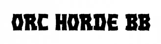
( Fonts by www.blambot.com )
A rugged, bold font with jagged edges and a tribal, hand-chiseled appearance.
![Orc Horde BB フリーフォントのダウンロード]() ダウンロード 430 ダウンロード数@WebFont
ダウンロード 430 ダウンロード数@WebFont -
( Fonts by IBM )
A bold, italic serif font with strong strokes and elegant curves.
![IBM Plex Serif Bold Italic フリーフォントのダウンロード]() ダウンロード 430 ダウンロード数@WebFont
ダウンロード 430 ダウンロード数@WebFont -
![Plump Regular フリーフォントのダウンロード]() ダウンロード 430 ダウンロード数@WebFont
ダウンロード 430 ダウンロード数@WebFont -
( Fonts by Irina ModBlackmoon )
A gothic, thorny font with intricate, sharp embellishments and dramatic flourishes.
![MB Gothic Spell フリーフォントのダウンロード]() ダウンロード 430 ダウンロード数@WebFont
ダウンロード 430 ダウンロード数@WebFont -
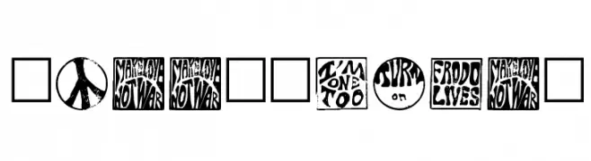
-
![HippyStampA フリーフォントのダウンロード]() ダウンロード 430 ダウンロード数@WebFont
ダウンロード 430 ダウンロード数@WebFont -
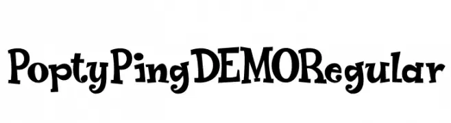
( Hanoded - David Kerkhoff - www.hanodedfonts.com )
A playful, whimsical font with bold, irregular strokes and a lively appearance.
![Popty Ping DEMO Regular フリーフォントのダウンロード]() ダウンロード 430 ダウンロード数@WebFont
ダウンロード 430 ダウンロード数@WebFont -
( Fonts by Omnibus Type )
A bold, italic font with high contrast and subtle serifs, perfect for dynamic headlines.
![Sansita Black Italic フリーフォントのダウンロード]() ダウンロード 430 ダウンロード数@WebFont
ダウンロード 430 ダウンロード数@WebFont -
( Fonts by Manuel Lage )
A rounded, light-weight font with a clean and modern aesthetic.
![LGfBesitosRound-Light フリーフォントのダウンロード]() ダウンロード 430 ダウンロード数@WebFont
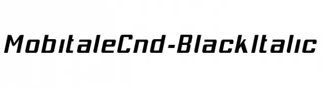
ダウンロード 430 ダウンロード数@WebFont -
![MobitaleCnd-BlackItalic フリーフォントのダウンロード]() ダウンロード 430 ダウンロード数@WebFont
ダウンロード 430 ダウンロード数@WebFont


今のトップフォントは?
は、クリーンな造形と広い適用範囲で支持を集めています。 ブランディングからランディングページ、ポスターまで活躍します。
ロゴで人気のフォントは?
幾何学系の サンセリフ(例: Poppins、Gotham 系のファミリー)は、スケーラブルでクリーンな印象に最適。 親しみやすさを出すなら スクリプト や手書き系も定番です。 見出しは力強く、本文はニュートラルに──この組み合わせが認知とバランスを高めます。
人気リストはどのくらいの頻度で更新される?
ダウンロード数やエンゲージメントに基づき定期的に更新します。 こまめにチェックして、次に流行るフォントを先取りしましょう。
💡 ヒント: このページをブックマークしておくと便利です。トレンドは速く、今のトップが明日のリブランディングを導くこともあります。