人気フォント セクションへようこそ。ここでは「よくダウンロードされ、よく使われている」実績ある書体をまとめています。 ロゴ、Web、SNS のどれにも使いやすい、外さない選択肢が見つかります。
どの トップフォント も、バランス・可読性・汎用性で高評価です。 モダン・サンセリフ、エレガントなスクリプト、ヴィンテージなセリフ、ミニマルなディスプレイなどを厳選しています。
-
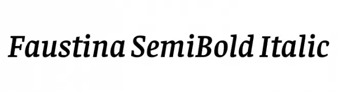
( Copyright 2016 The Faustina Project Authors (omnibus.type@gmail.com) )
Elegant serif font with a semi-bold weight and italic style, offering a classic yet modern appeal.
 ダウンロード 413 ダウンロード数@WebFont
 -
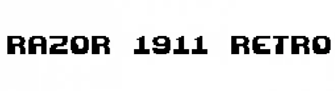
( Fonts by www.freakyfonts.de )
A bold, pixelated font with a retro digital style.
![Razor 1911 Retro フリーフォントのダウンロード]() ダウンロード 413 ダウンロード数@WebFont
ダウンロード 413 ダウンロード数@WebFont -
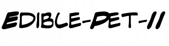
![Edible-Pet-II フリーフォントのダウンロード]() ダウンロード 413 ダウンロード数@WebFont
ダウンロード 413 ダウンロード数@WebFont -
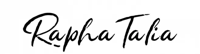
![Rapha Talia フリーフォントのダウンロード]() ダウンロード 413 ダウンロード数@WebFont
ダウンロード 413 ダウンロード数@WebFont -
( Fonts by Peter Wiegel - www.peter-wiegel.de - Personal-use only. For commercial use please contact owner. )
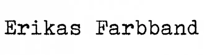
A vintage, typewriter-style font with textured, irregular edges.
![Erikas Farbband フリーフォントのダウンロード]() ダウンロード 413 ダウンロード数@WebFont
ダウンロード 413 ダウンロード数@WebFont -
-
( Fonts by a Claude Pelletier . Personal-use only. For commercial use please contact owner. )
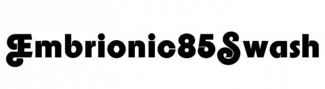
A bold, playful font with swash elements and distinctive character designs.
![Embrionic85Swash フリーフォントのダウンロード]() ダウンロード 413 ダウンロード数@WebFont
ダウンロード 413 ダウンロード数@WebFont -
( Fonts by Manfred Klein. Free for private and charity use. Free for commercial with donation to organizations )
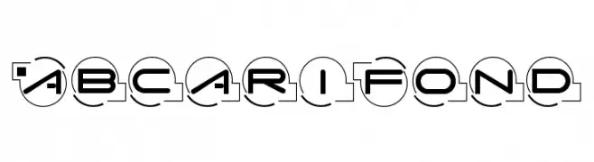
A futuristic, geometric font with characters enclosed in circles, offering a modern and technological look.
![AbcariFond フリーフォントのダウンロード]() ダウンロード 413 ダウンロード数@WebFont
ダウンロード 413 ダウンロード数@WebFont -
( Fonts by a Claude Pelletier . Personal-use only. For commercial use please contact owner. )
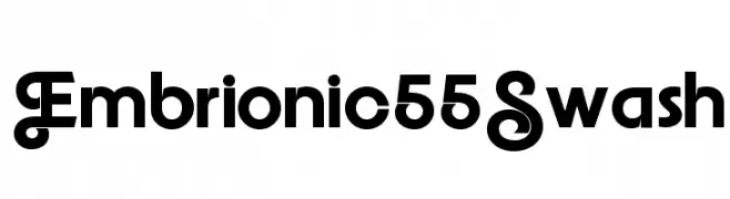
A decorative font with swashes and bold, clean lines.
![Embrionic55Swash フリーフォントのダウンロード]() ダウンロード 413 ダウンロード数@WebFont
ダウンロード 413 ダウンロード数@WebFont -
( Fonts by omnibus-type.com. Personal-use only. For commercial use please contact owner. )
A bold, italicized font with dynamic strokes and strong visual impact.
![Sansita-ExtraBoldItalic フリーフォントのダウンロード]() ダウンロード 412 ダウンロード数@WebFont
ダウンロード 412 ダウンロード数@WebFont -
![Vaille3 フリーフォントのダウンロード]() ダウンロード 412 ダウンロード数@WebFont
ダウンロード 412 ダウンロード数@WebFont

今のトップフォントは?
は、クリーンな造形と広い適用範囲で支持を集めています。 ブランディングからランディングページ、ポスターまで活躍します。
ロゴで人気のフォントは?
幾何学系の サンセリフ(例: Poppins、Gotham 系のファミリー)は、スケーラブルでクリーンな印象に最適。 親しみやすさを出すなら スクリプト や手書き系も定番です。 見出しは力強く、本文はニュートラルに──この組み合わせが認知とバランスを高めます。
人気リストはどのくらいの頻度で更新される?
ダウンロード数やエンゲージメントに基づき定期的に更新します。 こまめにチェックして、次に流行るフォントを先取りしましょう。
💡 ヒント: このページをブックマークしておくと便利です。トレンドは速く、今のトップが明日のリブランディングを導くこともあります。