人気フォント セクションへようこそ。ここでは「よくダウンロードされ、よく使われている」実績ある書体をまとめています。 ロゴ、Web、SNS のどれにも使いやすい、外さない選択肢が見つかります。
どの トップフォント も、バランス・可読性・汎用性で高評価です。 モダン・サンセリフ、エレガントなスクリプト、ヴィンテージなセリフ、ミニマルなディスプレイなどを厳選しています。
-
( Fonts by Ahmad Syarif Afandi - https://delapan.studio - Personal-use only. For commercial use please contact owner. )
A bold, narrow serif font with a strong, authoritative presence.
 ダウンロード 399 ダウンロード数@WebFont
 -
( Adam Wunn )
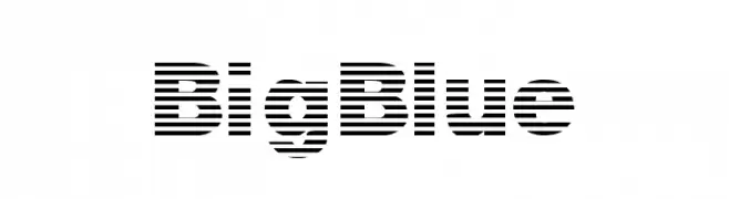
A bold, modern font with a unique horizontal striped pattern.
![BigBlue フリーフォントのダウンロード]() ダウンロード 399 ダウンロード数@WebFont
ダウンロード 399 ダウンロード数@WebFont -
![Telegraphic Light Italic フリーフォントのダウンロード]() ダウンロード 399 ダウンロード数@WebFont
ダウンロード 399 ダウンロード数@WebFont -
( Adhitya Nugroho )
A dynamic brush-style font with fluid, hand-painted strokes.
![Lismonia Brush Font Demo Regular フリーフォントのダウンロード]() ダウンロード 399 ダウンロード数@WebFont
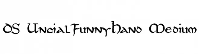
ダウンロード 399 ダウンロード数@WebFont -
![DS UncialFunnyHand Medium フリーフォントのダウンロード]() ダウンロード 399 ダウンロード数@WebFont
ダウンロード 399 ダウンロード数@WebFont -
-
( Fonts by Daniel Zadorozny - www.iconian.com )
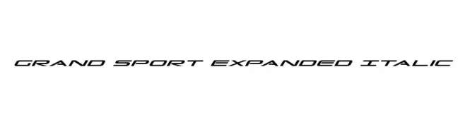
A sleek, italicized, and expanded font with a modern, sporty look.
![Grand Sport Expanded Italic フリーフォントのダウンロード]() ダウンロード 399 ダウンロード数@WebFont
ダウンロード 399 ダウンロード数@WebFont -
( Fonts by Typodermic Fonts )
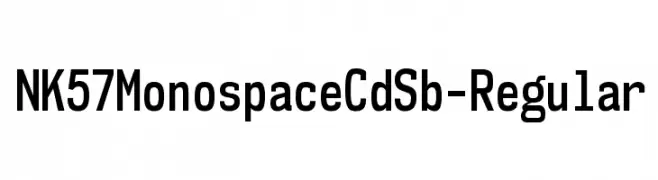
A modern, monospaced font with uniform character width and high legibility.
![NK57MonospaceCdSb-Regular フリーフォントのダウンロード]() ダウンロード 398 ダウンロード数@WebFont
ダウンロード 398 ダウンロード数@WebFont -
( Bayley Design - William Bayley - behance.net/bayleydesign www.freshcomfonts.co.uk/william-suckling-22-c.asp )
A bold, geometric font with sharp angles and a modern Gothic influence.
![AXE フリーフォントのダウンロード]() ダウンロード 398 ダウンロード数@WebFont
ダウンロード 398 ダウンロード数@WebFont -
![YOzFontCP04 Italic フリーフォントのダウンロード]() ダウンロード 398 ダウンロード数@WebFont
ダウンロード 398 ダウンロード数@WebFont -
( Fonts by Mans Greback - www.mawns.com )
A playful, handwritten font with irregular shapes and dynamic line thickness.
![Second Lyrics フリーフォントのダウンロード]() ダウンロード 398 ダウンロード数@WebFont
ダウンロード 398 ダウンロード数@WebFont


今のトップフォントは?
は、クリーンな造形と広い適用範囲で支持を集めています。 ブランディングからランディングページ、ポスターまで活躍します。
ロゴで人気のフォントは?
幾何学系の サンセリフ(例: Poppins、Gotham 系のファミリー)は、スケーラブルでクリーンな印象に最適。 親しみやすさを出すなら スクリプト や手書き系も定番です。 見出しは力強く、本文はニュートラルに──この組み合わせが認知とバランスを高めます。
人気リストはどのくらいの頻度で更新される?
ダウンロード数やエンゲージメントに基づき定期的に更新します。 こまめにチェックして、次に流行るフォントを先取りしましょう。
💡 ヒント: このページをブックマークしておくと便利です。トレンドは速く、今のトップが明日のリブランディングを導くこともあります。