人気フォント セクションへようこそ。ここでは「よくダウンロードされ、よく使われている」実績ある書体をまとめています。 ロゴ、Web、SNS のどれにも使いやすい、外さない選択肢が見つかります。
どの トップフォント も、バランス・可読性・汎用性で高評価です。 モダン・サンセリフ、エレガントなスクリプト、ヴィンテージなセリフ、ミニマルなディスプレイなどを厳選しています。
-
 ダウンロード 4626 ダウンロード数@WebFont
 -
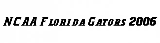
![NCAA Florida Gators 2006 フリーフォントのダウンロード]() ダウンロード 4625 ダウンロード数@WebFont
ダウンロード 4625 ダウンロード数@WebFont -
( Fonts by Matthew Welch - www.squaregear.net/fonts/ )
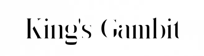
A bold, high-contrast serif font with a modern and dramatic style.
![King's Gambit フリーフォントのダウンロード]() ダウンロード 4625 ダウンロード数@WebFont
ダウンロード 4625 ダウンロード数@WebFont -
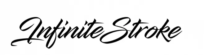
![InfiniteStroke フリーフォントのダウンロード]() ダウンロード 4623 ダウンロード数@WebFont
ダウンロード 4623 ダウンロード数@WebFont -
( Copyright (c) 2011 Fontstage (info@fontstage.com) )
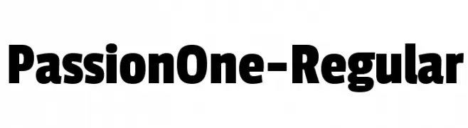
A bold, modern font with thick, uniform strokes for impactful design.
![PassionOne-Regular フリーフォントのダウンロード]() ダウンロード 4623 ダウンロード数@WebFont
ダウンロード 4623 ダウンロード数@WebFont -
-
フォント by defharo. For commercial use please contact the owner.
![a-sogra_Ruth フリーフォントのダウンロード]() ダウンロード 4620 ダウンロード数@WebFont
ダウンロード 4620 ダウンロード数@WebFont -
![BBOO フリーフォントのダウンロード]() ダウンロード 4618 ダウンロード数@WebFont
ダウンロード 4618 ダウンロード数@WebFont -
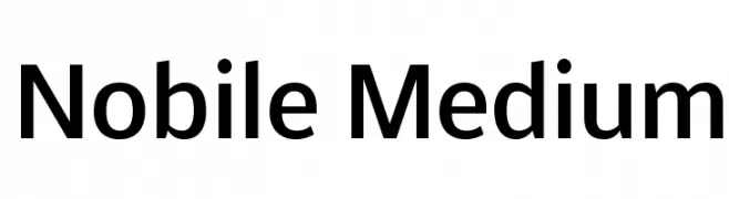
( Copyright (c) 2010-2012, Vernon Adams (vern@newtypography.co.uk), with Reserved Font Name Nobile. )
A modern sans-serif font with balanced proportions and smooth curves.
![Nobile Medium フリーフォントのダウンロード]() ダウンロード 4618 ダウンロード数@WebFont
ダウンロード 4618 ダウンロード数@WebFont -
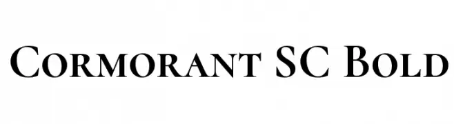
( Copyright (c) 2015, Christian Thalmann and the Cormorant Project Authors (github.com/CatharsisFonts/Cormorant) )
A classic serif font with elegant strokes and refined proportions.
![Cormorant SC Bold フリーフォントのダウンロード]() ダウンロード 4617 ダウンロード数@WebFont
ダウンロード 4617 ダウンロード数@WebFont -
( Fonts by Kimberly Geswein - kimberlygeswein.com )
A playful, handwritten-style font with rounded, informal characters.
![Architects Daughter フリーフォントのダウンロード]() ダウンロード 4616 ダウンロード数@WebFont
ダウンロード 4616 ダウンロード数@WebFont


今のトップフォントは?
は、クリーンな造形と広い適用範囲で支持を集めています。 ブランディングからランディングページ、ポスターまで活躍します。
ロゴで人気のフォントは?
幾何学系の サンセリフ(例: Poppins、Gotham 系のファミリー)は、スケーラブルでクリーンな印象に最適。 親しみやすさを出すなら スクリプト や手書き系も定番です。 見出しは力強く、本文はニュートラルに──この組み合わせが認知とバランスを高めます。
人気リストはどのくらいの頻度で更新される?
ダウンロード数やエンゲージメントに基づき定期的に更新します。 こまめにチェックして、次に流行るフォントを先取りしましょう。
💡 ヒント: このページをブックマークしておくと便利です。トレンドは速く、今のトップが明日のリブランディングを導くこともあります。