人気フォント セクションへようこそ。ここでは「よくダウンロードされ、よく使われている」実績ある書体をまとめています。 ロゴ、Web、SNS のどれにも使いやすい、外さない選択肢が見つかります。
どの トップフォント も、バランス・可読性・汎用性で高評価です。 モダン・サンセリフ、エレガントなスクリプト、ヴィンテージなセリフ、ミニマルなディスプレイなどを厳選しています。
-
 ダウンロード 4454 ダウンロード数@WebFont
 -
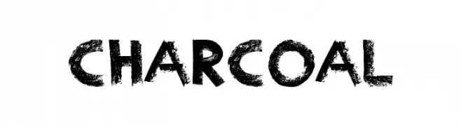
![Charcoal フリーフォントのダウンロード]() ダウンロード 4454 ダウンロード数@WebFont
ダウンロード 4454 ダウンロード数@WebFont -
( Fonts by Holydie Studio - Personal-use only. For commercial use please contact owner. )
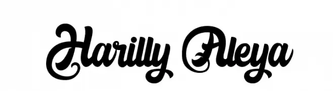
A bold, flowing script font with elegant curves and decorative flourishes.
![Harilly Aleya フリーフォントのダウンロード]() ダウンロード 4453 ダウンロード数@WebFont
ダウンロード 4453 ダウンロード数@WebFont -
( Fonts by Apostrophic Lab )
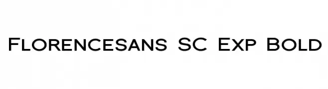
A bold, modern sans-serif font with expanded width and high legibility.
![Florencesans SC Exp Bold フリーフォントのダウンロード]() ダウンロード 4452 ダウンロード数@WebFont
ダウンロード 4452 ダウンロード数@WebFont -
![TeXGyreHeros-Regular フリーフォントのダウンロード]() ダウンロード 4450 ダウンロード数@WebFont
ダウンロード 4450 ダウンロード数@WebFont -
-
![Dylan フリーフォントのダウンロード]() ダウンロード 4447 ダウンロード数@WebFont
ダウンロード 4447 ダウンロード数@WebFont -
( Copyright (c) 2014, Indian Type Foundry (info@indiantypefoundry.com). )
A casual, handwritten-style font with smooth, rounded strokes.
![Kalam フリーフォントのダウンロード]() ダウンロード 4445 ダウンロード数@WebFont
ダウンロード 4445 ダウンロード数@WebFont -
( Fonts by Fonts by Rasmus Andersson / Changes by Cristiano Sobral with parts from Marc Monis - Personal-use only. For commercial use please contact owner. )
A clean, modern sans-serif typeface with uniform stroke width and excellent readability.
![LinikSans-SemiBold フリーフォントのダウンロード]() ダウンロード 4444 ダウンロード数@WebFont
ダウンロード 4444 ダウンロード数@WebFont -
( Fonts by Antrax - ja-fonts.iweb.pl )
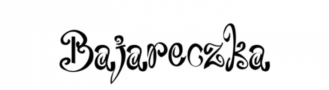
A whimsical and decorative font with intricate swirls and flourishes.
![Bajareczka フリーフォントのダウンロード]() ダウンロード 4444 ダウンロード数@WebFont
ダウンロード 4444 ダウンロード数@WebFont -
( Fonts by Daniel Zadorozny - www.iconian.com - Free for personal use )
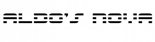
A futuristic, segmented font with a digital, high-tech appearance.
![Aldo's Nova フリーフォントのダウンロード]() ダウンロード 4443 ダウンロード数@WebFont
ダウンロード 4443 ダウンロード数@WebFont


今のトップフォントは?
は、クリーンな造形と広い適用範囲で支持を集めています。 ブランディングからランディングページ、ポスターまで活躍します。
ロゴで人気のフォントは?
幾何学系の サンセリフ(例: Poppins、Gotham 系のファミリー)は、スケーラブルでクリーンな印象に最適。 親しみやすさを出すなら スクリプト や手書き系も定番です。 見出しは力強く、本文はニュートラルに──この組み合わせが認知とバランスを高めます。
人気リストはどのくらいの頻度で更新される?
ダウンロード数やエンゲージメントに基づき定期的に更新します。 こまめにチェックして、次に流行るフォントを先取りしましょう。
💡 ヒント: このページをブックマークしておくと便利です。トレンドは速く、今のトップが明日のリブランディングを導くこともあります。