人気フォント セクションへようこそ。ここでは「よくダウンロードされ、よく使われている」実績ある書体をまとめています。 ロゴ、Web、SNS のどれにも使いやすい、外さない選択肢が見つかります。
どの トップフォント も、バランス・可読性・汎用性で高評価です。 モダン・サンセリフ、エレガントなスクリプト、ヴィンテージなセリフ、ミニマルなディスプレイなどを厳選しています。
-
フォント by antipixel. For commercial use please contact the owner.
 ダウンロード 358 ダウンロード数@WebFont
 -
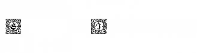
( Fonts by Dieter Steffmann )
Ornate initials with intricate floral borders, blending Gothic and Baroque styles.
![Schmuck-Initialen 1 フリーフォントのダウンロード]() ダウンロード 358 ダウンロード数@WebFont
ダウンロード 358 ダウンロード数@WebFont -
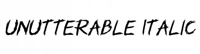
( Fonts by GGBotNet - Personal-use only. For commercial use please contact owner. )
A bold, distressed, hand-drawn font with an italicized, textured appearance.
![Unutterable Italic フリーフォントのダウンロード]() ダウンロード 358 ダウンロード数@WebFont
ダウンロード 358 ダウンロード数@WebFont -
![Yippee!!! フリーフォントのダウンロード]() ダウンロード 358 ダウンロード数
ダウンロード 358 ダウンロード数 -
( Fonts by Vladimir Nikolic )
A bold, geometric font with intricate patterns and sharp edges.
![Desert Medium フリーフォントのダウンロード]() ダウンロード 358 ダウンロード数@WebFont
ダウンロード 358 ダウンロード数@WebFont -
-
( Rick Mueller - moorstation.org/typoasis/designers/mueller/ )
A playful, rope-themed decorative font with a bold, textured design.
![Rope MF フリーフォントのダウンロード]() ダウンロード 358 ダウンロード数@WebFont
ダウンロード 358 ダウンロード数@WebFont -
( Fonts by Studio Typo )
A modern, clean sans-serif font with balanced proportions and consistent stroke width.
![Manti Sans Demo フリーフォントのダウンロード]() ダウンロード 358 ダウンロード数@WebFont
ダウンロード 358 ダウンロード数@WebFont -
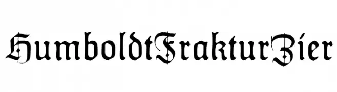
( Fonts by Dieter Steffmann )
A traditional blackletter font with intricate details and a medieval aesthetic.
![HumboldtFrakturZier フリーフォントのダウンロード]() ダウンロード 358 ダウンロード数@WebFont
ダウンロード 358 ダウンロード数@WebFont -
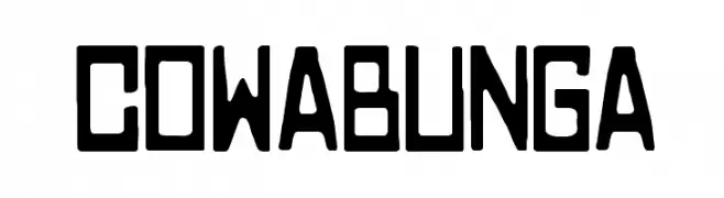
![COWABUNGA フリーフォントのダウンロード]() ダウンロード 358 ダウンロード数@WebFont
ダウンロード 358 ダウンロード数@WebFont -
( Melisa Gunawan )
A modern, rounded font with smooth curves and balanced spacing.
![noraviyel-Regular フリーフォントのダウンロード]() ダウンロード 358 ダウンロード数@WebFont
ダウンロード 358 ダウンロード数@WebFont


今のトップフォントは?
は、クリーンな造形と広い適用範囲で支持を集めています。 ブランディングからランディングページ、ポスターまで活躍します。
ロゴで人気のフォントは?
幾何学系の サンセリフ(例: Poppins、Gotham 系のファミリー)は、スケーラブルでクリーンな印象に最適。 親しみやすさを出すなら スクリプト や手書き系も定番です。 見出しは力強く、本文はニュートラルに──この組み合わせが認知とバランスを高めます。
人気リストはどのくらいの頻度で更新される?
ダウンロード数やエンゲージメントに基づき定期的に更新します。 こまめにチェックして、次に流行るフォントを先取りしましょう。
💡 ヒント: このページをブックマークしておくと便利です。トレンドは速く、今のトップが明日のリブランディングを導くこともあります。