人気フォント セクションへようこそ。ここでは「よくダウンロードされ、よく使われている」実績ある書体をまとめています。 ロゴ、Web、SNS のどれにも使いやすい、外さない選択肢が見つかります。
どの トップフォント も、バランス・可読性・汎用性で高評価です。 モダン・サンセリフ、エレガントなスクリプト、ヴィンテージなセリフ、ミニマルなディスプレイなどを厳選しています。
-
( Copyright (c) 2012, Brian J. Bonislawsky DBA Astigmatic (AOETI) (astigma@astigmatic.com), with Reserved Font Names "Marcellus" )
A classic, elegant serif font with moderate contrast and subtle curves.
 ダウンロード 4411 ダウンロード数@WebFont
 -
( Fonts by www.thebend.be - Dimitri Castrique )
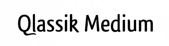
A modern, medium-weight sans-serif font with clean lines and versatile style.
![Qlassik Medium フリーフォントのダウンロード]() ダウンロード 4410 ダウンロード数@WebFont
ダウンロード 4410 ダウンロード数@WebFont -
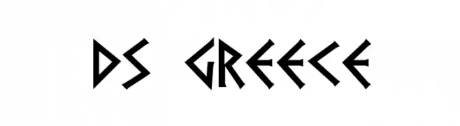
![DS Greece フリーフォントのダウンロード]() ダウンロード 4409 ダウンロード数@WebFont
ダウンロード 4409 ダウンロード数@WebFont -
![Basic Font フリーフォントのダウンロード]() ダウンロード 4409 ダウンロード数@WebFont
ダウンロード 4409 ダウンロード数@WebFont -
( Fonts by www.Fontfabric.com )
A modern, rounded sans-serif font with uniform strokes and excellent readability.
![StaticBold フリーフォントのダウンロード]() ダウンロード 4408 ダウンロード数@WebFont
ダウンロード 4408 ダウンロード数@WebFont -
-
![Dark11 フリーフォントのダウンロード]() ダウンロード 4408 ダウンロード数@WebFont
ダウンロード 4408 ダウンロード数@WebFont -
( Fonts by www.typodermicfonts.com - Ray Larabie )
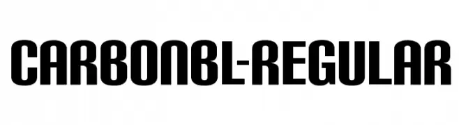
A bold, modern font with a strong and impactful design.
![CarbonBl-Regular フリーフォントのダウンロード]() ダウンロード 4405 ダウンロード数@WebFont
ダウンロード 4405 ダウンロード数@WebFont -
![Bach フリーフォントのダウンロード]() ダウンロード 4405 ダウンロード数@WebFont
ダウンロード 4405 ダウンロード数@WebFont -
( Fonts by Peter Olexa )
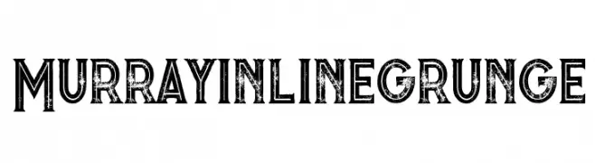
A bold, distressed font with a grunge texture and inline design.
![Murray inline grunge フリーフォントのダウンロード]() ダウンロード 4404 ダウンロード数@WebFont
ダウンロード 4404 ダウンロード数@WebFont -
( Fonts by antoniorodriguesjr.com )
A bold, modern typeface ideal for impactful headlines.
![Berlin ExtraBold フリーフォントのダウンロード]() ダウンロード 4404 ダウンロード数@WebFont
ダウンロード 4404 ダウンロード数@WebFont


今のトップフォントは?
は、クリーンな造形と広い適用範囲で支持を集めています。 ブランディングからランディングページ、ポスターまで活躍します。
ロゴで人気のフォントは?
幾何学系の サンセリフ(例: Poppins、Gotham 系のファミリー)は、スケーラブルでクリーンな印象に最適。 親しみやすさを出すなら スクリプト や手書き系も定番です。 見出しは力強く、本文はニュートラルに──この組み合わせが認知とバランスを高めます。
人気リストはどのくらいの頻度で更新される?
ダウンロード数やエンゲージメントに基づき定期的に更新します。 こまめにチェックして、次に流行るフォントを先取りしましょう。
💡 ヒント: このページをブックマークしておくと便利です。トレンドは速く、今のトップが明日のリブランディングを導くこともあります。