人気フォント セクションへようこそ。ここでは「よくダウンロードされ、よく使われている」実績ある書体をまとめています。 ロゴ、Web、SNS のどれにも使いやすい、外さない選択肢が見つかります。
どの トップフォント も、バランス・可読性・汎用性で高評価です。 モダン・サンセリフ、エレガントなスクリプト、ヴィンテージなセリフ、ミニマルなディスプレイなどを厳選しています。
-
( Fonts by La Tipomatika )
A modern, geometric typeface with consistent stroke width and clean design.
 ダウンロード 348 ダウンロード数@WebFont
 -
( Fonts by www.fontalicious.com )
A bold, geometric font with rounded edges and consistent proportions.
![Dunebug フリーフォントのダウンロード]() ダウンロード 348 ダウンロード数@WebFont
ダウンロード 348 ダウンロード数@WebFont -
( Christian Munk - fontstruct.com/fontstructors/25776/cmunk )
A geometric and abstract font with bold, circular shapes and a modern aesthetic.
![50/fifty Regular フリーフォントのダウンロード]() ダウンロード 348 ダウンロード数@WebFont
ダウンロード 348 ダウンロード数@WebFont -
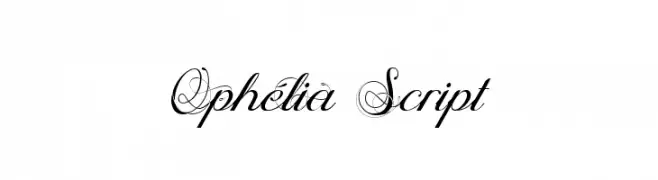
( Fonts by Maelle.K - Thomas Boucherie )
An elegant script font with intricate swashes and flourishes.
![Ophélia Script フリーフォントのダウンロード]() ダウンロード 348 ダウンロード数@WebFont
ダウンロード 348 ダウンロード数@WebFont -
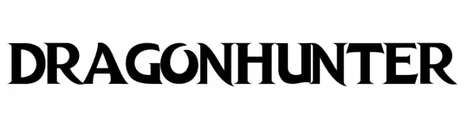
( Fonts by MaknaStudio - www.maknastudio.com - Personal-use only. For commercial use please contact owner. )
Bold, decorative font with medieval style.
![DRAGON HUNTER フリーフォントのダウンロード]() ダウンロード 348 ダウンロード数@WebFont
ダウンロード 348 ダウンロード数@WebFont -
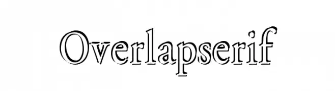
-
![Overlapserif フリーフォントのダウンロード]() ダウンロード 348 ダウンロード数@WebFont
ダウンロード 348 ダウンロード数@WebFont -
( Fonts by Graphix Line Studio )
A playful and whimsical font with rounded, slightly irregular letterforms.
![Dear Dreamer フリーフォントのダウンロード]() ダウンロード 348 ダウンロード数@WebFont
ダウンロード 348 ダウンロード数@WebFont -
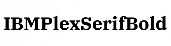
( Fonts by IBM )
A bold, modern serif font with a classic touch, ideal for professional use.
![IBM Plex Serif Bold フリーフォントのダウンロード]() ダウンロード 348 ダウンロード数@WebFont
ダウンロード 348 ダウンロード数@WebFont -
( Fonts by Katsia Jazwinska )
A bold, expressive script font with a hand-drawn, dynamic style.
![Hubster フリーフォントのダウンロード]() ダウンロード 348 ダウンロード数@WebFont
ダウンロード 348 ダウンロード数@WebFont -
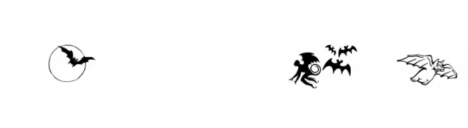
![Bats-Symbols フリーフォントのダウンロード]() ダウンロード 348 ダウンロード数@WebFont
ダウンロード 348 ダウンロード数@WebFont


今のトップフォントは?
は、クリーンな造形と広い適用範囲で支持を集めています。 ブランディングからランディングページ、ポスターまで活躍します。
ロゴで人気のフォントは?
幾何学系の サンセリフ(例: Poppins、Gotham 系のファミリー)は、スケーラブルでクリーンな印象に最適。 親しみやすさを出すなら スクリプト や手書き系も定番です。 見出しは力強く、本文はニュートラルに──この組み合わせが認知とバランスを高めます。
人気リストはどのくらいの頻度で更新される?
ダウンロード数やエンゲージメントに基づき定期的に更新します。 こまめにチェックして、次に流行るフォントを先取りしましょう。
💡 ヒント: このページをブックマークしておくと便利です。トレンドは速く、今のトップが明日のリブランディングを導くこともあります。