人気フォント セクションへようこそ。ここでは「よくダウンロードされ、よく使われている」実績ある書体をまとめています。 ロゴ、Web、SNS のどれにも使いやすい、外さない選択肢が見つかります。
どの トップフォント も、バランス・可読性・汎用性で高評価です。 モダン・サンセリフ、エレガントなスクリプト、ヴィンテージなセリフ、ミニマルなディスプレイなどを厳選しています。
-
( Fonts by Galdino Otten - Personal-use only. For commercial use please contact owner. )
A distressed, hand-drawn font with a raw, edgy appearance.
 ダウンロード 344 ダウンロード数@WebFont
 -
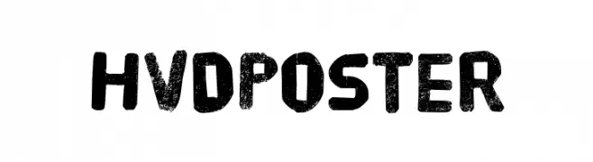
( Fonts by HVD Fonts )
A bold, distressed font with a vintage, textured appearance.
![HVD Poster フリーフォントのダウンロード]() ダウンロード 344 ダウンロード数@WebFont
ダウンロード 344 ダウンロード数@WebFont -
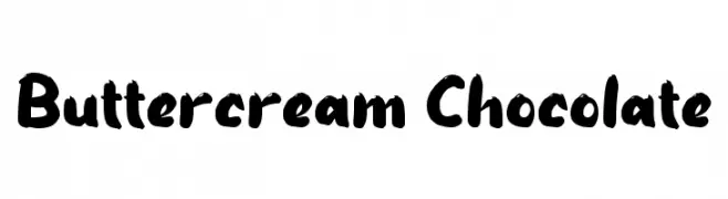
( Fonts by wep - Wahyu Eka Prasetya - Personal-use only. For commercial use please contact owner. )
A bold, playful handwritten font with thick, uneven strokes and a lively appearance.
![Buttercream Chocolate フリーフォントのダウンロード]() ダウンロード 344 ダウンロード数@WebFont
ダウンロード 344 ダウンロード数@WebFont -
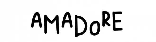
( Fonts by Fanastudio )
A playful, handwritten font with a quirky and informal style.
![AMADORE フリーフォントのダウンロード]() ダウンロード 344 ダウンロード数@WebFont
ダウンロード 344 ダウンロード数@WebFont -
![KR Star Letters フリーフォントのダウンロード]() ダウンロード 344 ダウンロード数@WebFont
ダウンロード 344 ダウンロード数@WebFont -
-
( Fonts by Apostrophic Lab )
A bold, geometric font with a futuristic outline style.
![Karnivore Tecca フリーフォントのダウンロード]() ダウンロード 344 ダウンロード数@WebFont
ダウンロード 344 ダウンロード数@WebFont -
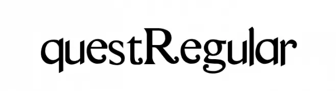
( Gage LaGreca - www.gagelagreca.com )
A classic serif font with elegant strokes and refined details.
![questRegular フリーフォントのダウンロード]() ダウンロード 344 ダウンロード数@WebFont
ダウンロード 344 ダウンロード数@WebFont -
![LaPierre フリーフォントのダウンロード]() ダウンロード 344 ダウンロード数@WebFont
ダウンロード 344 ダウンロード数@WebFont -
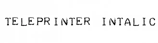
![Teleprinter Intalic フリーフォントのダウンロード]() ダウンロード 343 ダウンロード数@WebFont
ダウンロード 343 ダウンロード数@WebFont -
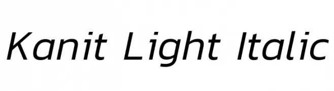
( Copyright (c) 2015, Cadson Demak (info@cadsondemak.com) )
A sleek, modern sans-serif font with a light, italic style.
![Kanit Light Italic フリーフォントのダウンロード]() ダウンロード 343 ダウンロード数@WebFont
ダウンロード 343 ダウンロード数@WebFont


今のトップフォントは?
は、クリーンな造形と広い適用範囲で支持を集めています。 ブランディングからランディングページ、ポスターまで活躍します。
ロゴで人気のフォントは?
幾何学系の サンセリフ(例: Poppins、Gotham 系のファミリー)は、スケーラブルでクリーンな印象に最適。 親しみやすさを出すなら スクリプト や手書き系も定番です。 見出しは力強く、本文はニュートラルに──この組み合わせが認知とバランスを高めます。
人気リストはどのくらいの頻度で更新される?
ダウンロード数やエンゲージメントに基づき定期的に更新します。 こまめにチェックして、次に流行るフォントを先取りしましょう。
💡 ヒント: このページをブックマークしておくと便利です。トレンドは速く、今のトップが明日のリブランディングを導くこともあります。