人気フォント セクションへようこそ。ここでは「よくダウンロードされ、よく使われている」実績ある書体をまとめています。 ロゴ、Web、SNS のどれにも使いやすい、外さない選択肢が見つかります。
どの トップフォント も、バランス・可読性・汎用性で高評価です。 モダン・サンセリフ、エレガントなスクリプト、ヴィンテージなセリフ、ミニマルなディスプレイなどを厳選しています。
-
 ダウンロード 340 ダウンロード数@WebFont
 -
( Fonts by Manfred Klein. Free for private and charity use. Free for commercial with donation to organizations )
A modern, geometric sans-serif font with a light weight and clean design.
![FolksDecoon-Light フリーフォントのダウンロード]() ダウンロード 340 ダウンロード数@WebFont
ダウンロード 340 ダウンロード数@WebFont -
![Roddy フリーフォントのダウンロード]() ダウンロード 340 ダウンロード数@WebFont
ダウンロード 340 ダウンロード数@WebFont -
( Fonts by Nick Curtis - www.nicksfonts.com )
A modern, elegant font with tall, narrow letterforms and high contrast strokes.
![ModernTypography フリーフォントのダウンロード]() ダウンロード 340 ダウンロード数@WebFont
ダウンロード 340 ダウンロード数@WebFont -
![Faktos Outline フリーフォントのダウンロード]() ダウンロード 340 ダウンロード数
ダウンロード 340 ダウンロード数 -
-
( 7NTypes - Situjuh Nazara - 7ntypes.com )
A bold, decorative font with a double-line design and geometric structure.
![Open Minded フリーフォントのダウンロード]() ダウンロード 340 ダウンロード数@WebFont
ダウンロード 340 ダウンロード数@WebFont -
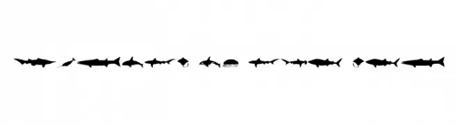
( Fonts by Daniel Zadorozny - www.iconian.com - Free for personal use )
A display font made from silhouettes of giant sea animals.
![Giants of the Sea フリーフォントのダウンロード]() ダウンロード 340 ダウンロード数@WebFont
ダウンロード 340 ダウンロード数@WebFont -
( Fonts by billyargel.blogspot.com - Billy Argel )
A bold, modern font with elongated vertical lines and sharp edges.
![LostWinner-Trial フリーフォントのダウンロード]() ダウンロード 340 ダウンロード数@WebFont
ダウンロード 340 ダウンロード数@WebFont -
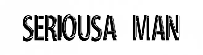
![Serious-Man フリーフォントのダウンロード]() ダウンロード 340 ダウンロード数@WebFont
ダウンロード 340 ダウンロード数@WebFont -
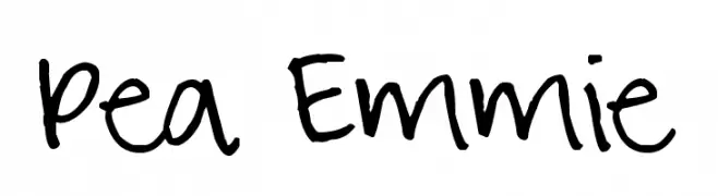
( Free for a personal use. For a commercial use please visit www.kevinandamanda.com )
A playful, casual handwritten font with irregular strokes and a dynamic feel.
![Pea Emmie フリーフォントのダウンロード]() ダウンロード 340 ダウンロード数@WebFont
ダウンロード 340 ダウンロード数@WebFont


今のトップフォントは?
は、クリーンな造形と広い適用範囲で支持を集めています。 ブランディングからランディングページ、ポスターまで活躍します。
ロゴで人気のフォントは?
幾何学系の サンセリフ(例: Poppins、Gotham 系のファミリー)は、スケーラブルでクリーンな印象に最適。 親しみやすさを出すなら スクリプト や手書き系も定番です。 見出しは力強く、本文はニュートラルに──この組み合わせが認知とバランスを高めます。
人気リストはどのくらいの頻度で更新される?
ダウンロード数やエンゲージメントに基づき定期的に更新します。 こまめにチェックして、次に流行るフォントを先取りしましょう。
💡 ヒント: このページをブックマークしておくと便利です。トレンドは速く、今のトップが明日のリブランディングを導くこともあります。