人気フォント セクションへようこそ。ここでは「よくダウンロードされ、よく使われている」実績ある書体をまとめています。 ロゴ、Web、SNS のどれにも使いやすい、外さない選択肢が見つかります。
どの トップフォント も、バランス・可読性・汎用性で高評価です。 モダン・サンセリフ、エレガントなスクリプト、ヴィンテージなセリフ、ミニマルなディスプレイなどを厳選しています。
-
( Fonts by Dan Steinbok - Out Of Step Font Company - outofstepfontco.com - Personal-use only. For commercial use please contact owner. )
A bold, decorative font with a 3D sketch effect and rugged outlines.
 ダウンロード 338 ダウンロード数@WebFont
 -
( Fonts by Alex Slobzheninov - Personal-use only. For commercial use please contact owner. )
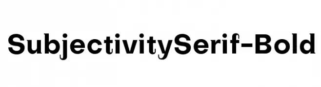
A bold, modern font with clean lines and consistent stroke weight.
![SubjectivitySerif-Bold フリーフォントのダウンロード]() ダウンロード 338 ダウンロード数@WebFont
ダウンロード 338 ダウンロード数@WebFont -
( Fonts by Daniel Gauthier )
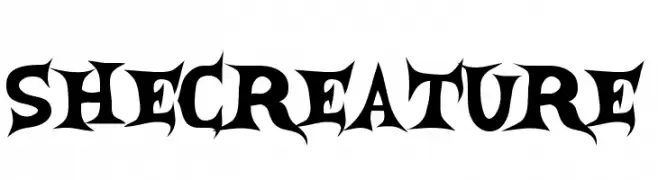
A bold, gothic-style font with sharp, angular edges and a dramatic flair.
![SheCreature フリーフォントのダウンロード]() ダウンロード 338 ダウンロード数@WebFont
ダウンロード 338 ダウンロード数@WebFont -
![Clensey フリーフォントのダウンロード]() ダウンロード 338 ダウンロード数@WebFont
ダウンロード 338 ダウンロード数@WebFont -
( Fonts by Daniel Zadorozny - www.iconian.com - Free for personal use )
A bold, distressed font with a rugged, grunge-like style and slanted orientation.
![G.I. Incognito Leftalic フリーフォントのダウンロード]() ダウンロード 338 ダウンロード数@WebFont
ダウンロード 338 ダウンロード数@WebFont -
-
![Dots All For Now 3D JL フリーフォントのダウンロード]() ダウンロード 338 ダウンロード数@WebFont
ダウンロード 338 ダウンロード数@WebFont -
( Fonts by Woodcutter )
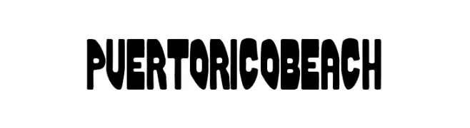
A bold, playful font with thick, rounded strokes and a friendly appearance.
![Puerto Rico Beach フリーフォントのダウンロード]() ダウンロード 338 ダウンロード数@WebFont
ダウンロード 338 ダウンロード数@WebFont -
( Iconian Fonts - Daniel Zadorozny - www.iconian.com )
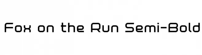
A modern, geometric font with clean, rounded edges and semi-bold weight.
![Fox on the Run Semi-Bold フリーフォントのダウンロード]() ダウンロード 338 ダウンロード数@WebFont
ダウンロード 338 ダウンロード数@WebFont -
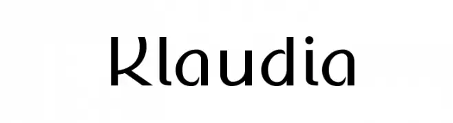
![Klaudia フリーフォントのダウンロード]() ダウンロード 338 ダウンロード数@WebFont
ダウンロード 338 ダウンロード数@WebFont -
( Fonts by Silverdav Studio )
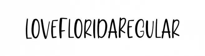
A playful, handwritten font with smooth, flowing lines and moderate contrast.
![LoveFloridaRegular フリーフォントのダウンロード]() ダウンロード 338 ダウンロード数@WebFont
ダウンロード 338 ダウンロード数@WebFont


今のトップフォントは?
は、クリーンな造形と広い適用範囲で支持を集めています。 ブランディングからランディングページ、ポスターまで活躍します。
ロゴで人気のフォントは?
幾何学系の サンセリフ(例: Poppins、Gotham 系のファミリー)は、スケーラブルでクリーンな印象に最適。 親しみやすさを出すなら スクリプト や手書き系も定番です。 見出しは力強く、本文はニュートラルに──この組み合わせが認知とバランスを高めます。
人気リストはどのくらいの頻度で更新される?
ダウンロード数やエンゲージメントに基づき定期的に更新します。 こまめにチェックして、次に流行るフォントを先取りしましょう。
💡 ヒント: このページをブックマークしておくと便利です。トレンドは速く、今のトップが明日のリブランディングを導くこともあります。