人気フォント セクションへようこそ。ここでは「よくダウンロードされ、よく使われている」実績ある書体をまとめています。 ロゴ、Web、SNS のどれにも使いやすい、外さない選択肢が見つかります。
どの トップフォント も、バランス・可読性・汎用性で高評価です。 モダン・サンセリフ、エレガントなスクリプト、ヴィンテージなセリフ、ミニマルなディスプレイなどを厳選しています。
-
( Fonts by Chequered Ink - chequered.ink - Personal-use only. For commercial use please contact owner. )
A bold, geometric font with a modern and angular design.
 ダウンロード 336 ダウンロード数@WebFont
 -
( Fonts by www.peter-wiegel.de. Personal-use only. For commercial use please contact owner. )
A bold, playful script font with interconnected, rounded characters.
![AdmiralCAT フリーフォントのダウンロード]() ダウンロード 336 ダウンロード数@WebFont
ダウンロード 336 ダウンロード数@WebFont -
( Fonts by Peax Webdesign - www.peax-webdesign.com. Personal-use only. For commercial use please contact owner. )
A playful, rounded font with bold, bubble-like characters and thick outlines.
![SimpleRounded フリーフォントのダウンロード]() ダウンロード 336 ダウンロード数@WebFont
ダウンロード 336 ダウンロード数@WebFont -
( Fonts by a Adrian Candela - http://www.behance.net/takuminokami . Personal-use only. For commercial use please contact owner. )
A bold serif font with strong vertical strokes and subtle curves, exuding timeless elegance.
![Martell Bold フリーフォントのダウンロード]() ダウンロード 336 ダウンロード数@WebFont
ダウンロード 336 ダウンロード数@WebFont -
( Fonts by Syaf Rizal - Khurasan - Personal-use only. For commercial use please contact owner. )
A bold, brush-style font with dynamic and expressive strokes.
![Young Robust フリーフォントのダウンロード]() ダウンロード 336 ダウンロード数@WebFont
ダウンロード 336 ダウンロード数@WebFont -
-
( Free for a personal use. For a commercial use please visit www.kevinandamanda.com )
A playful, handwritten font with bold, uneven strokes and a casual style.
![Pea Theresa フリーフォントのダウンロード]() ダウンロード 336 ダウンロード数@WebFont
ダウンロード 336 ダウンロード数@WebFont -
( Copyright (c) 2008-2012, 2014, Andrey V. Panov (panov@canopus.iacp.dvo.ru) )
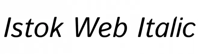
A modern, italic font with smooth curves and balanced readability.
![Istok Web Italic フリーフォントのダウンロード]() ダウンロード 336 ダウンロード数@WebFont
ダウンロード 336 ダウンロード数@WebFont -
( Fabian Flores - www.flickr.com/al_puerto )
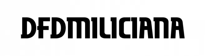
A bold, geometric font with a modern and impactful design.
![dfdMiliciana フリーフォントのダウンロード]() ダウンロード 336 ダウンロード数@WebFont
ダウンロード 336 ダウンロード数@WebFont -
( Fonts by Yusa Studio )
A playful, bold, and hand-drawn style font with a whimsical touch.
![Hello Paradise フリーフォントのダウンロード]() ダウンロード 336 ダウンロード数@WebFont
ダウンロード 336 ダウンロード数@WebFont -
( Free for a personal use. For a commercial use please visit www.kevinandamanda.com )
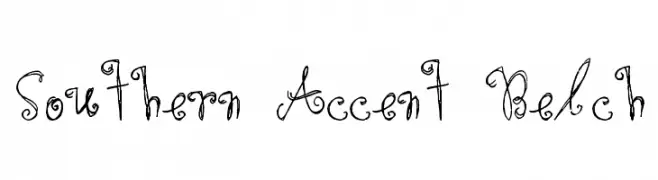
A whimsical, curly font with a playful, handwritten style.
![Southern Accent Belch フリーフォントのダウンロード]() ダウンロード 336 ダウンロード数@WebFont
ダウンロード 336 ダウンロード数@WebFont


今のトップフォントは?
は、クリーンな造形と広い適用範囲で支持を集めています。 ブランディングからランディングページ、ポスターまで活躍します。
ロゴで人気のフォントは?
幾何学系の サンセリフ(例: Poppins、Gotham 系のファミリー)は、スケーラブルでクリーンな印象に最適。 親しみやすさを出すなら スクリプト や手書き系も定番です。 見出しは力強く、本文はニュートラルに──この組み合わせが認知とバランスを高めます。
人気リストはどのくらいの頻度で更新される?
ダウンロード数やエンゲージメントに基づき定期的に更新します。 こまめにチェックして、次に流行るフォントを先取りしましょう。
💡 ヒント: このページをブックマークしておくと便利です。トレンドは速く、今のトップが明日のリブランディングを導くこともあります。