人気フォント セクションへようこそ。ここでは「よくダウンロードされ、よく使われている」実績ある書体をまとめています。 ロゴ、Web、SNS のどれにも使いやすい、外さない選択肢が見つかります。
どの トップフォント も、バランス・可読性・汎用性で高評価です。 モダン・サンセリフ、エレガントなスクリプト、ヴィンテージなセリフ、ミニマルなディスプレイなどを厳選しています。
-
( Fonts by Wolve Fonts - https://www.deviantart.com/wolves-fonts - Personal-use only. For commercial use please contact owner. )
A bold, modern sans-serif font with clean lines and strong presence.
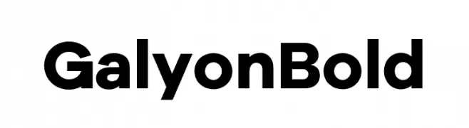 ダウンロード 4181 ダウンロード数@WebFont
 -
( Copyright (c) 2011 by Sorkin Type Co (www.sorkintype.com) )
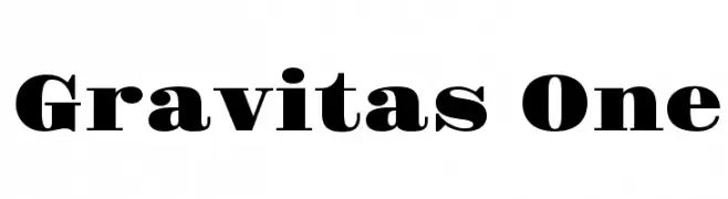
A bold, high-contrast typeface with strong, authoritative strokes.
![Gravitas One フリーフォントのダウンロード]() ダウンロード 4180 ダウンロード数@WebFont
ダウンロード 4180 ダウンロード数@WebFont -
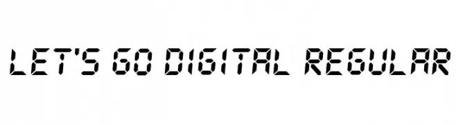
![Let's go Digital Regular フリーフォントのダウンロード]() ダウンロード 4179 ダウンロード数@WebFont
ダウンロード 4179 ダウンロード数@WebFont -
( Fonts by Nick Curtis - www.nicksfonts.com )
A bold, heavy font with strong geometric shapes and high contrast.
![Copper Canyon WBW フリーフォントのダウンロード]() ダウンロード 4179 ダウンロード数@WebFont
ダウンロード 4179 ダウンロード数@WebFont -
( Fonts by Ivan Petrov, Plamen Motev - www.fontfabric.com - Personal-use only. For commercial use please contact owner. )
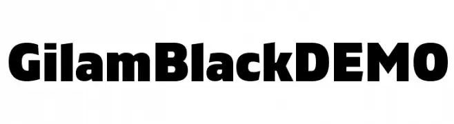
A bold, impactful font with thick strokes and uniform width.
![Gilam Black DEMO フリーフォントのダウンロード]() ダウンロード 4178 ダウンロード数@WebFont
ダウンロード 4178 ダウンロード数@WebFont -
-
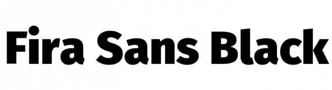
( Copyright (c) 2012-2015, The Mozilla Foundation and Telefonica S.A. )
A bold, geometric sans-serif font with strong, clean lines.
![Fira Sans Black フリーフォントのダウンロード]() ダウンロード 4178 ダウンロード数@WebFont
ダウンロード 4178 ダウンロード数@WebFont -
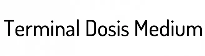
( Copyright (c) 2011, Edgar Tolentino and Pablo Impallari (www.impallari.com|impallari@gmail.com) )
A modern, rounded sans-serif font with a clean and friendly appearance.
![Terminal Dosis Medium フリーフォントのダウンロード]() ダウンロード 4178 ダウンロード数@WebFont
ダウンロード 4178 ダウンロード数@WebFont -
![Shining NFI Demo フリーフォントのダウンロード]() ダウンロード 4178 ダウンロード数@WebFont
ダウンロード 4178 ダウンロード数@WebFont -
![LCD Bold フリーフォントのダウンロード]() ダウンロード 4178 ダウンロード数@WebFont
ダウンロード 4178 ダウンロード数@WebFont -
![Delicious-Bold フリーフォントのダウンロード]() ダウンロード 4177 ダウンロード数@WebFont
ダウンロード 4177 ダウンロード数@WebFont


今のトップフォントは?
は、クリーンな造形と広い適用範囲で支持を集めています。 ブランディングからランディングページ、ポスターまで活躍します。
ロゴで人気のフォントは?
幾何学系の サンセリフ(例: Poppins、Gotham 系のファミリー)は、スケーラブルでクリーンな印象に最適。 親しみやすさを出すなら スクリプト や手書き系も定番です。 見出しは力強く、本文はニュートラルに──この組み合わせが認知とバランスを高めます。
人気リストはどのくらいの頻度で更新される?
ダウンロード数やエンゲージメントに基づき定期的に更新します。 こまめにチェックして、次に流行るフォントを先取りしましょう。
💡 ヒント: このページをブックマークしておくと便利です。トレンドは速く、今のトップが明日のリブランディングを導くこともあります。