人気フォント セクションへようこそ。ここでは「よくダウンロードされ、よく使われている」実績ある書体をまとめています。 ロゴ、Web、SNS のどれにも使いやすい、外さない選択肢が見つかります。
どの トップフォント も、バランス・可読性・汎用性で高評価です。 モダン・サンセリフ、エレガントなスクリプト、ヴィンテージなセリフ、ミニマルなディスプレイなどを厳選しています。
-
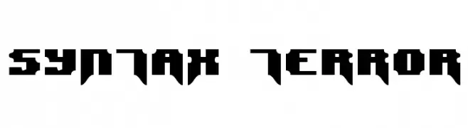
( Fonts by www.freakyfonts.de )
A bold, angular font with a futuristic and edgy design.
 ダウンロード 328 ダウンロード数@WebFont
 -
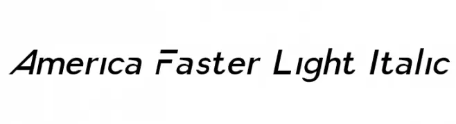
( Fonts by a Typeface Leone - www.tipografialeone.net. Personal-use only. For commercial use please contact owner. )
A sleek, modern italic sans-serif font with a light weight and tight character spacing.
![America Faster Light Italic フリーフォントのダウンロード]() ダウンロード 328 ダウンロード数@WebFont
ダウンロード 328 ダウンロード数@WebFont -
( Fonts by Astigmatic One Eye Typographic Institute - Brian J. Bonislawsky - astigmatic.com )
A dramatic, edgy font with sharp, elongated strokes and a cohesive design.
![Skinner AOE フリーフォントのダウンロード]() ダウンロード 328 ダウンロード数@WebFont
ダウンロード 328 ダウンロード数@WebFont -
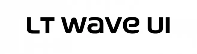
( Fonts by LyonsType - Daniel Lyons - Personal-use only. For commercial use please contact owner. )
A modern, geometric font with smooth, rounded edges and uniform width.
![LT Wave UI フリーフォントのダウンロード]() ダウンロード 328 ダウンロード数@WebFont
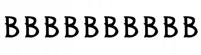
ダウンロード 328 ダウンロード数@WebFont -
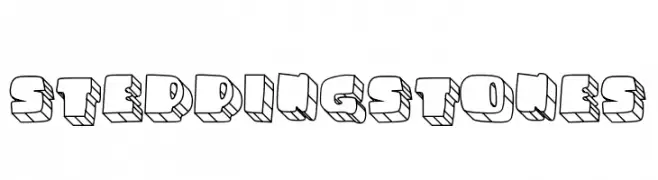
![STEPPINGSTONES フリーフォントのダウンロード]() ダウンロード 328 ダウンロード数@WebFont
ダウンロード 328 ダウンロード数@WebFont -
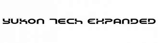
-
![Yukon Tech Expanded フリーフォントのダウンロード]() ダウンロード 328 ダウンロード数@WebFont
ダウンロード 328 ダウンロード数@WebFont -
フォント by Giovani. For commercial use please contact the owner.
![Alloy-Sans フリーフォントのダウンロード]() ダウンロード 328 ダウンロード数@WebFont
ダウンロード 328 ダウンロード数@WebFont -
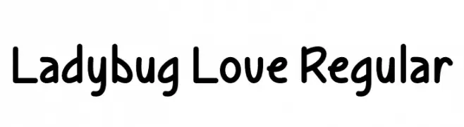
( Fonts by Misti Hammers - mistifonts.com - Personal-use only. For commercial use please contact owner. )
A playful, rounded font with smooth curves and a friendly vibe.
![Ladybug Love Regular フリーフォントのダウンロード]() ダウンロード 328 ダウンロード数@WebFont
ダウンロード 328 ダウンロード数@WebFont -
![Rabsy Regular フリーフォントのダウンロード]() ダウンロード 328 ダウンロード数@WebFont
ダウンロード 328 ダウンロード数@WebFont -
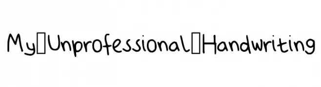
( Fonts by Anika Tovernic )
A playful, handwritten-style font with smooth, rounded strokes.
![My_Unprofessional_Handwriting フリーフォントのダウンロード]() ダウンロード 328 ダウンロード数@WebFont
ダウンロード 328 ダウンロード数@WebFont


今のトップフォントは?
は、クリーンな造形と広い適用範囲で支持を集めています。 ブランディングからランディングページ、ポスターまで活躍します。
ロゴで人気のフォントは?
幾何学系の サンセリフ(例: Poppins、Gotham 系のファミリー)は、スケーラブルでクリーンな印象に最適。 親しみやすさを出すなら スクリプト や手書き系も定番です。 見出しは力強く、本文はニュートラルに──この組み合わせが認知とバランスを高めます。
人気リストはどのくらいの頻度で更新される?
ダウンロード数やエンゲージメントに基づき定期的に更新します。 こまめにチェックして、次に流行るフォントを先取りしましょう。
💡 ヒント: このページをブックマークしておくと便利です。トレンドは速く、今のトップが明日のリブランディングを導くこともあります。