人気フォント セクションへようこそ。ここでは「よくダウンロードされ、よく使われている」実績ある書体をまとめています。 ロゴ、Web、SNS のどれにも使いやすい、外さない選択肢が見つかります。
どの トップフォント も、バランス・可読性・汎用性で高評価です。 モダン・サンセリフ、エレガントなスクリプト、ヴィンテージなセリフ、ミニマルなディスプレイなどを厳選しています。
-
( Fonts by PremiereGraphics )
A distressed, brush-style script font with a rugged, artistic appearance.
 ダウンロード 327 ダウンロード数@WebFont
 -
( Google Web Fonts )
A bold, italic, monospaced font with clean lines and equal character width.
![Ubuntu Mono Bold Italic フリーフォントのダウンロード]() ダウンロード 327 ダウンロード数@WebFont
ダウンロード 327 ダウンロード数@WebFont -
( Fonts by Diego ChenBrimac )
An ultra-thin, elongated font with a modern and artistic style.
![LaPiedrita フリーフォントのダウンロード]() ダウンロード 327 ダウンロード数@WebFont
ダウンロード 327 ダウンロード数@WebFont -
( Fonts by a Emily Spadoni - http://creativemarket.com/emilyspadoni/. Personal-use only. For commercial use please contact owner. )
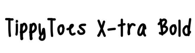
A bold, playful handwritten font with thick strokes and a casual style.
![TippyToes X-tra Bold フリーフォントのダウンロード]() ダウンロード 327 ダウンロード数@WebFont
ダウンロード 327 ダウンロード数@WebFont -
( Fonts by wep )
A bold, playful handwritten font with thick strokes and rounded edges.
![Istime フリーフォントのダウンロード]() ダウンロード 327 ダウンロード数@WebFont
ダウンロード 327 ダウンロード数@WebFont -
-
( Fonts by Daniel Zadorozny - www.iconian.com - Free for personal use )
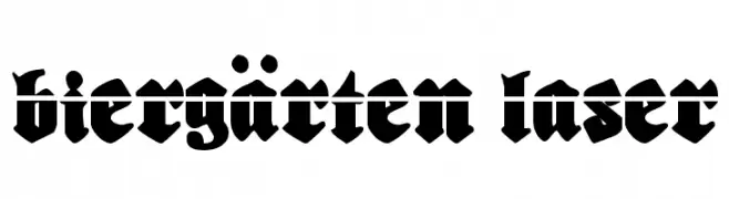
A bold, blackletter font with a medieval and dramatic style.
![Biergärten Laser フリーフォントのダウンロード]() ダウンロード 327 ダウンロード数@WebFont
ダウンロード 327 ダウンロード数@WebFont -
![de Manu 2 フリーフォントのダウンロード]() ダウンロード 327 ダウンロード数@WebFont
ダウンロード 327 ダウンロード数@WebFont -
![libre フリーフォントのダウンロード]() ダウンロード 327 ダウンロード数@WebFont
ダウンロード 327 ダウンロード数@WebFont -
( Fonts by David Kerkhoff - www.hanodedphotography.com )
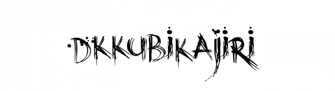
A chaotic, ink-splattered font with a raw, artistic style.
![DKKubikajiri フリーフォントのダウンロード]() ダウンロード 327 ダウンロード数@WebFont
ダウンロード 327 ダウンロード数@WebFont -
( Fonts by Origin Type )
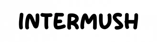
A playful, bold font with rounded, thick strokes and a whimsical touch.
![Inter Mush フリーフォントのダウンロード]() ダウンロード 327 ダウンロード数@WebFont
ダウンロード 327 ダウンロード数@WebFont


今のトップフォントは?
は、クリーンな造形と広い適用範囲で支持を集めています。 ブランディングからランディングページ、ポスターまで活躍します。
ロゴで人気のフォントは?
幾何学系の サンセリフ(例: Poppins、Gotham 系のファミリー)は、スケーラブルでクリーンな印象に最適。 親しみやすさを出すなら スクリプト や手書き系も定番です。 見出しは力強く、本文はニュートラルに──この組み合わせが認知とバランスを高めます。
人気リストはどのくらいの頻度で更新される?
ダウンロード数やエンゲージメントに基づき定期的に更新します。 こまめにチェックして、次に流行るフォントを先取りしましょう。
💡 ヒント: このページをブックマークしておくと便利です。トレンドは速く、今のトップが明日のリブランディングを導くこともあります。