人気フォント セクションへようこそ。ここでは「よくダウンロードされ、よく使われている」実績ある書体をまとめています。 ロゴ、Web、SNS のどれにも使いやすい、外さない選択肢が見つかります。
どの トップフォント も、バランス・可読性・汎用性で高評価です。 モダン・サンセリフ、エレガントなスクリプト、ヴィンテージなセリフ、ミニマルなディスプレイなどを厳選しています。
-
 ダウンロード 1245 ダウンロード数@WebFont
 -
( Fonts by Zdenek Gromnica - www.futuremillennium.com )
A bold serif font with strong strokes and sharp serifs, offering a classic yet modern look.
![InfraRed Bold フリーフォントのダウンロード]() ダウンロード 1245 ダウンロード数@WebFont
ダウンロード 1245 ダウンロード数@WebFont -
( Fonts by Daniel Midgley )
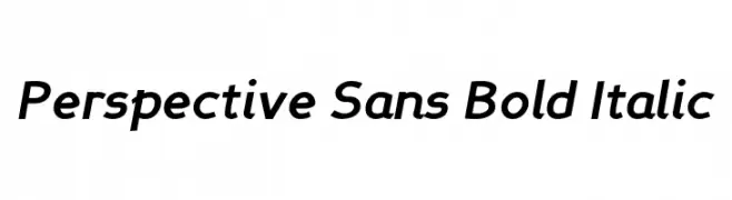
A bold, italicized sans-serif font with a modern and dynamic style.
![Perspective Sans Bold Italic フリーフォントのダウンロード]() ダウンロード 1245 ダウンロード数@WebFont
ダウンロード 1245 ダウンロード数@WebFont -
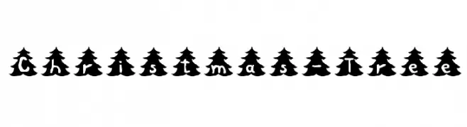
![Christmas-Tree フリーフォントのダウンロード]() ダウンロード 1245 ダウンロード数@WebFont
ダウンロード 1245 ダウンロード数@WebFont -
![Psycho-Poetry フリーフォントのダウンロード]() ダウンロード 1245 ダウンロード数@WebFont
ダウンロード 1245 ダウンロード数@WebFont -
( Fonts by Khurasan )
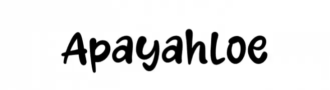
A bold, playful handwritten font with rounded strokes and a casual style.
![Apayah Loe フリーフォントのダウンロード]() ダウンロード 1244 ダウンロード数@WebFont
ダウンロード 1244 ダウンロード数@WebFont -
( Noto is a trademark of Google Inc. Noto fonts are open source. All Noto fonts are published under the SIL Open Font License, Version 1.1 )
A bold, extra condensed serif font with high contrast and elegant style.
![Noto Serif Display ExtraCondensed ExtraBold フリーフォントのダウンロード]() ダウンロード 1244 ダウンロード数@WebFont
ダウンロード 1244 ダウンロード数@WebFont -
( Fonts by Dieter Steffmann )
A bold, high-contrast font with a modern twist on traditional serif elements.
![Louisianne Black フリーフォントのダウンロード]() ダウンロード 1244 ダウンロード数@WebFont
ダウンロード 1244 ダウンロード数@WebFont -
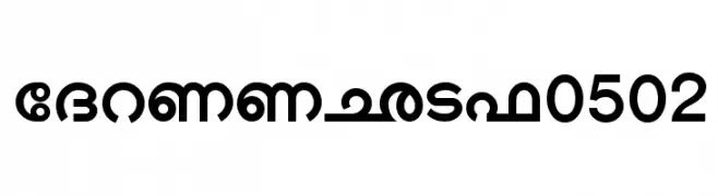
![Shree-Mal-0502 フリーフォントのダウンロード]() ダウンロード 1244 ダウンロード数@WebFont
ダウンロード 1244 ダウンロード数@WebFont -
( Fonts by Colorful Typhoon - http://orange.s56.xrea.com/blog/ )
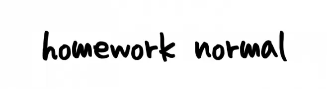
A playful, handwritten font with bold strokes and an informal style.
![homework normal フリーフォントのダウンロード]() ダウンロード 1244 ダウンロード数@WebFont
ダウンロード 1244 ダウンロード数@WebFont -
( Fonts by blueroom - Personal-use only. For commercial use please contact owner. )
A bold, geometric font with strong, blocky letterforms.
![Fyodor Bold フリーフォントのダウンロード]() ダウンロード 1243 ダウンロード数@WebFont
ダウンロード 1243 ダウンロード数@WebFont -
( Fonts by Måns Grebäck )
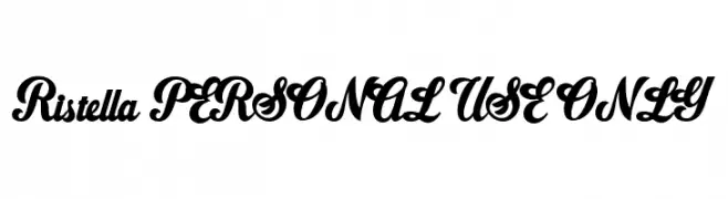
A modern, elegant script font with decorative swashes and smooth curves.
![Ristella PERSONAL USE ONLY フリーフォントのダウンロード]() ダウンロード 1243 ダウンロード数@WebFont
ダウンロード 1243 ダウンロード数@WebFont -
( twitter.com/omogollon )
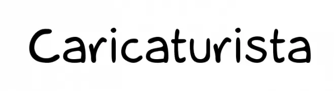
A playful, hand-drawn font with rounded, casual characters.
![Caricaturista フリーフォントのダウンロード]() ダウンロード 1243 ダウンロード数@WebFont
ダウンロード 1243 ダウンロード数@WebFont -
( Fonts by developer.android.com )
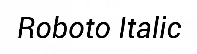
A modern, italicized sans-serif font with clean lines and balanced proportions.
![Roboto Italic フリーフォントのダウンロード]() ダウンロード 1243 ダウンロード数@WebFont
ダウンロード 1243 ダウンロード数@WebFont -
( Fonts by Chank Co. - www.chank.com )
A bold, medieval-inspired font with sharp serifs and dynamic strokes.
![Tortuga フリーフォントのダウンロード]() ダウンロード 1243 ダウンロード数@WebFont
ダウンロード 1243 ダウンロード数@WebFont -
![Sydney Regular フリーフォントのダウンロード]() ダウンロード 1243 ダウンロード数@WebFont
ダウンロード 1243 ダウンロード数@WebFont -
( Fonts by www.fontalicious.com )
A bold, geometric font with thick, block-like characters ideal for modern designs.
![Moog フリーフォントのダウンロード]() ダウンロード 1243 ダウンロード数@WebFont
ダウンロード 1243 ダウンロード数@WebFont -
![Primer Print Regular フリーフォントのダウンロード]() ダウンロード 1243 ダウンロード数@WebFont
ダウンロード 1243 ダウンロード数@WebFont -
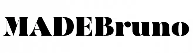
( Fonts by MadeType - Personal-use only. For commercial use please contact owner. )
A bold, high-contrast font with a modern and dramatic style.
![MADEBruno フリーフォントのダウンロード]() ダウンロード 1242 ダウンロード数@WebFont
ダウンロード 1242 ダウンロード数@WebFont -
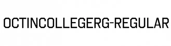
( Typodermic Fonts - Ray Larabie - www.typodermicfonts.com/ )
A bold, geometric font with a collegiate and modern aesthetic.
![OctinCollegeRg-Regular フリーフォントのダウンロード]() ダウンロード 1242 ダウンロード数@WebFont
ダウンロード 1242 ダウンロード数@WebFont -
( Runsell Studio - creativemarket.com/RunsellStudio )
A clean, modern sans-serif font with uniform stroke width and excellent legibility.
![RobustaSansDemo フリーフォントのダウンロード]() ダウンロード 1242 ダウンロード数@WebFont
ダウンロード 1242 ダウンロード数@WebFont -
( Fonts by www.love-letters.be. Personal-use only. For commercial use please contact owner. )
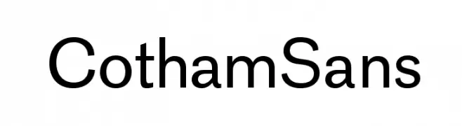
A modern, clean sans-serif font with balanced stroke width and excellent readability.
![CothamSans フリーフォントのダウンロード]() ダウンロード 1242 ダウンロード数@WebFont
ダウンロード 1242 ダウンロード数@WebFont -
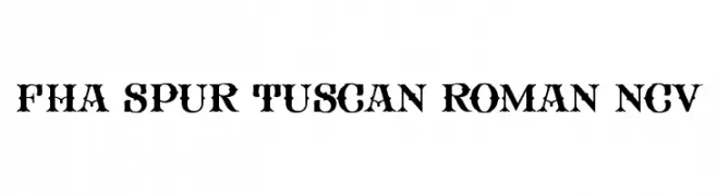
![FHA Spur Tuscan Roman NCV フリーフォントのダウンロード]() ダウンロード 1242 ダウンロード数@WebFont
ダウンロード 1242 ダウンロード数@WebFont -
( Copyright (c) 2013, Juan Pablo del Peral (juan@huertatipografica.com.ar), with Reserved Font Names 'Alegreya Sans' )
A modern sans-serif font with balanced proportions and open forms, offering clarity and elegance.
![Alegreya Sans フリーフォントのダウンロード]() ダウンロード 1242 ダウンロード数@WebFont
ダウンロード 1242 ダウンロード数@WebFont -
![CATALYST フリーフォントのダウンロード]() ダウンロード 1242 ダウンロード数@WebFont
ダウンロード 1242 ダウンロード数@WebFont -
( Fonts by www.gust.org.pl )
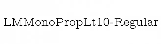
A modern, monospaced font with low contrast and uniform spacing.
![LMMonoPropLt10-Regular フリーフォントのダウンロード]() ダウンロード 1242 ダウンロード数@WebFont
ダウンロード 1242 ダウンロード数@WebFont -
( Fonts by www.onezero.tv )
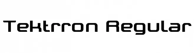
A modern, geometric font with a technological and futuristic design.
![Tektrron Regular フリーフォントのダウンロード]() ダウンロード 1242 ダウンロード数@WebFont
ダウンロード 1242 ダウンロード数@WebFont -
![pf_snowman citadel フリーフォントのダウンロード]() ダウンロード 1242 ダウンロード数@WebFont
ダウンロード 1242 ダウンロード数@WebFont -
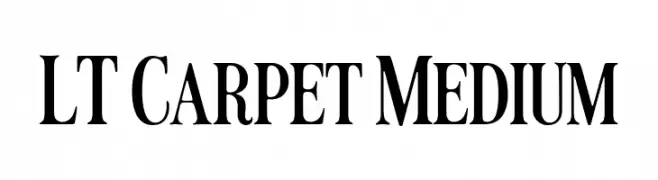
( Fonts by LyonsType - Daniel Lyons - Personal-use only. For commercial use please contact owner. )
A classic serif font with medium weight and moderate contrast, ideal for elegant designs.
![LT Carpet Medium フリーフォントのダウンロード]() ダウンロード 1241 ダウンロード数@WebFont
ダウンロード 1241 ダウンロード数@WebFont -
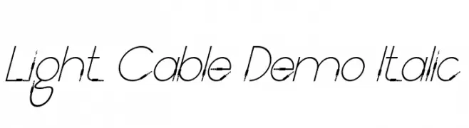
( Fonts by RaisProject )
A sleek, modern italic font with thin strokes and a futuristic touch.
![Light Cable Demo Italic フリーフォントのダウンロード]() ダウンロード 1241 ダウンロード数@WebFont
ダウンロード 1241 ダウンロード数@WebFont -
( Michael D. Adams - www.triskele.com/roadgeek-fonts/ )
A bold, modern font with strong, clear letterforms ideal for signage.
![Roadgeek Transport Heavy フリーフォントのダウンロード]() ダウンロード 1241 ダウンロード数@WebFont
ダウンロード 1241 ダウンロード数@WebFont -
( Fonts by Alif Devan R. )
A bold, cursive font with dynamic strokes and a handwritten feel.
![Venetian フリーフォントのダウンロード]() ダウンロード 1241 ダウンロード数@WebFont
ダウンロード 1241 ダウンロード数@WebFont -
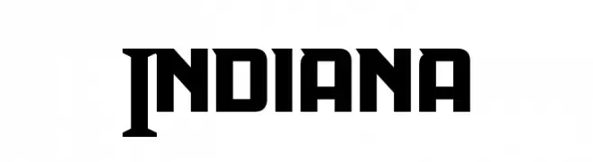
( Fonts by a Neale Davidson - www.pixelsagas.com. Personal-use only. For commercial use please contact owner. )
A bold, geometric font with a modern and powerful aesthetic.
![Indiana フリーフォントのダウンロード]() ダウンロード 1241 ダウンロード数@WebFont
ダウンロード 1241 ダウンロード数@WebFont -
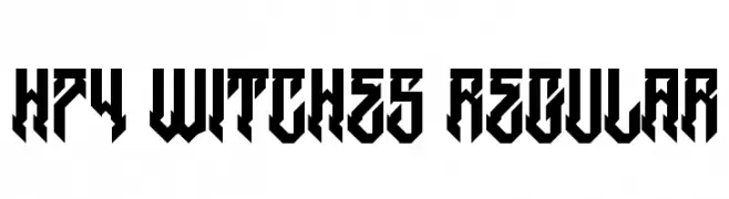
( Fonts by www.legacyofdefeat.com )
A bold, angular font with a gothic, geometric style.
![H74 Witches Regular フリーフォントのダウンロード]() ダウンロード 1241 ダウンロード数@WebFont
ダウンロード 1241 ダウンロード数@WebFont -
![AntPoltSemiCond-Regular フリーフォントのダウンロード]() ダウンロード 1241 ダウンロード数@WebFont
ダウンロード 1241 ダウンロード数@WebFont


今のトップフォントは?
は、クリーンな造形と広い適用範囲で支持を集めています。 ブランディングからランディングページ、ポスターまで活躍します。
ロゴで人気のフォントは?
幾何学系の サンセリフ(例: Poppins、Gotham 系のファミリー)は、スケーラブルでクリーンな印象に最適。 親しみやすさを出すなら スクリプト や手書き系も定番です。 見出しは力強く、本文はニュートラルに──この組み合わせが認知とバランスを高めます。
人気リストはどのくらいの頻度で更新される?
ダウンロード数やエンゲージメントに基づき定期的に更新します。 こまめにチェックして、次に流行るフォントを先取りしましょう。
💡 ヒント: このページをブックマークしておくと便利です。トレンドは速く、今のトップが明日のリブランディングを導くこともあります。