人気フォント セクションへようこそ。ここでは「よくダウンロードされ、よく使われている」実績ある書体をまとめています。 ロゴ、Web、SNS のどれにも使いやすい、外さない選択肢が見つかります。
どの トップフォント も、バランス・可読性・汎用性で高評価です。 モダン・サンセリフ、エレガントなスクリプト、ヴィンテージなセリフ、ミニマルなディスプレイなどを厳選しています。
-
( Fonts by Woodcutter )
 ダウンロード 321 ダウンロード数@WebFont
 -
( Lasagner - Daniele Capelli - www.behance.net/danielecapelli )
A bold, impactful typeface with thick, uniform strokes.
![build フリーフォントのダウンロード]() ダウンロード 321 ダウンロード数@WebFont
ダウンロード 321 ダウンロード数@WebFont -
( Fonts by Omnibus Type )
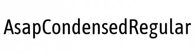
A modern, condensed sans-serif font with excellent legibility and space efficiency.
![Asap Condensed Regular フリーフォントのダウンロード]() ダウンロード 321 ダウンロード数@WebFont
ダウンロード 321 ダウンロード数@WebFont -
( Fonts by Dieter Steffmann )
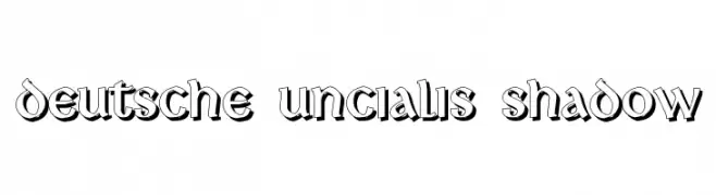
A bold, shadowed font with a vintage decorative style.
![Deutsche Uncialis Shadow フリーフォントのダウンロード]() ダウンロード 321 ダウンロード数@WebFont
ダウンロード 321 ダウンロード数@WebFont -
( Fonts by Dieter Steffmann )
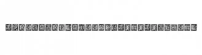
A decorative display font with intricate woodcut designs and ornate floral motifs.
![TypographerWoodcutInitialsOne フリーフォントのダウンロード]() ダウンロード 321 ダウンロード数@WebFont
ダウンロード 321 ダウンロード数@WebFont -
-
![Perolet フリーフォントのダウンロード]() ダウンロード 321 ダウンロード数@WebFont
ダウンロード 321 ダウンロード数@WebFont -
( Fonts by Apostrophic Lab )
A decorative and gothic font with sharp angles and intricate embellishments.
![Celexa フリーフォントのダウンロード]() ダウンロード 321 ダウンロード数@WebFont
ダウンロード 321 ダウンロード数@WebFont -
( ingoFonts - Ingo Zimmermann - www.ingofonts.com )
A bold, italicized sans-serif font with a modern and dynamic style.
![August Sans Reduced 76 Bold Italic フリーフォントのダウンロード]() ダウンロード 321 ダウンロード数@WebFont
ダウンロード 321 ダウンロード数@WebFont -
( Fonts by Scratchones )
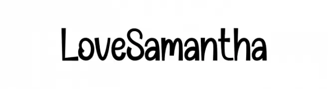
Playful handwritten font with tall, narrow letters.
![Love Samantha フリーフォントのダウンロード]() ダウンロード 321 ダウンロード数@WebFont
ダウンロード 321 ダウンロード数@WebFont -
( Fonts by Yves Michel - Personal-use only. For commercial use please contact owner. )
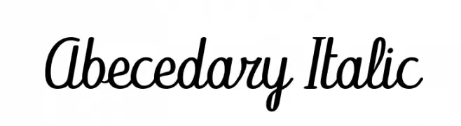
A cursive, italic font with elegant, flowing curves and a sophisticated style.
![Abecedary Italic フリーフォントのダウンロード]() ダウンロード 321 ダウンロード数@WebFont
ダウンロード 321 ダウンロード数@WebFont


今のトップフォントは?
は、クリーンな造形と広い適用範囲で支持を集めています。 ブランディングからランディングページ、ポスターまで活躍します。
ロゴで人気のフォントは?
幾何学系の サンセリフ(例: Poppins、Gotham 系のファミリー)は、スケーラブルでクリーンな印象に最適。 親しみやすさを出すなら スクリプト や手書き系も定番です。 見出しは力強く、本文はニュートラルに──この組み合わせが認知とバランスを高めます。
人気リストはどのくらいの頻度で更新される?
ダウンロード数やエンゲージメントに基づき定期的に更新します。 こまめにチェックして、次に流行るフォントを先取りしましょう。
💡 ヒント: このページをブックマークしておくと便利です。トレンドは速く、今のトップが明日のリブランディングを導くこともあります。