人気フォント セクションへようこそ。ここでは「よくダウンロードされ、よく使われている」実績ある書体をまとめています。 ロゴ、Web、SNS のどれにも使いやすい、外さない選択肢が見つかります。
どの トップフォント も、バランス・可読性・汎用性で高評価です。 モダン・サンセリフ、エレガントなスクリプト、ヴィンテージなセリフ、ミニマルなディスプレイなどを厳選しています。
-
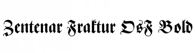
( Fonts by Dieter Steffmann )
A bold, ornate blackletter font with intricate details and a medieval aesthetic.
 ダウンロード 315 ダウンロード数@WebFont
 -
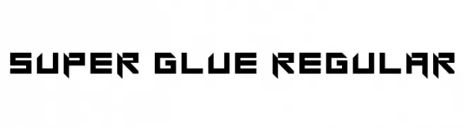
( Fonts by Matěj Hofman )
A bold, geometric font with a futuristic and edgy style.
![Super glue Regular フリーフォントのダウンロード]() ダウンロード 315 ダウンロード数@WebFont
ダウンロード 315 ダウンロード数@WebFont -
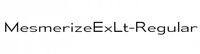
( Typodermic Fonts - Ray Larabie - www.typodermicfonts.com/ )
A modern, clean sans-serif font with balanced spacing and a sleek design.
![MesmerizeExLt-Regular フリーフォントのダウンロード]() ダウンロード 315 ダウンロード数@WebFont
ダウンロード 315 ダウンロード数@WebFont -
![Cisco Cisco フリーフォントのダウンロード]() ダウンロード 315 ダウンロード数@WebFont
ダウンロード 315 ダウンロード数@WebFont -
( Fonts by Galdino Otten - galdinootten.com )
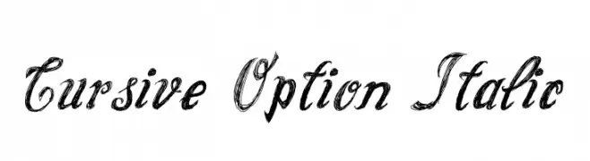
Elegant cursive font with an italic slant and artistic flair.
![Cursive Option Italic フリーフォントのダウンロード]() ダウンロード 315 ダウンロード数@WebFont
ダウンロード 315 ダウンロード数@WebFont -
-
( EvasUniqueFonts - Eva Barabas - www.etsy.com/ie/shop/DigitalTypefaceS )
A playful and elegant script font with decorative elements and smooth, flowing lines.
![Blysher Demo フリーフォントのダウンロード]() ダウンロード 315 ダウンロード数@WebFont
ダウンロード 315 ダウンロード数@WebFont -
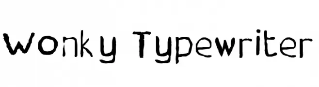
![Wonky Typewriter フリーフォントのダウンロード]() ダウンロード 315 ダウンロード数@WebFont
ダウンロード 315 ダウンロード数@WebFont -
( Fonts by a Clement Nicolle - www.stereo-type.fr . Personal-use only. For commercial use please contact owner. )
A clean, geometric sans-serif with uniform strokes and rounded terminals.
![Reclame フリーフォントのダウンロード]() ダウンロード 315 ダウンロード数@WebFont
ダウンロード 315 ダウンロード数@WebFont -
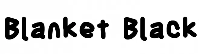
![Blanket Black フリーフォントのダウンロード]() ダウンロード 315 ダウンロード数@WebFont
ダウンロード 315 ダウンロード数@WebFont -
( Fonts by PiPi Creative )
A bold, playful font with rounded, slanted letterforms for a casual look.
![Stay Casual フリーフォントのダウンロード]() ダウンロード 315 ダウンロード数@WebFont
ダウンロード 315 ダウンロード数@WebFont

今のトップフォントは?
は、クリーンな造形と広い適用範囲で支持を集めています。 ブランディングからランディングページ、ポスターまで活躍します。
ロゴで人気のフォントは?
幾何学系の サンセリフ(例: Poppins、Gotham 系のファミリー)は、スケーラブルでクリーンな印象に最適。 親しみやすさを出すなら スクリプト や手書き系も定番です。 見出しは力強く、本文はニュートラルに──この組み合わせが認知とバランスを高めます。
人気リストはどのくらいの頻度で更新される?
ダウンロード数やエンゲージメントに基づき定期的に更新します。 こまめにチェックして、次に流行るフォントを先取りしましょう。
💡 ヒント: このページをブックマークしておくと便利です。トレンドは速く、今のトップが明日のリブランディングを導くこともあります。