人気フォント セクションへようこそ。ここでは「よくダウンロードされ、よく使われている」実績ある書体をまとめています。 ロゴ、Web、SNS のどれにも使いやすい、外さない選択肢が見つかります。
どの トップフォント も、バランス・可読性・汎用性で高評価です。 モダン・サンセリフ、エレガントなスクリプト、ヴィンテージなセリフ、ミニマルなディスプレイなどを厳選しています。
-
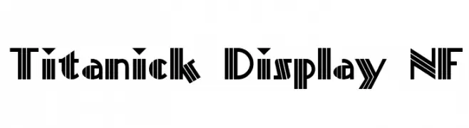
( Fonts by Nick Curtis - www.nicksfonts.com )
A bold, geometric font with Art Deco influences and high contrast.
 ダウンロード 301 ダウンロード数@WebFont
 -
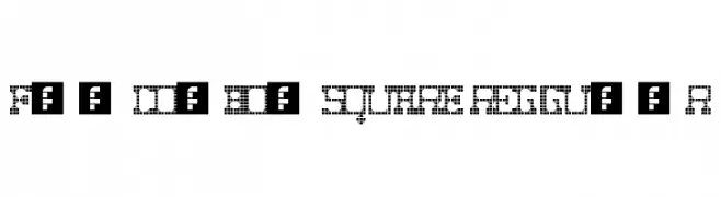
( Fonts by Manuel Viergutz - Typo Graphic Design - www.typographicdesign.de )
A bold, pixelated font with a retro digital aesthetic.
![Fat Cowboy SQUARE Regular フリーフォントのダウンロード]() ダウンロード 301 ダウンロード数@WebFont
ダウンロード 301 ダウンロード数@WebFont -
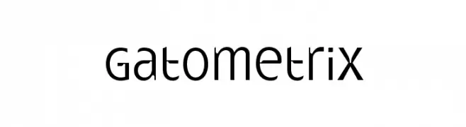
![Gatometrix フリーフォントのダウンロード]() ダウンロード 301 ダウンロード数@WebFont
ダウンロード 301 ダウンロード数@WebFont -
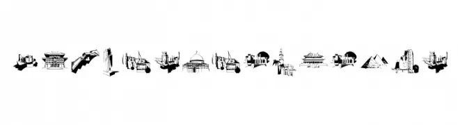
( Fonts by Manfred Klein - manfred-klein.ina-mar.com )
A display font composed of iconic building silhouettes as glyphs.
![FamousBuildings フリーフォントのダウンロード]() ダウンロード 301 ダウンロード数@WebFont
ダウンロード 301 ダウンロード数@WebFont -
( Vladimir Nikolic - www.coroflot.com/vladimirnikolic )
A bold, geometric font with thick strokes and minimal contrast.
![Intransitive Regular フリーフォントのダウンロード]() ダウンロード 301 ダウンロード数@WebFont
ダウンロード 301 ダウンロード数@WebFont -
-
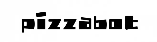
( Fonts by Jacob Fisher - www.pizzadude.dk )
A playful, bold font with irregular, chunky characters and a dynamic feel.
![PizzaBot フリーフォントのダウンロード]() ダウンロード 301 ダウンロード数@WebFont
ダウンロード 301 ダウンロード数@WebFont -
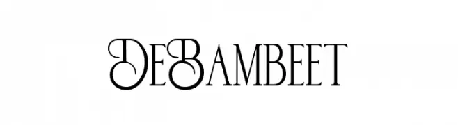
( Fonts by zamjump - Ahmad Zamzami - Personal-use only. For commercial use please contact owner. )
An elegant and whimsical serif font with decorative uppercase letters and balanced lowercase characters.
![De Bambeet フリーフォントのダウンロード]() ダウンロード 301 ダウンロード数@WebFont
ダウンロード 301 ダウンロード数@WebFont -
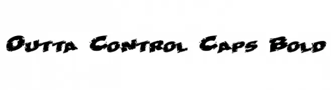
![Outta Control Caps Bold フリーフォントのダウンロード]() ダウンロード 301 ダウンロード数@WebFont
ダウンロード 301 ダウンロード数@WebFont -
( Fonts by www.blambot.com )
A bold, angular font with a rebellious, graffiti-like aesthetic.
![KillCrazyBB フリーフォントのダウンロード]() ダウンロード 301 ダウンロード数@WebFont
ダウンロード 301 ダウンロード数@WebFont -
( Fonts by Graphicfresh - Personal-use only. For commercial use please contact owner. )
A lively and expressive handwritten font with dynamic strokes.
![Bellevue フリーフォントのダウンロード]() ダウンロード 301 ダウンロード数@WebFont
ダウンロード 301 ダウンロード数@WebFont


今のトップフォントは?
は、クリーンな造形と広い適用範囲で支持を集めています。 ブランディングからランディングページ、ポスターまで活躍します。
ロゴで人気のフォントは?
幾何学系の サンセリフ(例: Poppins、Gotham 系のファミリー)は、スケーラブルでクリーンな印象に最適。 親しみやすさを出すなら スクリプト や手書き系も定番です。 見出しは力強く、本文はニュートラルに──この組み合わせが認知とバランスを高めます。
人気リストはどのくらいの頻度で更新される?
ダウンロード数やエンゲージメントに基づき定期的に更新します。 こまめにチェックして、次に流行るフォントを先取りしましょう。
💡 ヒント: このページをブックマークしておくと便利です。トレンドは速く、今のトップが明日のリブランディングを導くこともあります。