人気フォント セクションへようこそ。ここでは「よくダウンロードされ、よく使われている」実績ある書体をまとめています。 ロゴ、Web、SNS のどれにも使いやすい、外さない選択肢が見つかります。
どの トップフォント も、バランス・可読性・汎用性で高評価です。 モダン・サンセリフ、エレガントなスクリプト、ヴィンテージなセリフ、ミニマルなディスプレイなどを厳選しています。
-
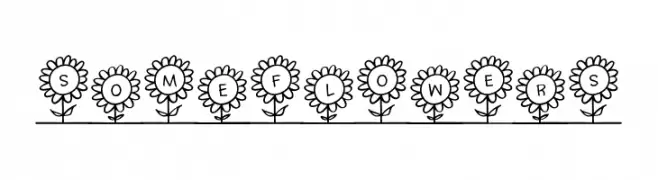
( Fonts by Brittney Murphy Design )
A whimsical decorative font with characters encased in floral designs.
 ダウンロード 285 ダウンロード数@WebFont
 -
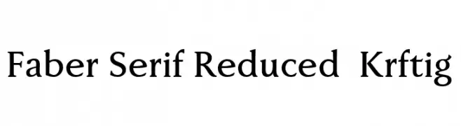
( Fonts by ingoFonts - Ingo Zimmermann - Personal-use only. For commercial use please contact owner. )
A classic serif font with pronounced serifs and moderate contrast, ideal for formal use.
![Faber Serif Reduced 65 Kräftig フリーフォントのダウンロード]() ダウンロード 285 ダウンロード数@WebFont
ダウンロード 285 ダウンロード数@WebFont -
( Fonts by Iconian Fonts )
A bold, expanded, and italic font with a modern and dynamic style.
![Governor Expanded Italic フリーフォントのダウンロード]() ダウンロード 285 ダウンロード数@WebFont
ダウンロード 285 ダウンロード数@WebFont -
![Sugarfish フリーフォントのダウンロード]() ダウンロード 285 ダウンロード数@WebFont
ダウンロード 285 ダウンロード数@WebFont -
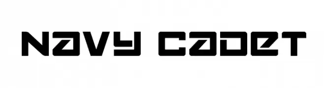
![Navy Cadet フリーフォントのダウンロード]() ダウンロード 285 ダウンロード数@WebFont
ダウンロード 285 ダウンロード数@WebFont -
-
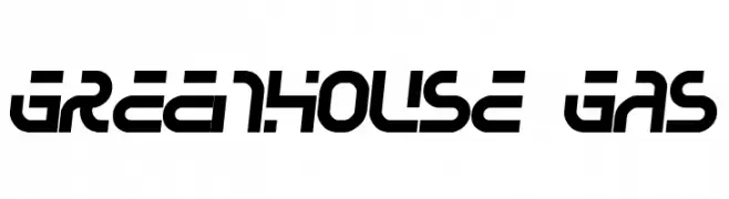
( Fonts by Jacob Fisher - www.pizzadude.dk )
A bold, futuristic font with geometric shapes and a dynamic style.
![Greenhouse gas フリーフォントのダウンロード]() ダウンロード 285 ダウンロード数@WebFont
ダウンロード 285 ダウンロード数@WebFont -
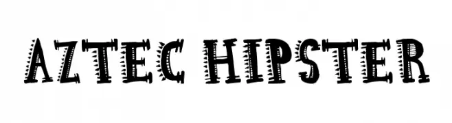
( I Like Fonts - Alan Alan )
A bold, decorative font with tribal-inspired geometric patterns.
![Aztec Hipster フリーフォントのダウンロード]() ダウンロード 285 ダウンロード数@WebFont
ダウンロード 285 ダウンロード数@WebFont -
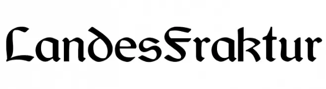
( Fleisch )
An ornate Blackletter font with intricate, angular letterforms and historical elegance.
![LandesFraktur フリーフォントのダウンロード]() ダウンロード 285 ダウンロード数@WebFont
ダウンロード 285 ダウンロード数@WebFont -
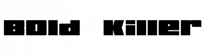
( Fonts by Jayde Garrow - GarrowGlitch - http://jaydegarrow.wix.com/jaydefonts. Personal-use only. For commercial use please contact owner. )
A bold, geometric font with block-like characters and tight spacing.
![Bold Killer フリーフォントのダウンロード]() ダウンロード 285 ダウンロード数@WebFont
ダウンロード 285 ダウンロード数@WebFont -
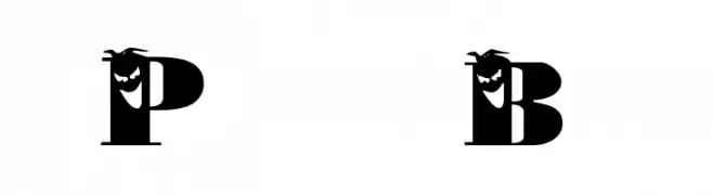
( Fonts by www.houseoflime.com )
A bold, decorative font with intricate embellishments on each letter.
![PhilliBoo フリーフォントのダウンロード]() ダウンロード 285 ダウンロード数@WebFont
ダウンロード 285 ダウンロード数@WebFont


今のトップフォントは?
は、クリーンな造形と広い適用範囲で支持を集めています。 ブランディングからランディングページ、ポスターまで活躍します。
ロゴで人気のフォントは?
幾何学系の サンセリフ(例: Poppins、Gotham 系のファミリー)は、スケーラブルでクリーンな印象に最適。 親しみやすさを出すなら スクリプト や手書き系も定番です。 見出しは力強く、本文はニュートラルに──この組み合わせが認知とバランスを高めます。
人気リストはどのくらいの頻度で更新される?
ダウンロード数やエンゲージメントに基づき定期的に更新します。 こまめにチェックして、次に流行るフォントを先取りしましょう。
💡 ヒント: このページをブックマークしておくと便利です。トレンドは速く、今のトップが明日のリブランディングを導くこともあります。