人気フォント セクションへようこそ。ここでは「よくダウンロードされ、よく使われている」実績ある書体をまとめています。 ロゴ、Web、SNS のどれにも使いやすい、外さない選択肢が見つかります。
どの トップフォント も、バランス・可読性・汎用性で高評価です。 モダン・サンセリフ、エレガントなスクリプト、ヴィンテージなセリフ、ミニマルなディスプレイなどを厳選しています。
-
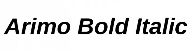
( Copyright (c) 2010, Google Corporation. )
A bold, italic sans-serif font with a modern and dynamic style.
 ダウンロード 3838 ダウンロード数@WebFont
 -
( Fonts by Arkandis Digital Foundry )
A bold serif font with strong strokes and classic detailing, perfect for impactful headlines.
![VenturisADFCd-Bold フリーフォントのダウンロード]() ダウンロード 3836 ダウンロード数@WebFont
ダウンロード 3836 ダウンロード数@WebFont -
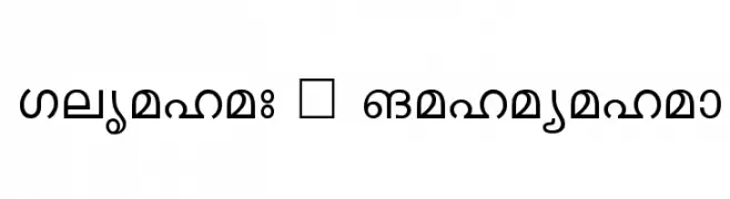
![Keralax - Malayalam フリーフォントのダウンロード]() ダウンロード 3836 ダウンロード数@WebFont
ダウンロード 3836 ダウンロード数@WebFont -
( Fonts by www.koenhachmang.com - Glitch )
A modern, geometric sans-serif font with uniform strokes and balanced spacing.
![Y2K Neophyte フリーフォントのダウンロード]() ダウンロード 3836 ダウンロード数@WebFont
ダウンロード 3836 ダウンロード数@WebFont -
( Fonts by CannotIntoSpaceFonts - KineticPlasma Fonts - Personal-use only. For commercial use please contact owner. )
A bold, modern font with tall, narrow letterforms and high contrast.
![Warsaw Gothic フリーフォントのダウンロード]() ダウンロード 3835 ダウンロード数@WebFont
ダウンロード 3835 ダウンロード数@WebFont -
-
![14 minutes sharp フリーフォントのダウンロード]() ダウンロード 3835 ダウンロード数@WebFont
ダウンロード 3835 ダウンロード数@WebFont -
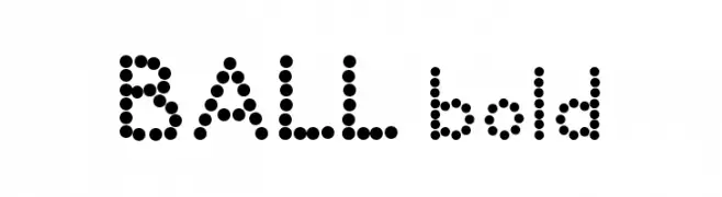
![BALL bold フリーフォントのダウンロード]() ダウンロード 3834 ダウンロード数@WebFont
ダウンロード 3834 ダウンロード数@WebFont -
( Fonts by www.Fontfabric.com )
A sleek, modern font with geometric lines and uniform stroke width.
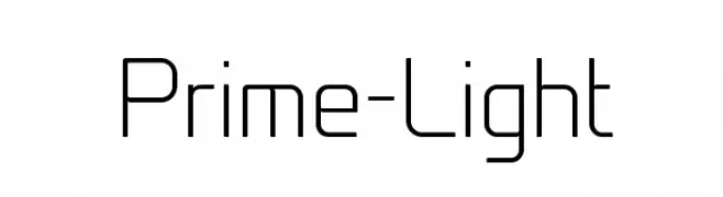
![Prime-Light フリーフォントのダウンロード]() ダウンロード 3833 ダウンロード数@WebFont
ダウンロード 3833 ダウンロード数@WebFont -
( Font by Jayvee D. Enaguas - grandchaos9000.deviantart.com )
A playful and whimsical script font with smooth, flowing curves and elegant loops.
![That's Font Folks! Italic フリーフォントのダウンロード]() ダウンロード 3832 ダウンロード数@WebFont
ダウンロード 3832 ダウンロード数@WebFont -
![ThunderCats フリーフォントのダウンロード]() ダウンロード 3832 ダウンロード数@WebFont
ダウンロード 3832 ダウンロード数@WebFont


今のトップフォントは?
は、クリーンな造形と広い適用範囲で支持を集めています。 ブランディングからランディングページ、ポスターまで活躍します。
ロゴで人気のフォントは?
幾何学系の サンセリフ(例: Poppins、Gotham 系のファミリー)は、スケーラブルでクリーンな印象に最適。 親しみやすさを出すなら スクリプト や手書き系も定番です。 見出しは力強く、本文はニュートラルに──この組み合わせが認知とバランスを高めます。
人気リストはどのくらいの頻度で更新される?
ダウンロード数やエンゲージメントに基づき定期的に更新します。 こまめにチェックして、次に流行るフォントを先取りしましょう。
💡 ヒント: このページをブックマークしておくと便利です。トレンドは速く、今のトップが明日のリブランディングを導くこともあります。