人気フォント セクションへようこそ。ここでは「よくダウンロードされ、よく使われている」実績ある書体をまとめています。 ロゴ、Web、SNS のどれにも使いやすい、外さない選択肢が見つかります。
どの トップフォント も、バランス・可読性・汎用性で高評価です。 モダン・サンセリフ、エレガントなスクリプト、ヴィンテージなセリフ、ミニマルなディスプレイなどを厳選しています。
-
( Fonts by Daniel Gauthier )
A bold, brush-like font with a dramatic and artistic style.
 ダウンロード 280 ダウンロード数@WebFont
 -
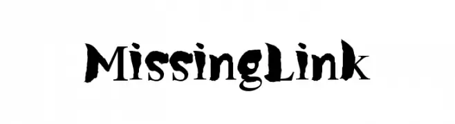
( Fonts by Allouse Studio - Personal-use only. For commercial use please contact owner. )
A playful, casual handwritten font with rounded, consistent strokes.
![The August フリーフォントのダウンロード]() ダウンロード 280 ダウンロード数@WebFont
ダウンロード 280 ダウンロード数@WebFont -
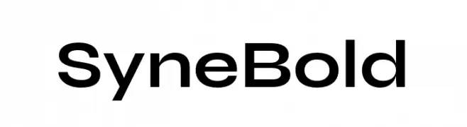
( Fonts by Bonjour Monde )
A bold, geometric sans-serif font with a modern and clean design.
![Syne Bold フリーフォントのダウンロード]() ダウンロード 280 ダウンロード数@WebFont
ダウンロード 280 ダウンロード数@WebFont -
( Fonts by William Jeovah de Medeiros )
A playful, bold handwritten font with rounded strokes and an informal style.
![Decalk フリーフォントのダウンロード]() ダウンロード 280 ダウンロード数@WebFont
ダウンロード 280 ダウンロード数@WebFont -
( Fonts by RodrigoTypo - Rodrigo Araya Salas - Personal-use only. For commercial use please contact owner. )
A bold, rough-textured font with a vintage, handcrafted appearance.
![Minado Rough Demo Regular フリーフォントのダウンロード]() ダウンロード 280 ダウンロード数@WebFont
ダウンロード 280 ダウンロード数@WebFont -
-
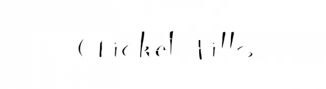
( Fonts by www.abecedarienne.com )
A bold, stencil-like font with fragmented, dynamic strokes.
![Cricket Fills フリーフォントのダウンロード]() ダウンロード 280 ダウンロード数@WebFont
ダウンロード 280 ダウンロード数@WebFont -
( Fonts by joeBob graff-X )
A playful, handwritten font with varied stroke thickness and a casual, informal style.
![JoeHand1 フリーフォントのダウンロード]() ダウンロード 280 ダウンロード数@WebFont
ダウンロード 280 ダウンロード数@WebFont -
( Fonts by Apostrophic Lab )
A modern, narrow sans-serif font with clean lines and consistent stroke widths.
![Street Corner Narrower フリーフォントのダウンロード]() ダウンロード 280 ダウンロード数@WebFont
ダウンロード 280 ダウンロード数@WebFont -
![poo フリーフォントのダウンロード]() ダウンロード 280 ダウンロード数@WebFont
ダウンロード 280 ダウンロード数@WebFont -
![Mf Summertime フリーフォントのダウンロード]() ダウンロード 280 ダウンロード数@WebFont
ダウンロード 280 ダウンロード数@WebFont


今のトップフォントは?
は、クリーンな造形と広い適用範囲で支持を集めています。 ブランディングからランディングページ、ポスターまで活躍します。
ロゴで人気のフォントは?
幾何学系の サンセリフ(例: Poppins、Gotham 系のファミリー)は、スケーラブルでクリーンな印象に最適。 親しみやすさを出すなら スクリプト や手書き系も定番です。 見出しは力強く、本文はニュートラルに──この組み合わせが認知とバランスを高めます。
人気リストはどのくらいの頻度で更新される?
ダウンロード数やエンゲージメントに基づき定期的に更新します。 こまめにチェックして、次に流行るフォントを先取りしましょう。
💡 ヒント: このページをブックマークしておくと便利です。トレンドは速く、今のトップが明日のリブランディングを導くこともあります。