人気フォント セクションへようこそ。ここでは「よくダウンロードされ、よく使われている」実績ある書体をまとめています。 ロゴ、Web、SNS のどれにも使いやすい、外さない選択肢が見つかります。
どの トップフォント も、バランス・可読性・汎用性で高評価です。 モダン・サンセリフ、エレガントなスクリプト、ヴィンテージなセリフ、ミニマルなディスプレイなどを厳選しています。
-
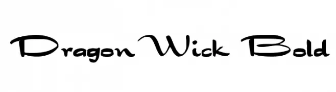
( Fonts by David Rakowski )
A bold, decorative font with a whimsical, cursive-like style.
 ダウンロード 1102 ダウンロード数@WebFont
 -
![amoeba フリーフォントのダウンロード]() ダウンロード 1102 ダウンロード数@WebFont
ダウンロード 1102 ダウンロード数@WebFont -
( Fonts by Katatrad Team, changes by Cristiano Sobral - Personal-use only. For commercial use please contact owner. )
A bold, modern typeface with thick, geometric strokes for strong visual impact.
![Dizhitl ExtraBold Regular フリーフォントのダウンロード]() ダウンロード 1101 ダウンロード数@WebFont
ダウンロード 1101 ダウンロード数@WebFont -
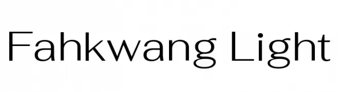
( Copyright 2018 The Fahkwang Project Authors (https://github.com/cadsondemak/Fah-Kwang) )
A modern, light sans-serif font with clean lines and balanced proportions.
![Fahkwang Light フリーフォントのダウンロード]() ダウンロード 1101 ダウンロード数@WebFont
ダウンロード 1101 ダウンロード数@WebFont -
( Fonts by dot colon - Personal-use only. For commercial use please contact owner. )
A modern, semi-bold sans-serif font with excellent readability and a professional appearance.
![Route159-SemiBold フリーフォントのダウンロード]() ダウンロード 1101 ダウンロード数@WebFont
ダウンロード 1101 ダウンロード数@WebFont -
![Steppers フリーフォントのダウンロード]() ダウンロード 1101 ダウンロード数@WebFont
ダウンロード 1101 ダウンロード数@WebFont -
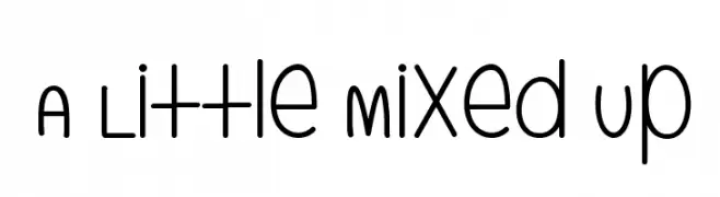
( mistifonts.com/ )
A playful, rounded font with smooth edges and consistent stroke width.
![A Little Mixed Up フリーフォントのダウンロード]() ダウンロード 1101 ダウンロード数@WebFont
ダウンロード 1101 ダウンロード数@WebFont -
( Fonts by Vanessa Bays - bythebutterfly.com )
A playful, handwritten font with a casual and friendly style.
![The Urban Way フリーフォントのダウンロード]() ダウンロード 1101 ダウンロード数@WebFont
ダウンロード 1101 ダウンロード数@WebFont -
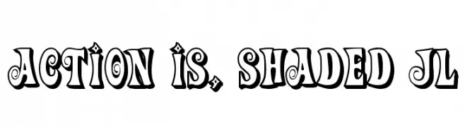
![Action Is, Shaded JL フリーフォントのダウンロード]() ダウンロード 1101 ダウンロード数@WebFont
ダウンロード 1101 ダウンロード数@WebFont -
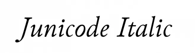
![Junicode Italic フリーフォントのダウンロード]() ダウンロード 1101 ダウンロード数@WebFont
ダウンロード 1101 ダウンロード数@WebFont -
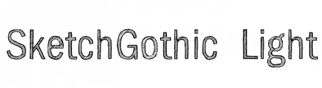
( Fonts by www.artill.de - Lukas Bischoff )
A sketch-style, hand-drawn font with a playful and artistic appearance.
![SketchGothic-Light フリーフォントのダウンロード]() ダウンロード 1101 ダウンロード数@WebFont
ダウンロード 1101 ダウンロード数@WebFont -
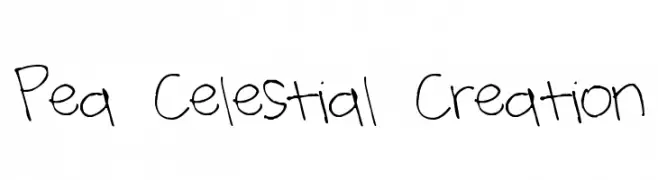
( Free for a personal use. For a commercial use please visit www.kevinandamanda.com )
A playful, handwritten font with a casual and whimsical style.
![Pea Celestial Creation フリーフォントのダウンロード]() ダウンロード 1101 ダウンロード数@WebFont
ダウンロード 1101 ダウンロード数@WebFont -
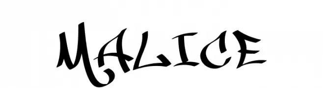
![MALICE フリーフォントのダウンロード]() ダウンロード 1101 ダウンロード数@WebFont
ダウンロード 1101 ダウンロード数@WebFont -
フォント by spideraysfonts. For commercial use please contact the owner.
![KRYPTOSCRIPTO フリーフォントのダウンロード]() ダウンロード 1101 ダウンロード数@WebFont
ダウンロード 1101 ダウンロード数@WebFont -
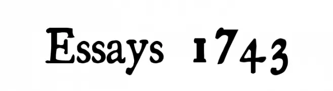
![Essays 1743 フリーフォントのダウンロード]() ダウンロード 1101 ダウンロード数@WebFont
ダウンロード 1101 ダウンロード数@WebFont -
![C&C Red Alert [LAN] フリーフォントのダウンロード]() ダウンロード 1101 ダウンロード数@WebFont
ダウンロード 1101 ダウンロード数@WebFont -
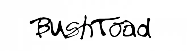
![BushToad フリーフォントのダウンロード]() ダウンロード 1101 ダウンロード数@WebFont
ダウンロード 1101 ダウンロード数@WebFont -
( Fonts by Daniel Zadorozny - www.iconian.com - Free for personal use )
A bold, futuristic font with geometric shapes and rounded edges.
![Universal Jack フリーフォントのダウンロード]() ダウンロード 1101 ダウンロード数@WebFont
ダウンロード 1101 ダウンロード数@WebFont -
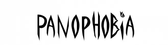
![Panophobia フリーフォントのダウンロード]() ダウンロード 1101 ダウンロード数
ダウンロード 1101 ダウンロード数 -
( Fonts by Patria Ari Typestudio - Patria Ari - Personal-use only. For commercial use please contact owner. )
A bold, geometric font with a futuristic and technical style.
![Astronomus フリーフォントのダウンロード]() ダウンロード 1100 ダウンロード数@WebFont
ダウンロード 1100 ダウンロード数@WebFont -
( Fonts by imagex )
A bold, graffiti-inspired font with splatter effects for a dynamic look.
![Spotyfied Me フリーフォントのダウンロード]() ダウンロード 1100 ダウンロード数@WebFont
ダウンロード 1100 ダウンロード数@WebFont -
( Noto is a trademark of Google Inc. Noto fonts are open source. All Noto fonts are published under the SIL Open Font License, Version 1.1 )
A clean, modern sans-serif typeface with excellent readability.
![Noto Sans Display Regular フリーフォントのダウンロード]() ダウンロード 1100 ダウンロード数@WebFont
ダウンロード 1100 ダウンロード数@WebFont -
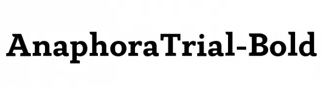
( Zetafonts - www.zetafonts.com )
A bold serif font with strong strokes and classic-modern appeal.
![AnaphoraTrial-Bold フリーフォントのダウンロード]() ダウンロード 1100 ダウンロード数@WebFont
ダウンロード 1100 ダウンロード数@WebFont -
![NCAA Baylor Bear Claw フリーフォントのダウンロード]() ダウンロード 1100 ダウンロード数@WebFont
ダウンロード 1100 ダウンロード数@WebFont -
( Fonts by Style-7 - www.styleseven.com - Personal-use only. For commercial use please contact owner. )
A digital dot matrix font with a retro, pixelated style.
![Triple Dot Digital-7 フリーフォントのダウンロード]() ダウンロード 1100 ダウンロード数@WebFont
ダウンロード 1100 ダウンロード数@WebFont -
( Fonts by Nick Curtis - www.nicksfonts.com )
A bold, geometric font with block-like shapes and uniform stroke width.
![CuppaJoe フリーフォントのダウンロード]() ダウンロード 1100 ダウンロード数
ダウンロード 1100 ダウンロード数 -
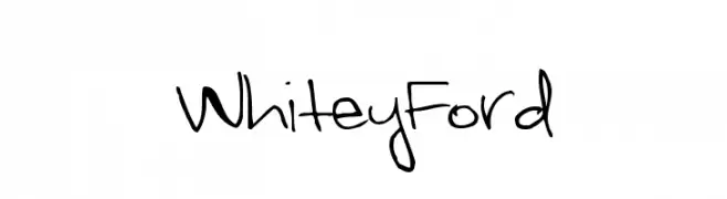
![WhiteyFord フリーフォントのダウンロード]() ダウンロード 1100 ダウンロード数@WebFont
ダウンロード 1100 ダウンロード数@WebFont -
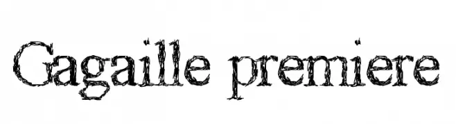
![Gagaille premiere フリーフォントのダウンロード]() ダウンロード 1100 ダウンロード数@WebFont
ダウンロード 1100 ダウンロード数@WebFont -
( Fonts by Levi Halmos )
A bold, playful font with a three-dimensional, cartoonish style.
![King Kikapu フリーフォントのダウンロード]() ダウンロード 1100 ダウンロード数@WebFont
ダウンロード 1100 ダウンロード数@WebFont -
( Fonts by Khurasan )
A playful, bold font with a bubbly, rounded design and glossy effect.
![Copyduck フリーフォントのダウンロード]() ダウンロード 1099 ダウンロード数@WebFont
ダウンロード 1099 ダウンロード数@WebFont -
( Fonts by U.S. Web Design System )
A bold, italic sans-serif font with a modern and dynamic style.
![Public Sans ExtraBold Italic フリーフォントのダウンロード]() ダウンロード 1099 ダウンロード数@WebFont
ダウンロード 1099 ダウンロード数@WebFont -
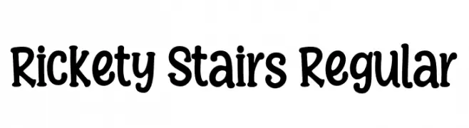
( Fonts by Niskala Huruf )
A playful, hand-drawn font with uneven strokes and a whimsical style.
![Rickety Stairs Regular フリーフォントのダウンロード]() ダウンロード 1099 ダウンロード数@WebFont
ダウンロード 1099 ダウンロード数@WebFont -
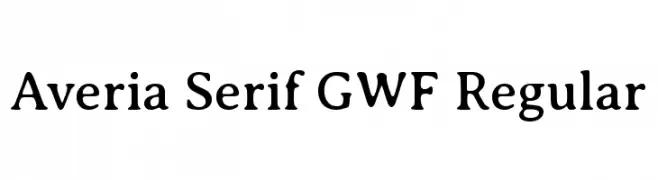
( Personal-use only. For commercial use please contact owner. )
A classic serif font with a soft, rounded appearance and excellent readability.
![Averia Serif GWF Regular フリーフォントのダウンロード]() ダウンロード 1099 ダウンロード数@WebFont
ダウンロード 1099 ダウンロード数@WebFont -
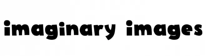
![Imaginary Images フリーフォントのダウンロード]() ダウンロード 1099 ダウンロード数@WebFont
ダウンロード 1099 ダウンロード数@WebFont -
( Copyright 2016 The Cabin Project Authors (impallari@gmail.com) )
A modern, geometric sans-serif font with balanced proportions and a professional appearance.
![Cabin VF Beta Regular フリーフォントのダウンロード]() ダウンロード 1099 ダウンロード数@WebFont
ダウンロード 1099 ダウンロード数@WebFont


![C&C Red Alert [LAN] フリーフォントのダウンロード](https://d144mzi0q5mijx.cloudfront.net/img/C/0/CC-Red-Alert-LAN.webp)


今のトップフォントは?
は、クリーンな造形と広い適用範囲で支持を集めています。 ブランディングからランディングページ、ポスターまで活躍します。
ロゴで人気のフォントは?
幾何学系の サンセリフ(例: Poppins、Gotham 系のファミリー)は、スケーラブルでクリーンな印象に最適。 親しみやすさを出すなら スクリプト や手書き系も定番です。 見出しは力強く、本文はニュートラルに──この組み合わせが認知とバランスを高めます。
人気リストはどのくらいの頻度で更新される?
ダウンロード数やエンゲージメントに基づき定期的に更新します。 こまめにチェックして、次に流行るフォントを先取りしましょう。
💡 ヒント: このページをブックマークしておくと便利です。トレンドは速く、今のトップが明日のリブランディングを導くこともあります。