人気フォント セクションへようこそ。ここでは「よくダウンロードされ、よく使われている」実績ある書体をまとめています。 ロゴ、Web、SNS のどれにも使いやすい、外さない選択肢が見つかります。
どの トップフォント も、バランス・可読性・汎用性で高評価です。 モダン・サンセリフ、エレガントなスクリプト、ヴィンテージなセリフ、ミニマルなディスプレイなどを厳選しています。
-
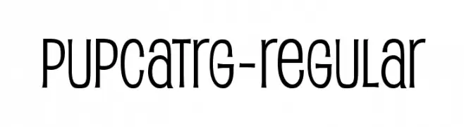
( Fonts by www.typodermicfonts.com - Ray Larabie )
A playful, modern font with tall, narrow letters and rounded edges.
 ダウンロード 1060 ダウンロード数@WebFont
 -
![Awaken フリーフォントのダウンロード]() ダウンロード 1060 ダウンロード数@WebFont
ダウンロード 1060 ダウンロード数@WebFont -
( Fonts by ShyFonts )
A bold, condensed, and playful font with a comic book style.
![SF Comic Script Condensed フリーフォントのダウンロード]() ダウンロード 1060 ダウンロード数@WebFont
ダウンロード 1060 ダウンロード数@WebFont -
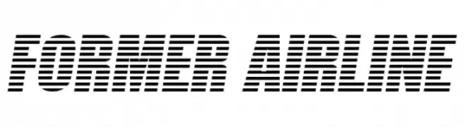
( Fonts by www.vicfieger.com )
A bold, modern font with a unique horizontal striped pattern.
![Former Airline フリーフォントのダウンロード]() ダウンロード 1060 ダウンロード数@WebFont
ダウンロード 1060 ダウンロード数@WebFont -
( Fonts by www.fontpanda.com. Personal-use only. For commercial use please contact owner. )
A casual, handwritten font with a playful and spontaneous style.
![ChickenScratch フリーフォントのダウンロード]() ダウンロード 1060 ダウンロード数@WebFont
ダウンロード 1060 ダウンロード数@WebFont -
( Fonts by David Rakowski )
A bold, jagged font with sharp, dynamic angles and an energetic appearance.
![Aarcover Regular フリーフォントのダウンロード]() ダウンロード 1060 ダウンロード数@WebFont
ダウンロード 1060 ダウンロード数@WebFont -
![CrackBoum フリーフォントのダウンロード]() ダウンロード 1060 ダウンロード数@WebFont
ダウンロード 1060 ダウンロード数@WebFont -
( Fonts by Khurasan )
A playful, hand-drawn font with bold, whimsical characters.
![Coffee Show フリーフォントのダウンロード]() ダウンロード 1059 ダウンロード数@WebFont
ダウンロード 1059 ダウンロード数@WebFont -
( Fonts by Febryl Arully - Personal-use only. For commercial use please contact owner. )
An elegant script font with intricate swashes and flowing, interconnected letters.
![Arully フリーフォントのダウンロード]() ダウンロード 1059 ダウンロード数@WebFont
ダウンロード 1059 ダウンロード数@WebFont -
( Fonts by Daniel Zadorozny - www.iconian.com - Personal-use only. For commercial use please contact owner. )
A bold, geometric font with a futuristic and technical style.
![Pilot Command Expanded フリーフォントのダウンロード]() ダウンロード 1059 ダウンロード数@WebFont
ダウンロード 1059 ダウンロード数@WebFont -
( Fonts by Subectype & Orenari )
A playful, bold font with rounded, bubbly characters and a lively, informal style.
![Jumping Unicorn フリーフォントのダウンロード]() ダウンロード 1059 ダウンロード数@WebFont
ダウンロード 1059 ダウンロード数@WebFont -
( JoannaVu - ioannaladopoulou.com )
A bold, gothic-style font with sharp edges and a distressed texture.
![Frozito フリーフォントのダウンロード]() ダウンロード 1059 ダウンロード数@WebFont
ダウンロード 1059 ダウンロード数@WebFont -
( Copyright 2016 Michal Sahar. All rights reserved. )
A clean, modern sans-serif typeface with uniform stroke width and excellent readability.
![Miriam Libre Regular フリーフォントのダウンロード]() ダウンロード 1059 ダウンロード数@WebFont
ダウンロード 1059 ダウンロード数@WebFont -
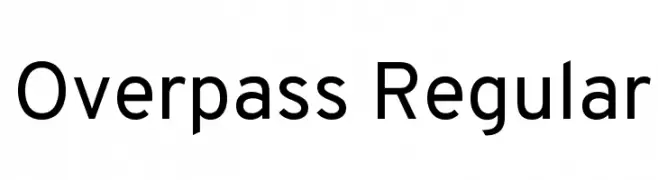
( Copyright (c) 2016 by Red Hat, Inc. All rights reserved. )
A modern, geometric sans-serif font with uniform stroke widths.
![Overpass Regular フリーフォントのダウンロード]() ダウンロード 1059 ダウンロード数@WebFont
ダウンロード 1059 ダウンロード数@WebFont -
( Fonts by a Neale Davidson - www.pixelsagas.com. Personal-use only. For commercial use please contact owner. )
A bold, italicized font with a futuristic, angular design.
![Cyberverse Bold Italic フリーフォントのダウンロード]() ダウンロード 1059 ダウンロード数@WebFont
ダウンロード 1059 ダウンロード数@WebFont -
( Fonts by a Neale Davidson - www.pixelsagas.com. Personal-use only. For commercial use please contact owner. )
A sleek, modern italic font with a geometric and futuristic design.
![PCap Terminal Italic フリーフォントのダウンロード]() ダウンロード 1059 ダウンロード数@WebFont
ダウンロード 1059 ダウンロード数@WebFont -
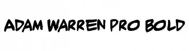
( Fonts by Press Gang Studios - Andeh Pinkard - www.pressgang-studios.com )
A bold, handwritten-style font with a dynamic and energetic appearance.
![Adam Warren pro Bold フリーフォントのダウンロード]() ダウンロード 1059 ダウンロード数@WebFont
ダウンロード 1059 ダウンロード数@WebFont -
( Fonts by Casady & Greene )
A casual, handwritten font with a smooth, flowing style.
![JottFLF-Casual フリーフォントのダウンロード]() ダウンロード 1059 ダウンロード数@WebFont
ダウンロード 1059 ダウンロード数@WebFont -
( Fonts by Manfred Klein. Free for private and charity use. Free for commercial with donation to organizations )
A geometric, angular font with a futuristic and bold style.
![GreeKish フリーフォントのダウンロード]() ダウンロード 1059 ダウンロード数@WebFont
ダウンロード 1059 ダウンロード数@WebFont -
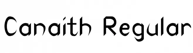
![Canaith Regular フリーフォントのダウンロード]() ダウンロード 1059 ダウンロード数@WebFont
ダウンロード 1059 ダウンロード数@WebFont -
( Fonts by Paul Lloyd )
An elongated, elegant font with tall, narrow letterforms and subtle curves.
![BoltonTitlingElongated フリーフォントのダウンロード]() ダウンロード 1059 ダウンロード数@WebFont
ダウンロード 1059 ダウンロード数@WebFont -
![Amrit-Lipi-Slim Regular フリーフォントのダウンロード]() ダウンロード 1059 ダウンロード数@WebFont
ダウンロード 1059 ダウンロード数@WebFont -
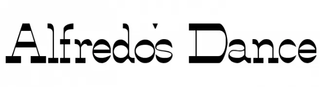
( Fonts by Slub Design - Raymond Buetens - www.slubdesign.com )
A bold, geometric font with a modern and versatile style.
![Alfredo's Dance フリーフォントのダウンロード]() ダウンロード 1059 ダウンロード数
ダウンロード 1059 ダウンロード数 -
( Fonts by Gassstype )
A bold, rounded font with a playful and friendly style.
![Soap Opera フリーフォントのダウンロード]() ダウンロード 1058 ダウンロード数@WebFont
ダウンロード 1058 ダウンロード数@WebFont -
( Fonts by Dumadi Studios )
A bold, rounded font with a playful and energetic style.
![dumadi フリーフォントのダウンロード]() ダウンロード 1058 ダウンロード数@WebFont
ダウンロード 1058 ダウンロード数@WebFont -
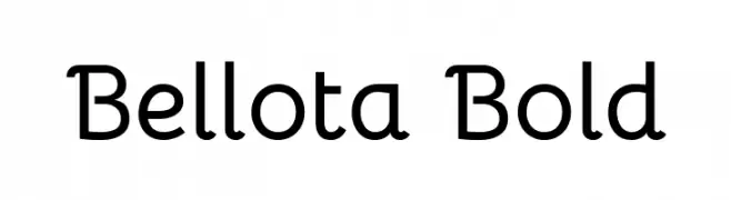
( Copyright 2019 The Bellota Project Authors (https://github.com/kemie/Bellota-Font) )
A playful and modern font with rounded edges and smooth curves.
![Bellota Bold フリーフォントのダウンロード]() ダウンロード 1058 ダウンロード数@WebFont
ダウンロード 1058 ダウンロード数@WebFont -
( Fonts by Hanken Design Co. - Personal-use only. For commercial use please contact owner. )
A modern, semi-bold sans-serif font with clean lines and strong legibility.
![Decalotype SemiBold フリーフォントのダウンロード]() ダウンロード 1058 ダウンロード数@WebFont
ダウンロード 1058 ダウンロード数@WebFont -
( Roger White - web.archive.org/web/20120416090521/www.rogersfonts.org.uk/ )
A classic serif typeface with high contrast and sharp serifs, exuding elegance and sophistication.
![Fradley フリーフォントのダウンロード]() ダウンロード 1058 ダウンロード数@WebFont
ダウンロード 1058 ダウンロード数@WebFont -
( 7NTypes - Situjuh Nazara - 7ntypes.com )
A bold, flowing script font with elegant, connected letters.
![Veni フリーフォントのダウンロード]() ダウンロード 1058 ダウンロード数@WebFont
ダウンロード 1058 ダウンロード数@WebFont -
( Fonts by artimasa studio )
A bold, dynamic script font with fluid, cursive letterforms.
![Sweet Sorrow フリーフォントのダウンロード]() ダウンロード 1058 ダウンロード数@WebFont
ダウンロード 1058 ダウンロード数@WebFont -
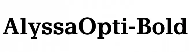
( Fonts by Castcraft Software - opti.netii.net - check the website before use )
A bold serif font with strong, authoritative strokes and classic elegance.
![AlyssaOpti-Bold フリーフォントのダウンロード]() ダウンロード 1058 ダウンロード数@WebFont
ダウンロード 1058 ダウンロード数@WebFont -
( Copyright (c) 2011, Dan Sayers (i@iotic.com) )
A playful, hand-drawn style with rounded, irregular strokes.
![Averia Gruesa Libre フリーフォントのダウンロード]() ダウンロード 1058 ダウンロード数@WebFont
ダウンロード 1058 ダウンロード数@WebFont -
フォント by spideraysfonts. For commercial use please contact the owner.
![OLYMPIAD XXX フリーフォントのダウンロード]() ダウンロード 1058 ダウンロード数@WebFont
ダウンロード 1058 ダウンロード数@WebFont -
![NewtonCTT Italic フリーフォントのダウンロード]() ダウンロード 1058 ダウンロード数@WebFont
ダウンロード 1058 ダウンロード数@WebFont -
( Fonts by Utopia - www.daleharris.com )
A bold, hand-drawn font with textured, jagged edges and a playful style.
![Frazzle フリーフォントのダウンロード]() ダウンロード 1058 ダウンロード数@WebFont
ダウンロード 1058 ダウンロード数@WebFont


今のトップフォントは?
は、クリーンな造形と広い適用範囲で支持を集めています。 ブランディングからランディングページ、ポスターまで活躍します。
ロゴで人気のフォントは?
幾何学系の サンセリフ(例: Poppins、Gotham 系のファミリー)は、スケーラブルでクリーンな印象に最適。 親しみやすさを出すなら スクリプト や手書き系も定番です。 見出しは力強く、本文はニュートラルに──この組み合わせが認知とバランスを高めます。
人気リストはどのくらいの頻度で更新される?
ダウンロード数やエンゲージメントに基づき定期的に更新します。 こまめにチェックして、次に流行るフォントを先取りしましょう。
💡 ヒント: このページをブックマークしておくと便利です。トレンドは速く、今のトップが明日のリブランディングを導くこともあります。