人気フォント セクションへようこそ。ここでは「よくダウンロードされ、よく使われている」実績ある書体をまとめています。 ロゴ、Web、SNS のどれにも使いやすい、外さない選択肢が見つかります。
どの トップフォント も、バランス・可読性・汎用性で高評価です。 モダン・サンセリフ、エレガントなスクリプト、ヴィンテージなセリフ、ミニマルなディスプレイなどを厳選しています。
-
 ダウンロード 255 ダウンロード数@WebFont
 -
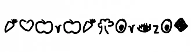
( Fonts by Woodcutter )
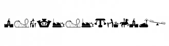
A decorative pictogram font featuring amusement park icons.
![amusement park フリーフォントのダウンロード]() ダウンロード 255 ダウンロード数@WebFont
ダウンロード 255 ダウンロード数@WebFont -
( Fonts by Misti Hammers - mistifonts.com - Personal-use only. For commercial use please contact owner. )
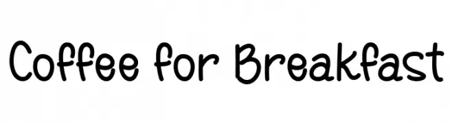
A playful, handwritten font with rounded edges and a casual style.
![Coffee for Breakfast フリーフォントのダウンロード]() ダウンロード 255 ダウンロード数@WebFont
ダウンロード 255 ダウンロード数@WebFont -
( Fonts by Roland Huse - rolandhuse.com )
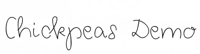
A playful and whimsical script font with smooth, rounded strokes.
![Chickpeas Demo フリーフォントのダウンロード]() ダウンロード 255 ダウンロード数@WebFont
ダウンロード 255 ダウンロード数@WebFont -
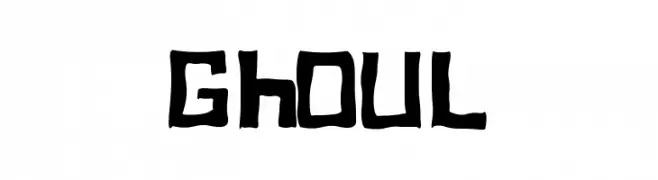
![Ghoul フリーフォントのダウンロード]() ダウンロード 255 ダウンロード数@WebFont
ダウンロード 255 ダウンロード数@WebFont -
-
( Fonts by Inayati Thahir - Personal-use only. For commercial use please contact owner. )
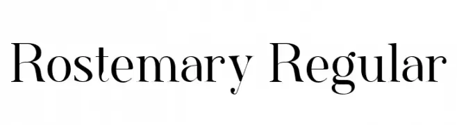
A classic serif font with elegant strokes and high contrast.
![Rostemary Regular フリーフォントのダウンロード]() ダウンロード 255 ダウンロード数@WebFont
ダウンロード 255 ダウンロード数@WebFont -
( Fonts by Eimantas Paškonis - Personal-use only. For commercial use please contact owner. )
A modern, geometric sans-serif font with clean lines and balanced spacing.
![Neris Light フリーフォントのダウンロード]() ダウンロード 255 ダウンロード数@WebFont
ダウンロード 255 ダウンロード数@WebFont -
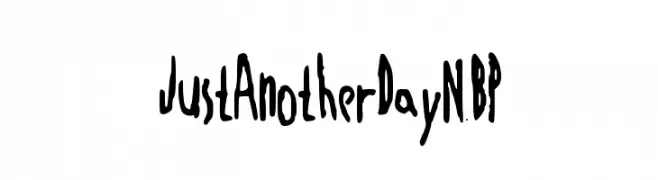
![JustAnotherDayNBP フリーフォントのダウンロード]() ダウンロード 255 ダウンロード数@WebFont
ダウンロード 255 ダウンロード数@WebFont -
( Fonts by www.woodcutter.es - woodcutter Manero - Personal-use only. For commercial use please contact owner. )
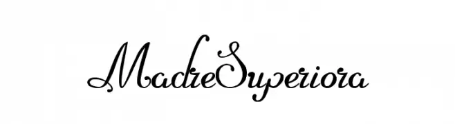
An elegant script font with ornate uppercase and smooth, connected lowercase letters.
![Madre Superiora フリーフォントのダウンロード]() ダウンロード 255 ダウンロード数@WebFont
ダウンロード 255 ダウンロード数@WebFont -
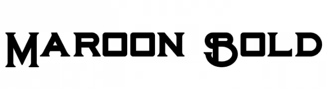
( Peter Olexa - www.dealjumbo.com )
A bold, geometric font with sharp edges and a modern vintage feel.
![Maroon Bold フリーフォントのダウンロード]() ダウンロード 255 ダウンロード数@WebFont
ダウンロード 255 ダウンロード数@WebFont

今のトップフォントは?
は、クリーンな造形と広い適用範囲で支持を集めています。 ブランディングからランディングページ、ポスターまで活躍します。
ロゴで人気のフォントは?
幾何学系の サンセリフ(例: Poppins、Gotham 系のファミリー)は、スケーラブルでクリーンな印象に最適。 親しみやすさを出すなら スクリプト や手書き系も定番です。 見出しは力強く、本文はニュートラルに──この組み合わせが認知とバランスを高めます。
人気リストはどのくらいの頻度で更新される?
ダウンロード数やエンゲージメントに基づき定期的に更新します。 こまめにチェックして、次に流行るフォントを先取りしましょう。
💡 ヒント: このページをブックマークしておくと便利です。トレンドは速く、今のトップが明日のリブランディングを導くこともあります。