人気フォント セクションへようこそ。ここでは「よくダウンロードされ、よく使われている」実績ある書体をまとめています。 ロゴ、Web、SNS のどれにも使いやすい、外さない選択肢が見つかります。
どの トップフォント も、バランス・可読性・汎用性で高評価です。 モダン・サンセリフ、エレガントなスクリプト、ヴィンテージなセリフ、ミニマルなディスプレイなどを厳選しています。
-
( Fonts by www.vicfieger.com )
A bold, industrial font with a distinctive shadow effect for a three-dimensional look.
 ダウンロード 3596 ダウンロード数@WebFont
 -
フォント by defharo. For commercial use please contact the owner.
![GlotonaBlack フリーフォントのダウンロード]() ダウンロード 3595 ダウンロード数@WebFont
ダウンロード 3595 ダウンロード数@WebFont -
フォント by NimaVisual. For commercial use please contact the owner.
( Freeware fonts by Nima Visual - http://be.net/NImaVisual )
A futuristic, geometric font with bold, angular letterforms.
![moonhouse フリーフォントのダウンロード]() ダウンロード 3595 ダウンロード数@WebFont
ダウンロード 3595 ダウンロード数@WebFont -
( Fonts by Daniel Zadorozny - www.iconian.com )
A futuristic, geometric font with bold, angular letterforms and a condensed width.
![4114 Blaster Condensed フリーフォントのダウンロード]() ダウンロード 3594 ダウンロード数@WebFont
ダウンロード 3594 ダウンロード数@WebFont -
( THESE ARE SHAREWARE FONTS ! NOT FREEWARE ! PLEASE VISIT www.fuelfonts.com )
A bold, geometric font with thick strokes and a strong, cohesive design.
![Makimango フリーフォントのダウンロード]() ダウンロード 3593 ダウンロード数@WebFont
ダウンロード 3593 ダウンロード数@WebFont -
-
![Wet Paint フリーフォントのダウンロード]() ダウンロード 3593 ダウンロード数@WebFont
ダウンロード 3593 ダウンロード数@WebFont -
![Cookie フリーフォントのダウンロード]() ダウンロード 3591 ダウンロード数@WebFont
ダウンロード 3591 ダウンロード数@WebFont -
![GL-Nummernschild-Mtl フリーフォントのダウンロード]() ダウンロード 3589 ダウンロード数@WebFont
ダウンロード 3589 ダウンロード数@WebFont -
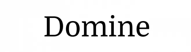
( Copyright (c) 2012, Pablo Impallari (www.impallari.com|impallari@gmail.com) )
A modern serif typeface with elegant, readable characters and balanced proportions.
![Domine フリーフォントのダウンロード]() ダウンロード 3586 ダウンロード数@WebFont
ダウンロード 3586 ダウンロード数@WebFont -
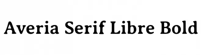
( Copyright (c) 2011, Dan Sayers (i@iotic.com) )
A bold, friendly serif font with rounded edges and a professional appearance.
![Averia Serif Libre Bold フリーフォントのダウンロード]() ダウンロード 3586 ダウンロード数@WebFont
ダウンロード 3586 ダウンロード数@WebFont


今のトップフォントは?
は、クリーンな造形と広い適用範囲で支持を集めています。 ブランディングからランディングページ、ポスターまで活躍します。
ロゴで人気のフォントは?
幾何学系の サンセリフ(例: Poppins、Gotham 系のファミリー)は、スケーラブルでクリーンな印象に最適。 親しみやすさを出すなら スクリプト や手書き系も定番です。 見出しは力強く、本文はニュートラルに──この組み合わせが認知とバランスを高めます。
人気リストはどのくらいの頻度で更新される?
ダウンロード数やエンゲージメントに基づき定期的に更新します。 こまめにチェックして、次に流行るフォントを先取りしましょう。
💡 ヒント: このページをブックマークしておくと便利です。トレンドは速く、今のトップが明日のリブランディングを導くこともあります。