人気フォント セクションへようこそ。ここでは「よくダウンロードされ、よく使われている」実績ある書体をまとめています。 ロゴ、Web、SNS のどれにも使いやすい、外さない選択肢が見つかります。
どの トップフォント も、バランス・可読性・汎用性で高評価です。 モダン・サンセリフ、エレガントなスクリプト、ヴィンテージなセリフ、ミニマルなディスプレイなどを厳選しています。
-
( Fonts by Jacob Fisher - www.pizzadude.dk )
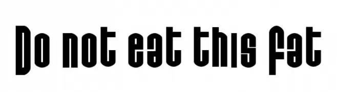
A bold, geometric font with a modern, retro flair and tight character spacing.
 ダウンロード 234 ダウンロード数@WebFont
 -
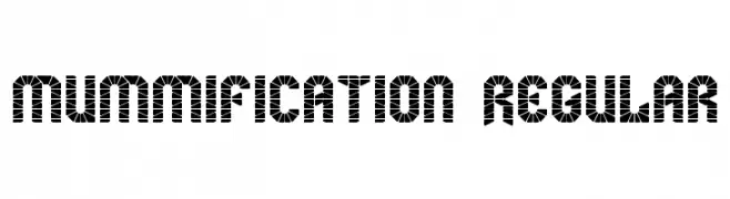
![mummification Regular フリーフォントのダウンロード]() ダウンロード 234 ダウンロード数@WebFont
ダウンロード 234 ダウンロード数@WebFont -
( Fonts by Rich Gast - www.greywolfwebworks.com OFF SITE )
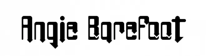
A bold, geometric font with sharp angles and a modern style.
![Angie BareFoot フリーフォントのダウンロード]() ダウンロード 234 ダウンロード数
ダウンロード 234 ダウンロード数 -
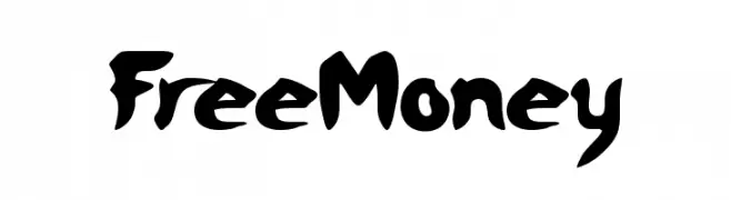
![FreeMoney フリーフォントのダウンロード]() ダウンロード 234 ダウンロード数@WebFont
ダウンロード 234 ダウンロード数@WebFont -
( Fonts by Jacob Fisher - www.pizzadude.dk )
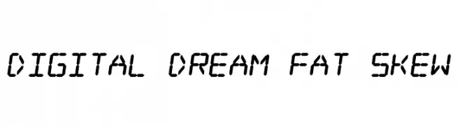
A futuristic, skewed font with a digital, geometric style.
![Digital dream Fat Skew フリーフォントのダウンロード]() ダウンロード 234 ダウンロード数@WebFont
ダウンロード 234 ダウンロード数@WebFont -
-
( Måns Grebäck - www.mansgreback.com )
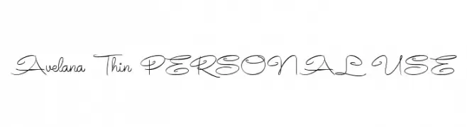
A delicate and elegant script font with thin, flowing lines.
![Avelana Thin PERSONAL USE フリーフォントのダウンロード]() ダウンロード 234 ダウンロード数@WebFont
ダウンロード 234 ダウンロード数@WebFont -
( Fonts by Iconian Fonts )
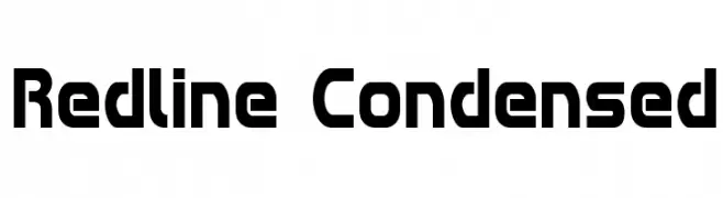
A bold, geometric, and condensed font with a modern and futuristic style.
![Redline Condensed フリーフォントのダウンロード]() ダウンロード 234 ダウンロード数@WebFont
ダウンロード 234 ダウンロード数@WebFont -
( Font by Jayvee D. Enaguas - grandchaos9000.deviantart.com )
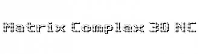
A 3D dot matrix font with a futuristic and digital aesthetic.
![Matrix Complex 3D NC フリーフォントのダウンロード]() ダウンロード 234 ダウンロード数@WebFont
ダウンロード 234 ダウンロード数@WebFont -
( These fonts are free to use in any private, recreational manner.For commercial go to www.flopdesign.com/fordesign/font.html )
A bold, angular font with a futuristic and geometric design.
![pers フリーフォントのダウンロード]() ダウンロード 234 ダウンロード数@WebFont
ダウンロード 234 ダウンロード数@WebFont -
![BunchOLines フリーフォントのダウンロード]() ダウンロード 234 ダウンロード数
ダウンロード 234 ダウンロード数

今のトップフォントは?
は、クリーンな造形と広い適用範囲で支持を集めています。 ブランディングからランディングページ、ポスターまで活躍します。
ロゴで人気のフォントは?
幾何学系の サンセリフ(例: Poppins、Gotham 系のファミリー)は、スケーラブルでクリーンな印象に最適。 親しみやすさを出すなら スクリプト や手書き系も定番です。 見出しは力強く、本文はニュートラルに──この組み合わせが認知とバランスを高めます。
人気リストはどのくらいの頻度で更新される?
ダウンロード数やエンゲージメントに基づき定期的に更新します。 こまめにチェックして、次に流行るフォントを先取りしましょう。
💡 ヒント: このページをブックマークしておくと便利です。トレンドは速く、今のトップが明日のリブランディングを導くこともあります。