人気フォント セクションへようこそ。ここでは「よくダウンロードされ、よく使われている」実績ある書体をまとめています。 ロゴ、Web、SNS のどれにも使いやすい、外さない選択肢が見つかります。
どの トップフォント も、バランス・可読性・汎用性で高評価です。 モダン・サンセリフ、エレガントなスクリプト、ヴィンテージなセリフ、ミニマルなディスプレイなどを厳選しています。
-
 ダウンロード 232 ダウンロード数@WebFont
 -
( Fonts by Kevin Richey - Personal-use only. For commercial use please contact owner. )
A whimsical and artistic font with elongated, curvy lines and decorative elements.
![Absinthe フリーフォントのダウンロード]() ダウンロード 232 ダウンロード数@WebFont
ダウンロード 232 ダウンロード数@WebFont -
![Decibel Dingbats フリーフォントのダウンロード]() ダウンロード 232 ダウンロード数@WebFont
ダウンロード 232 ダウンロード数@WebFont -
( Typodermic Fonts - Ray Larabie - www.typodermicfonts.com/ )
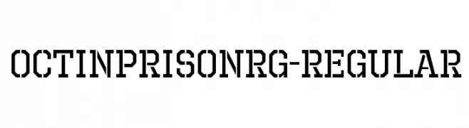
A bold, industrial font with a geometric, stencil-like design.
![OctinPrisonRg-Regular フリーフォントのダウンロード]() ダウンロード 232 ダウンロード数@WebFont
ダウンロード 232 ダウンロード数@WebFont -
( Fonts by a Claude Pelletier . Personal-use only. For commercial use please contact owner. )
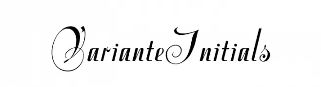
An elegant script font with flowing curves and sharp edges, perfect for refined designs.
![VarianteInitials フリーフォントのダウンロード]() ダウンロード 232 ダウンロード数@WebFont
ダウンロード 232 ダウンロード数@WebFont -
-
![Grudge 2 BRK フリーフォントのダウンロード]() ダウンロード 232 ダウンロード数@WebFont
ダウンロード 232 ダウンロード数@WebFont -
![SF Eccentric Opus Condensed Oblique フリーフォントのダウンロード]() ダウンロード 232 ダウンロード数@WebFont
ダウンロード 232 ダウンロード数@WebFont -
( Fonts by Eko Bimantara - Personal-use only. For commercial use please contact owner. )
A bold, classic serif font with strong, pronounced strokes and well-defined serifs.
![AnkoPersonalUse-Bold フリーフォントのダウンロード]() ダウンロード 232 ダウンロード数@WebFont
ダウンロード 232 ダウンロード数@WebFont -
![bistort フリーフォントのダウンロード]() ダウンロード 232 ダウンロード数@WebFont
ダウンロード 232 ダウンロード数@WebFont -
( Fonts by Manfred Klein - manfred-klein.ina-mar.com )
Energetic silhouette figures representing fitness and athletic activities.
![FitnessSilhouettes フリーフォントのダウンロード]() ダウンロード 232 ダウンロード数@WebFont
ダウンロード 232 ダウンロード数@WebFont


今のトップフォントは?
は、クリーンな造形と広い適用範囲で支持を集めています。 ブランディングからランディングページ、ポスターまで活躍します。
ロゴで人気のフォントは?
幾何学系の サンセリフ(例: Poppins、Gotham 系のファミリー)は、スケーラブルでクリーンな印象に最適。 親しみやすさを出すなら スクリプト や手書き系も定番です。 見出しは力強く、本文はニュートラルに──この組み合わせが認知とバランスを高めます。
人気リストはどのくらいの頻度で更新される?
ダウンロード数やエンゲージメントに基づき定期的に更新します。 こまめにチェックして、次に流行るフォントを先取りしましょう。
💡 ヒント: このページをブックマークしておくと便利です。トレンドは速く、今のトップが明日のリブランディングを導くこともあります。