人気フォント セクションへようこそ。ここでは「よくダウンロードされ、よく使われている」実績ある書体をまとめています。 ロゴ、Web、SNS のどれにも使いやすい、外さない選択肢が見つかります。
どの トップフォント も、バランス・可読性・汎用性で高評価です。 モダン・サンセリフ、エレガントなスクリプト、ヴィンテージなセリフ、ミニマルなディスプレイなどを厳選しています。
-
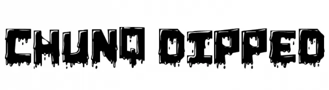
( Fonts by Bud White. Personal-use only. For commercial use please contact owner. )
A bold, dripping font with a dynamic and edgy appearance.
 ダウンロード 228 ダウンロード数@WebFont
 -
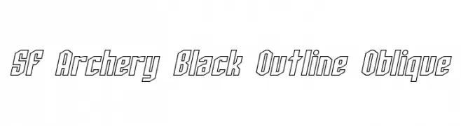
( Fonts by ShyFonts )
A bold, outlined, oblique font with sharp angles and a modern look.
![SF Archery Black Outline Oblique フリーフォントのダウンロード]() ダウンロード 228 ダウンロード数@WebFont
ダウンロード 228 ダウンロード数@WebFont -
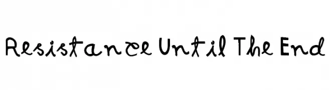
( Fonts by Galdino Otten - galdinootten.com )
A bold, hand-drawn font with an expressive and playful style.
![Resistance Until The End フリーフォントのダウンロード]() ダウンロード 228 ダウンロード数@WebFont
ダウンロード 228 ダウンロード数@WebFont -
![enen eng フリーフォントのダウンロード]() ダウンロード 228 ダウンロード数@WebFont
ダウンロード 228 ダウンロード数@WebFont -
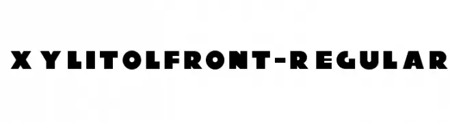
( Typodermic Fonts - Ray Larabie - www.typodermicfonts.com/ )
A bold, geometric font with strong, rounded characters and a modern style.
![XylitolFront-Regular フリーフォントのダウンロード]() ダウンロード 228 ダウンロード数@WebFont
ダウンロード 228 ダウンロード数@WebFont -
-
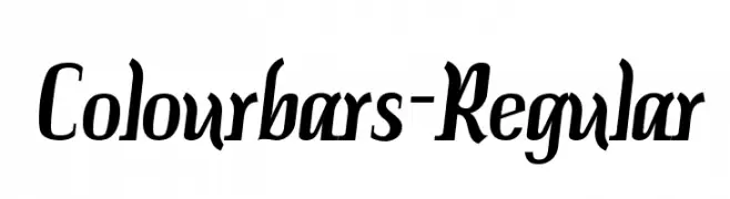
( Fonts by www.typodermicfonts.com - Ray Larabie )
A dynamic and flowing font combining script and serif elements.
![Colourbars-Regular フリーフォントのダウンロード]() ダウンロード 228 ダウンロード数@WebFont
ダウンロード 228 ダウンロード数@WebFont -
![Drunker [sRB] フリーフォントのダウンロード]() ダウンロード 228 ダウンロード数@WebFont
ダウンロード 228 ダウンロード数@WebFont -
( Fonts by Spork Thug Typography - Josh Wilhelm - www.lifewithouttaffy.com/taffy/blog )
A bold, textured font with a distressed, wave-like appearance.
![Undertow フリーフォントのダウンロード]() ダウンロード 228 ダウンロード数@WebFont
ダウンロード 228 ダウンロード数@WebFont -
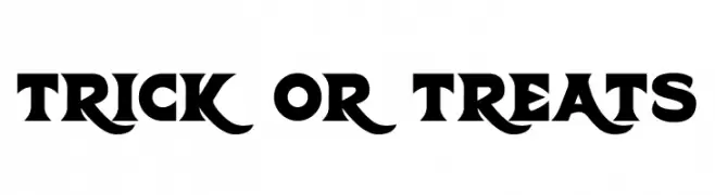
( Fonts by Hawtpixel )
A bold, gothic-style font with sharp serifs and dramatic flair.
![Trick Or Treats フリーフォントのダウンロード]() ダウンロード 228 ダウンロード数@WebFont
ダウンロード 228 ダウンロード数@WebFont -
( Tami Vu - thepinksushi.com )
A playful, hand-drawn font with tall, narrow characters and a whimsical style.
![6PM フリーフォントのダウンロード]() ダウンロード 228 ダウンロード数@WebFont
ダウンロード 228 ダウンロード数@WebFont
![Drunker [sRB] フリーフォントのダウンロード](https://d144mzi0q5mijx.cloudfront.net/img/D/R/Drunker-sRB.webp)

今のトップフォントは?
は、クリーンな造形と広い適用範囲で支持を集めています。 ブランディングからランディングページ、ポスターまで活躍します。
ロゴで人気のフォントは?
幾何学系の サンセリフ(例: Poppins、Gotham 系のファミリー)は、スケーラブルでクリーンな印象に最適。 親しみやすさを出すなら スクリプト や手書き系も定番です。 見出しは力強く、本文はニュートラルに──この組み合わせが認知とバランスを高めます。
人気リストはどのくらいの頻度で更新される?
ダウンロード数やエンゲージメントに基づき定期的に更新します。 こまめにチェックして、次に流行るフォントを先取りしましょう。
💡 ヒント: このページをブックマークしておくと便利です。トレンドは速く、今のトップが明日のリブランディングを導くこともあります。