人気フォント セクションへようこそ。ここでは「よくダウンロードされ、よく使われている」実績ある書体をまとめています。 ロゴ、Web、SNS のどれにも使いやすい、外さない選択肢が見つかります。
どの トップフォント も、バランス・可読性・汎用性で高評価です。 モダン・サンセリフ、エレガントなスクリプト、ヴィンテージなセリフ、ミニマルなディスプレイなどを厳選しています。
-
( Fonts by Levi Halmos )
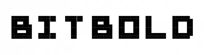
A dramatic, elongated font with sharp serifs and a gothic flair.
 ダウンロード 227 ダウンロード数@WebFont
 -
![BitBold フリーフォントのダウンロード]() ダウンロード 227 ダウンロード数@WebFont
ダウンロード 227 ダウンロード数@WebFont -
( Fonts by Nick Curtis - www.nicksfonts.com )
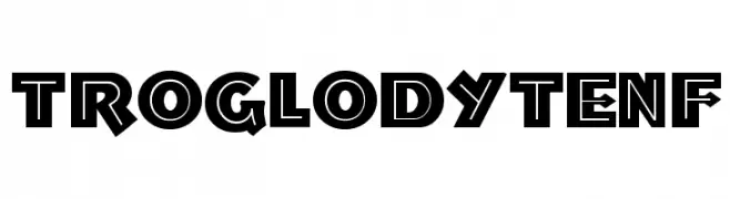
A bold, geometric font with a playful, three-dimensional style.
![TroglodyteNF フリーフォントのダウンロード]() ダウンロード 227 ダウンロード数@WebFont
ダウンロード 227 ダウンロード数@WebFont -
( Fonts by Galdino Otten Fonts - www.galdinootten.com - Personal-use only. For commercial use please contact owner. )
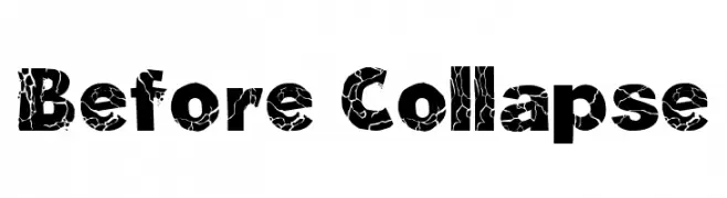
A bold, distressed font with a cracked texture for an edgy look.
![Before Collapse フリーフォントのダウンロード]() ダウンロード 227 ダウンロード数@WebFont
ダウンロード 227 ダウンロード数@WebFont -
( Fonts by a Max Infeld - XEROGRAPHER FONTS - xerographer.blogspot.com . Personal-use only. For commercial use please contact owner. )
A playful, handwritten font with bold strokes and a casual, friendly appearance.
![ComicTans フリーフォントのダウンロード]() ダウンロード 227 ダウンロード数@WebFont
ダウンロード 227 ダウンロード数@WebFont -
-
( Fonts by Jeri Ingalls - littlehouse.homestead.com )
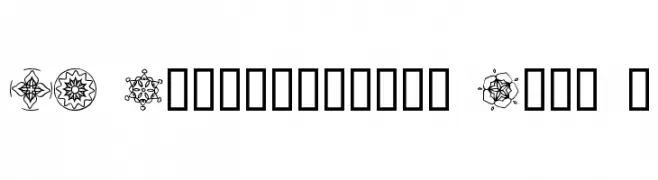
Ornamental dingbat font with kaleidoscopic mandala motifs.
![JI Kaleidoscope Bats 4 フリーフォントのダウンロード]() ダウンロード 227 ダウンロード数@WebFont
ダウンロード 227 ダウンロード数@WebFont -
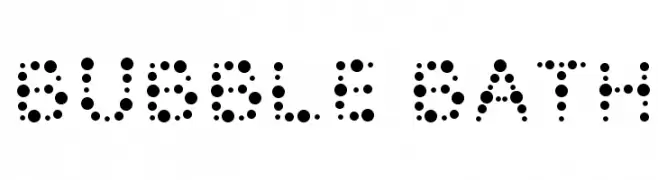
( Fonts by Vanessa Bays - bythebutterfly.com )
A playful, dot-based font ideal for fun and informal projects.
![Bubble Bath フリーフォントのダウンロード]() ダウンロード 227 ダウンロード数@WebFont
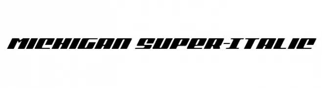
ダウンロード 227 ダウンロード数@WebFont -
![Michigan Super-Italic フリーフォントのダウンロード]() ダウンロード 227 ダウンロード数@WebFont
ダウンロード 227 ダウンロード数@WebFont -
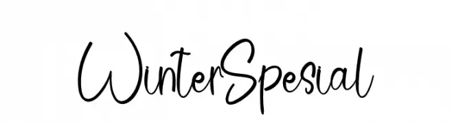
( Fonts by Etik Fatimah )
Playful handwritten font with a modern style.
![Winter Spesial フリーフォントのダウンロード]() ダウンロード 227 ダウンロード数@WebFont
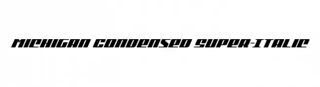
ダウンロード 227 ダウンロード数@WebFont -
![Michigan Condensed Super-Italic フリーフォントのダウンロード]() ダウンロード 227 ダウンロード数@WebFont
ダウンロード 227 ダウンロード数@WebFont

今のトップフォントは?
は、クリーンな造形と広い適用範囲で支持を集めています。 ブランディングからランディングページ、ポスターまで活躍します。
ロゴで人気のフォントは?
幾何学系の サンセリフ(例: Poppins、Gotham 系のファミリー)は、スケーラブルでクリーンな印象に最適。 親しみやすさを出すなら スクリプト や手書き系も定番です。 見出しは力強く、本文はニュートラルに──この組み合わせが認知とバランスを高めます。
人気リストはどのくらいの頻度で更新される?
ダウンロード数やエンゲージメントに基づき定期的に更新します。 こまめにチェックして、次に流行るフォントを先取りしましょう。
💡 ヒント: このページをブックマークしておくと便利です。トレンドは速く、今のトップが明日のリブランディングを導くこともあります。