人気フォント セクションへようこそ。ここでは「よくダウンロードされ、よく使われている」実績ある書体をまとめています。 ロゴ、Web、SNS のどれにも使いやすい、外さない選択肢が見つかります。
どの トップフォント も、バランス・可読性・汎用性で高評価です。 モダン・サンセリフ、エレガントなスクリプト、ヴィンテージなセリフ、ミニマルなディスプレイなどを厳選しています。
-
 ダウンロード 3328 ダウンロード数@WebFont
 -
( Copyright 2019 The Big Shoulders Project Authors (https://github.com/xotypeco/big_shoulders) )
A bold, modern typeface with tall, narrow letterforms and strong vertical emphasis.
![Big Shoulders Display Bold フリーフォントのダウンロード]() ダウンロード 3327 ダウンロード数@WebFont
ダウンロード 3327 ダウンロード数@WebFont -
( Fonts by antoniorodriguesjr.com )
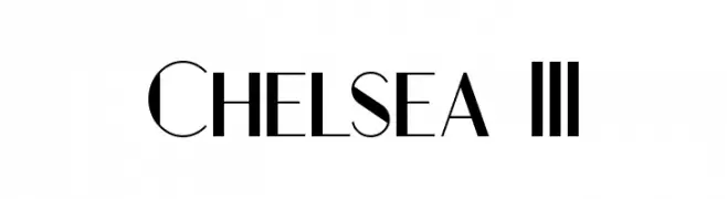
A modern, high-contrast font with elegant, sharp lines and bold numerals.
![Chelsea III フリーフォントのダウンロード]() ダウンロード 3327 ダウンロード数@WebFont
ダウンロード 3327 ダウンロード数@WebFont -
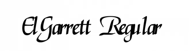
![ElGarrett Regular フリーフォントのダウンロード]() ダウンロード 3327 ダウンロード数@WebFont
ダウンロード 3327 ダウンロード数@WebFont -
![Acid Bold Italic フリーフォントのダウンロード]() ダウンロード 3327 ダウンロード数@WebFont
ダウンロード 3327 ダウンロード数@WebFont -
-
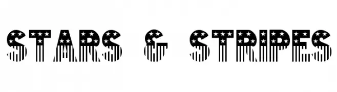
![Stars & Stripes フリーフォントのダウンロード]() ダウンロード 3327 ダウンロード数@WebFont
ダウンロード 3327 ダウンロード数@WebFont -
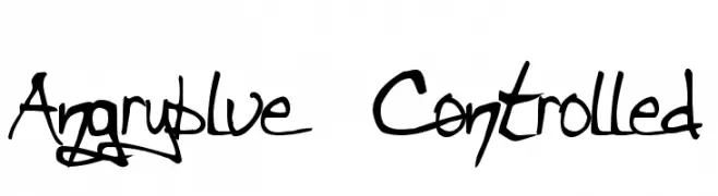
( Fonts by www.angryblue.com )
A bold, hand-drawn font with dynamic strokes and an expressive, rebellious style.
![Angryblue Controlled フリーフォントのダウンロード]() ダウンロード 3327 ダウンロード数@WebFont
ダウンロード 3327 ダウンロード数@WebFont -
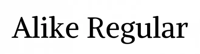
( Copyright (c) 2011, Cyreal (www.cyreal.org), with Reserved Font Name 'Alike'. )
A classic serif font with elegant strokes and balanced readability.
![Alike Regular フリーフォントのダウンロード]() ダウンロード 3326 ダウンロード数@WebFont
ダウンロード 3326 ダウンロード数@WebFont -
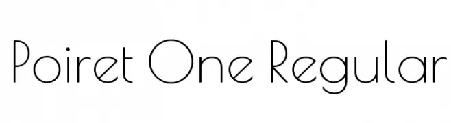
( Copyright 2011 The Poiret One Project Authors (https://github.com/alexeiva/poiretone) )
A sleek, geometric font with a modern and elegant design.
![Poiret One Regular フリーフォントのダウンロード]() ダウンロード 3325 ダウンロード数@WebFont
ダウンロード 3325 ダウンロード数@WebFont -
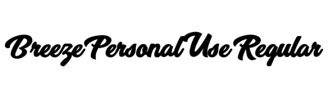
( Fonts by Billy Argel - www.billyargel.com - Personal-use only. For commercial use please contact owner. )
A bold, flowing script font with elegant curves and a modern touch.
![Breeze Personal Use Regular フリーフォントのダウンロード]() ダウンロード 3325 ダウンロード数@WebFont
ダウンロード 3325 ダウンロード数@WebFont


今のトップフォントは?
は、クリーンな造形と広い適用範囲で支持を集めています。 ブランディングからランディングページ、ポスターまで活躍します。
ロゴで人気のフォントは?
幾何学系の サンセリフ(例: Poppins、Gotham 系のファミリー)は、スケーラブルでクリーンな印象に最適。 親しみやすさを出すなら スクリプト や手書き系も定番です。 見出しは力強く、本文はニュートラルに──この組み合わせが認知とバランスを高めます。
人気リストはどのくらいの頻度で更新される?
ダウンロード数やエンゲージメントに基づき定期的に更新します。 こまめにチェックして、次に流行るフォントを先取りしましょう。
💡 ヒント: このページをブックマークしておくと便利です。トレンドは速く、今のトップが明日のリブランディングを導くこともあります。