人気フォント セクションへようこそ。ここでは「よくダウンロードされ、よく使われている」実績ある書体をまとめています。 ロゴ、Web、SNS のどれにも使いやすい、外さない選択肢が見つかります。
どの トップフォント も、バランス・可読性・汎用性で高評価です。 モダン・サンセリフ、エレガントなスクリプト、ヴィンテージなセリフ、ミニマルなディスプレイなどを厳選しています。
-
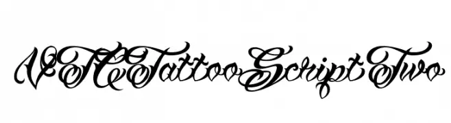
( Fonts by Vigilante Typeface Corporation Larry Yerkes. Personal-use only. For commercial use please contact owner. )
An ornate script font with intricate loops and flourishes, reminiscent of traditional calligraphy.
 ダウンロード 221 ダウンロード数@WebFont
 -
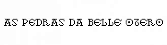
( Fonts by Ruben Prol - www.ipanemagrafica.com )
A pixelated, retro font inspired by early digital displays.
![As pedras da Belle Otero フリーフォントのダウンロード]() ダウンロード 221 ダウンロード数@WebFont
ダウンロード 221 ダウンロード数@WebFont -
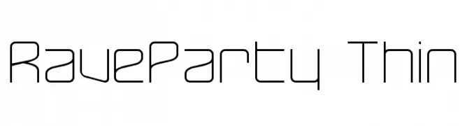
( Fonts by Graham Meade - GemFonts )
A sleek, geometric font with a modern, minimalist design.
![RaveParty Thin フリーフォントのダウンロード]() ダウンロード 221 ダウンロード数@WebFont
ダウンロード 221 ダウンロード数@WebFont -
![Liza Bold Italic フリーフォントのダウンロード]() ダウンロード 221 ダウンロード数
ダウンロード 221 ダウンロード数 -
( Fonts by Youssef Habchi )
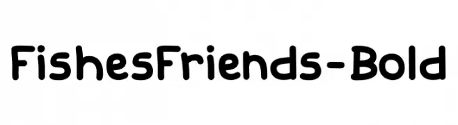
A playful, bold font with rounded, friendly characters.
![FishesFriends-Bold フリーフォントのダウンロード]() ダウンロード 221 ダウンロード数@WebFont
ダウンロード 221 ダウンロード数@WebFont -
-
( Alejandro Londoño - www.londoarq.com )
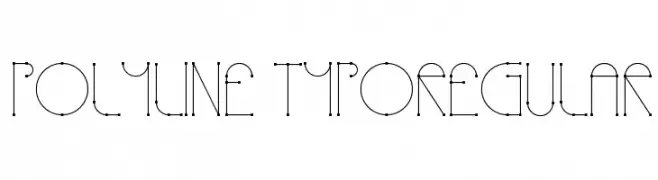
A geometric, modern font with visible nodes and a minimalist design.
![Polyline TypoRegular フリーフォントのダウンロード]() ダウンロード 221 ダウンロード数@WebFont
ダウンロード 221 ダウンロード数@WebFont -
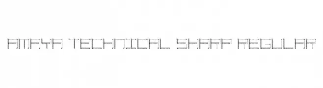
![Amaya Technical Sharp Regular フリーフォントのダウンロード]() ダウンロード 221 ダウンロード数@WebFont
ダウンロード 221 ダウンロード数@WebFont -
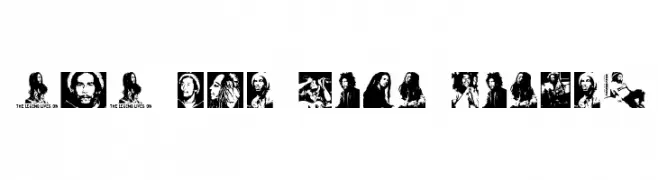
![BOB The Lion Singer フリーフォントのダウンロード]() ダウンロード 221 ダウンロード数@WebFont
ダウンロード 221 ダウンロード数@WebFont -
( Fonts by Alex Slobzheninov - Personal-use only. For commercial use please contact owner. )
A clean, modern font with consistent stroke width and balanced spacing.
![SubjectivitySerif-Light フリーフォントのダウンロード]() ダウンロード 221 ダウンロード数@WebFont
ダウンロード 221 ダウンロード数@WebFont -
( Fonts by Daniel Zadorozny - www.iconian.com )
A bold, dynamic font with thick strokes and a modern, artistic flair.
![Nuevo Passion Expanded フリーフォントのダウンロード]() ダウンロード 221 ダウンロード数@WebFont
ダウンロード 221 ダウンロード数@WebFont

今のトップフォントは?
は、クリーンな造形と広い適用範囲で支持を集めています。 ブランディングからランディングページ、ポスターまで活躍します。
ロゴで人気のフォントは?
幾何学系の サンセリフ(例: Poppins、Gotham 系のファミリー)は、スケーラブルでクリーンな印象に最適。 親しみやすさを出すなら スクリプト や手書き系も定番です。 見出しは力強く、本文はニュートラルに──この組み合わせが認知とバランスを高めます。
人気リストはどのくらいの頻度で更新される?
ダウンロード数やエンゲージメントに基づき定期的に更新します。 こまめにチェックして、次に流行るフォントを先取りしましょう。
💡 ヒント: このページをブックマークしておくと便利です。トレンドは速く、今のトップが明日のリブランディングを導くこともあります。