人気フォント セクションへようこそ。ここでは「よくダウンロードされ、よく使われている」実績ある書体をまとめています。 ロゴ、Web、SNS のどれにも使いやすい、外さない選択肢が見つかります。
どの トップフォント も、バランス・可読性・汎用性で高評価です。 モダン・サンセリフ、エレガントなスクリプト、ヴィンテージなセリフ、ミニマルなディスプレイなどを厳選しています。
-
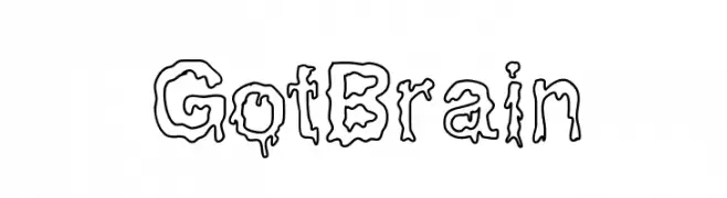
( Fonts by Ramiro Baldivieso - behance.net/baldivieso. Personal-use only. For commercial use please contact owner. )
A dripping, liquid-style font perfect for spooky or whimsical designs.
 ダウンロード 209 ダウンロード数@WebFont
 -
( Andrea Gaspari )
A bold, modern sans-serif font with clean lines and strong visual impact.
![FFF フリーフォントのダウンロード]() ダウンロード 209 ダウンロード数@WebFont
ダウンロード 209 ダウンロード数@WebFont -
( Regina Quesada - reginaqr.blogspot.com )
A geometric, monospaced font with clean lines and uniform character width.
![den フリーフォントのダウンロード]() ダウンロード 209 ダウンロード数@WebFont
ダウンロード 209 ダウンロード数@WebFont -
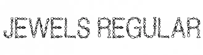
( Fonts by Steve Cloutier - www.cloutierfontes.ca )
A decorative font with letters formed by jewel-like shapes, perfect for artistic projects.
![Jewels Regular フリーフォントのダウンロード]() ダウンロード 209 ダウンロード数@WebFont
ダウンロード 209 ダウンロード数@WebFont -
![RansomThreat フリーフォントのダウンロード]() ダウンロード 209 ダウンロード数@WebFont
ダウンロード 209 ダウンロード数@WebFont -
-
![Saavaeri Regular フリーフォントのダウンロード]() ダウンロード 209 ダウンロード数@WebFont
ダウンロード 209 ダウンロード数@WebFont -
![Ags フリーフォントのダウンロード]() ダウンロード 209 ダウンロード数@WebFont
ダウンロード 209 ダウンロード数@WebFont -
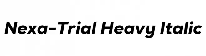
( Fonts by Fontfabric - Svetoslav Simov - Personal-use only. For commercial use please contact owner. )
A bold, italicized sans-serif font with a modern and dynamic style.
![Nexa-Trial Heavy Italic フリーフォントのダウンロード]() ダウンロード 209 ダウンロード数@WebFont
ダウンロード 209 ダウンロード数@WebFont -
( Fonts by Daniel Zadorozny - www.iconian.com - Free for personal use )
A bold, italic blackletter-inspired font with dynamic, decorative characters.
![Biergärten Laser Italic フリーフォントのダウンロード]() ダウンロード 209 ダウンロード数@WebFont
ダウンロード 209 ダウンロード数@WebFont -
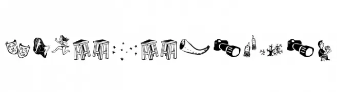
( Fonts by Galdino Otten - Personal-use only. For commercial use please contact owner. )
A pictogram font with folk-inspired, hand-drawn illustrations.
![Cordel de Mangai フリーフォントのダウンロード]() ダウンロード 209 ダウンロード数@WebFont
ダウンロード 209 ダウンロード数@WebFont


今のトップフォントは?
は、クリーンな造形と広い適用範囲で支持を集めています。 ブランディングからランディングページ、ポスターまで活躍します。
ロゴで人気のフォントは?
幾何学系の サンセリフ(例: Poppins、Gotham 系のファミリー)は、スケーラブルでクリーンな印象に最適。 親しみやすさを出すなら スクリプト や手書き系も定番です。 見出しは力強く、本文はニュートラルに──この組み合わせが認知とバランスを高めます。
人気リストはどのくらいの頻度で更新される?
ダウンロード数やエンゲージメントに基づき定期的に更新します。 こまめにチェックして、次に流行るフォントを先取りしましょう。
💡 ヒント: このページをブックマークしておくと便利です。トレンドは速く、今のトップが明日のリブランディングを導くこともあります。