人気フォント セクションへようこそ。ここでは「よくダウンロードされ、よく使われている」実績ある書体をまとめています。 ロゴ、Web、SNS のどれにも使いやすい、外さない選択肢が見つかります。
どの トップフォント も、バランス・可読性・汎用性で高評価です。 モダン・サンセリフ、エレガントなスクリプト、ヴィンテージなセリフ、ミニマルなディスプレイなどを厳選しています。
-
 ダウンロード 876 ダウンロード数@WebFont
 -
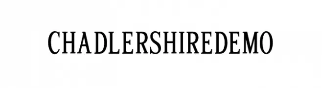
( Peter S. Baker - faculty.virginia.edu/oldenglish/ )
A classic serif font with elegant proportions and sharp serifs.
![JuniusSmallCaps フリーフォントのダウンロード]() ダウンロード 876 ダウンロード数@WebFont
ダウンロード 876 ダウンロード数@WebFont -
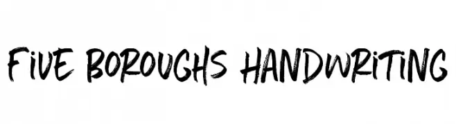
( Fonts by Callie Hegstrom - www.makemediaco.com - Personal-use only. For commercial use please contact owner. )
A bold, brush-style font with dynamic, hand-painted strokes.
![Five Boroughs Handwriting フリーフォントのダウンロード]() ダウンロード 876 ダウンロード数@WebFont
ダウンロード 876 ダウンロード数@WebFont -
( Fonts by Olivier Mordefroid )
A playful, handwritten font with a casual and whimsical style.
![123Bambou フリーフォントのダウンロード]() ダウンロード 876 ダウンロード数@WebFont
ダウンロード 876 ダウンロード数@WebFont -
![Unisketch-light_limited Light フリーフォントのダウンロード]() ダウンロード 876 ダウンロード数@WebFont
ダウンロード 876 ダウンロード数@WebFont -
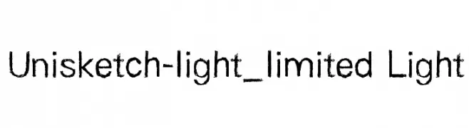
( Fonts by Dieter Steffmann )
A bold, shadowed font with a classic serif touch, perfect for impactful headlines.
![Hansen Shadow フリーフォントのダウンロード]() ダウンロード 876 ダウンロード数@WebFont
ダウンロード 876 ダウンロード数@WebFont -
( Fonts by Michael Tension - www.TensionType.com )
A modern, geometric sans-serif font with balanced spacing and clear legibility.
![Sans I Am フリーフォントのダウンロード]() ダウンロード 876 ダウンロード数@WebFont
ダウンロード 876 ダウンロード数@WebFont -
( Fonts by Tup Wanders - www.tupwanders.nl )
A bold, rounded font with smooth curves and uniform strokes.
![effortless フリーフォントのダウンロード]() ダウンロード 876 ダウンロード数@WebFont
ダウンロード 876 ダウンロード数@WebFont -
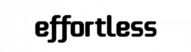
( Fonts by www.artill.de - Lukas Bischoff )
A modern geometric sans-serif font with clean lines and balanced proportions.
![lelim 800 フリーフォントのダウンロード]() ダウンロード 876 ダウンロード数@WebFont
ダウンロード 876 ダウンロード数@WebFont -
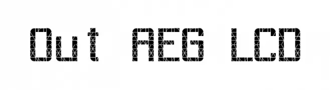
![Out AEG LCD フリーフォントのダウンロード]() ダウンロード 876 ダウンロード数@WebFont
ダウンロード 876 ダウンロード数@WebFont -
( Fonts by Audrius Skersys - www.extate.lt )
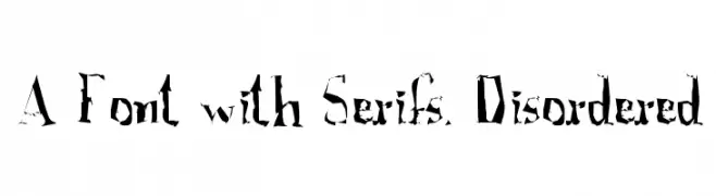
A bold, serif font with a distressed and disordered appearance.
![A Font with Serifs. Disordered フリーフォントのダウンロード]() ダウンロード 876 ダウンロード数@WebFont
ダウンロード 876 ダウンロード数@WebFont -
( Fonts by www.fugit-tempus.de )
A bold, Gothic-inspired font with tall, narrow characters and strong vertical emphasis.
![SF Iron Gothic Bold フリーフォントのダウンロード]() ダウンロード 876 ダウンロード数@WebFont
ダウンロード 876 ダウンロード数@WebFont -
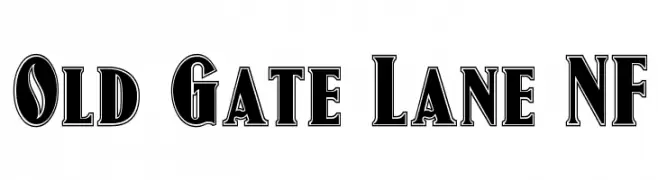
( Fonts by Nick Curtis - www.nicksfonts.com )
A bold, shadowed serif font with a classic yet modern style.
![Old Gate Lane NF フリーフォントのダウンロード]() ダウンロード 876 ダウンロード数@WebFont
ダウンロード 876 ダウンロード数@WebFont -
![GlOrY BoLd フリーフォントのダウンロード]() ダウンロード 876 ダウンロード数@WebFont
ダウンロード 876 ダウンロード数@WebFont -
![Push2Black フリーフォントのダウンロード]() ダウンロード 876 ダウンロード数@WebFont
ダウンロード 876 ダウンロード数@WebFont -
![broccoli フリーフォントのダウンロード]() ダウンロード 876 ダウンロード数@WebFont
ダウンロード 876 ダウンロード数@WebFont -
( Fonts by Lafontype - Anugrah Pasau - Personal-use only. For commercial use please contact owner. )
A bold, modern sans-serif font with clean lines and strong presence.
![Cedora-Bold フリーフォントのダウンロード]() ダウンロード 875 ダウンロード数@WebFont
ダウンロード 875 ダウンロード数@WebFont -
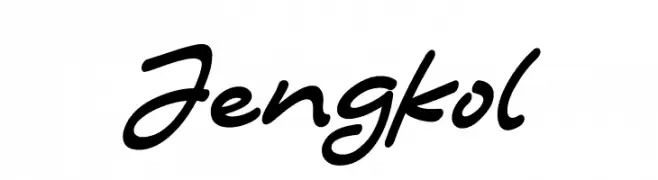
( Fonts by Syaf Rizal - www.creativefabrica.com/ref/53/ - Personal-use only. For commercial use please contact owner. )
A dynamic and fluid script font with smooth, flowing strokes.
![Jengkol フリーフォントのダウンロード]() ダウンロード 875 ダウンロード数@WebFont
ダウンロード 875 ダウンロード数@WebFont -
( Fonts by Huerta Tipográfica - Personal-use only. For commercial use please contact owner. )
A bold, modern serif font with strong, confident letterforms.
![Andada Bold フリーフォントのダウンロード]() ダウンロード 875 ダウンロード数@WebFont
ダウンロード 875 ダウンロード数@WebFont -
( loosydesign - Fabian Pfeifhofer - www.loosydesign.com )
A bold, modern sans-serif font with geometric shapes and smooth curves.
![helvari Bold フリーフォントのダウンロード]() ダウンロード 875 ダウンロード数@WebFont
ダウンロード 875 ダウンロード数@WebFont -
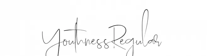
![Youthness-Regular フリーフォントのダウンロード]() ダウンロード 875 ダウンロード数@WebFont
ダウンロード 875 ダウンロード数@WebFont -
( Copyright 2017, The Mozilla Foundation )
A modern slab serif font with strong geometric shapes and consistent stroke width.
![Zilla Slab Highlight フリーフォントのダウンロード]() ダウンロード 875 ダウンロード数@WebFont
ダウンロード 875 ダウンロード数@WebFont -
( Fonts by a Jayvee Enaguas - harvettfox96.deviantart.com. Personal-use only. For commercial use please contact owner. )
A bold, pixelated font with a retro, digital aesthetic.
![Pixel Operator SC Bold フリーフォントのダウンロード]() ダウンロード 875 ダウンロード数@WebFont
ダウンロード 875 ダウンロード数@WebFont -
( Fonts by Art of Mai )
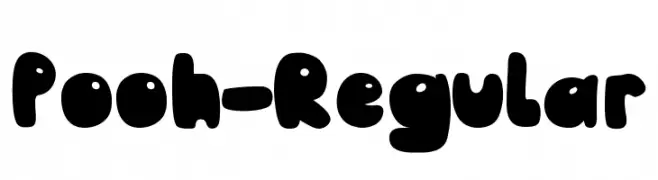
A playful, bold font with rounded, bubble-like characters.
![Pooh-Regular フリーフォントのダウンロード]() ダウンロード 875 ダウンロード数@WebFont
ダウンロード 875 ダウンロード数@WebFont -
( Fonts by www.blambot.com )
A bold, playful, and dynamic font with rounded, slanted characters.
![BlowholeBB-Italic フリーフォントのダウンロード]() ダウンロード 875 ダウンロード数@WebFont
ダウンロード 875 ダウンロード数@WebFont -
( Fonts by Grzegorz l - www.glukfonts.pl )
A bold, modern typeface with clean lines and a strong presence.
![Resagokr Bold フリーフォントのダウンロード]() ダウンロード 875 ダウンロード数@WebFont
ダウンロード 875 ダウンロード数@WebFont -
( Fonts by Daniel Zadorozny - www.iconian.com - Free for personal use )
A bold, italic, and condensed font with a dynamic and energetic style.
![Nightwraith Condensed Italic フリーフォントのダウンロード]() ダウンロード 875 ダウンロード数@WebFont
ダウンロード 875 ダウンロード数@WebFont -
( - dhezonk.tumblr.com/ )
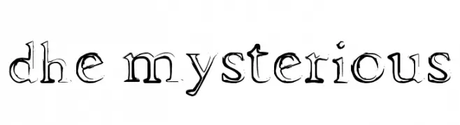
A decorative serif font with artistic, hand-drawn embellishments.
![dhe mysterious フリーフォントのダウンロード]() ダウンロード 875 ダウンロード数@WebFont
ダウンロード 875 ダウンロード数@WebFont -
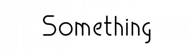
![Something フリーフォントのダウンロード]() ダウンロード 875 ダウンロード数@WebFont
ダウンロード 875 ダウンロード数@WebFont -
( Fonts by Jay Hilgert - www.bittbox.com )
A decorative, sketch-like font with bold outlines and intricate hatching.
![BB Petie Boy Medium フリーフォントのダウンロード]() ダウンロード 875 ダウンロード数@WebFont
ダウンロード 875 ダウンロード数@WebFont -
( Fonts by or from www.graffitifonts.net )
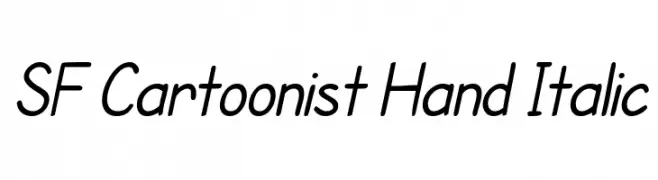
A playful, handwritten font with a slight slant and rounded characters.
![SF Cartoonist Hand Italic フリーフォントのダウンロード]() ダウンロード 875 ダウンロード数@WebFont
ダウンロード 875 ダウンロード数@WebFont -
![Buds and Blossoms フリーフォントのダウンロード]() ダウンロード 875 ダウンロード数@WebFont
ダウンロード 875 ダウンロード数@WebFont -
( Fonts by Paul Lloyd )
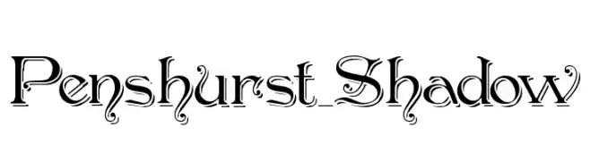
An ornate and decorative font with shadow effects and intricate details.
![Penshurst_Shadow フリーフォントのダウンロード]() ダウンロード 875 ダウンロード数
ダウンロード 875 ダウンロード数 -
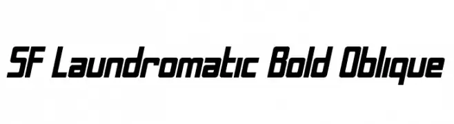
![SF Laundromatic Bold Oblique フリーフォントのダウンロード]() ダウンロード 875 ダウンロード数@WebFont
ダウンロード 875 ダウンロード数@WebFont -
( Fonts by Graham Meade - GemFonts )
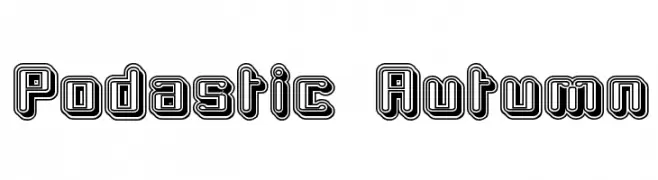
A bold, retro font with a playful, three-dimensional outline effect.
![Podastic Autumn フリーフォントのダウンロード]() ダウンロード 875 ダウンロード数@WebFont
ダウンロード 875 ダウンロード数@WebFont


今のトップフォントは?
は、クリーンな造形と広い適用範囲で支持を集めています。 ブランディングからランディングページ、ポスターまで活躍します。
ロゴで人気のフォントは?
幾何学系の サンセリフ(例: Poppins、Gotham 系のファミリー)は、スケーラブルでクリーンな印象に最適。 親しみやすさを出すなら スクリプト や手書き系も定番です。 見出しは力強く、本文はニュートラルに──この組み合わせが認知とバランスを高めます。
人気リストはどのくらいの頻度で更新される?
ダウンロード数やエンゲージメントに基づき定期的に更新します。 こまめにチェックして、次に流行るフォントを先取りしましょう。
💡 ヒント: このページをブックマークしておくと便利です。トレンドは速く、今のトップが明日のリブランディングを導くこともあります。