人気フォント セクションへようこそ。ここでは「よくダウンロードされ、よく使われている」実績ある書体をまとめています。 ロゴ、Web、SNS のどれにも使いやすい、外さない選択肢が見つかります。
どの トップフォント も、バランス・可読性・汎用性で高評価です。 モダン・サンセリフ、エレガントなスクリプト、ヴィンテージなセリフ、ミニマルなディスプレイなどを厳選しています。
-
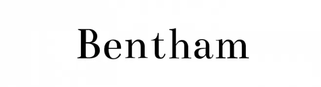
( Copyright (c) 2010, Ben Weiner (ben@readingtype.org.uk) )
A classic serif font with elegant strokes and refined details.
 ダウンロード 3083 ダウンロード数@WebFont
 -
( Roger White - web.archive.org/web/20120416090521/www.rogersfonts.org.uk/ )
A bold serif font with strong vertical strokes and slightly curved serifs, ideal for impactful headlines.
![Cardiff Bold フリーフォントのダウンロード]() ダウンロード 3082 ダウンロード数@WebFont
ダウンロード 3082 ダウンロード数@WebFont -
![Tradizione Slim フリーフォントのダウンロード]() ダウンロード 3082 ダウンロード数@WebFont
ダウンロード 3082 ダウンロード数@WebFont -
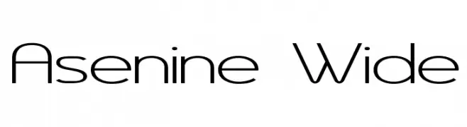
( Fonts by Apostrophic Lab )
A modern, geometric font with clean lines and a wide stance.
![Asenine Wide フリーフォントのダウンロード]() ダウンロード 3082 ダウンロード数@WebFont
ダウンロード 3082 ダウンロード数@WebFont -
フォント by tomtor. For commercial use please contact the owner.
![Enso フリーフォントのダウンロード]() ダウンロード 3081 ダウンロード数@WebFont
ダウンロード 3081 ダウンロード数@WebFont -
-
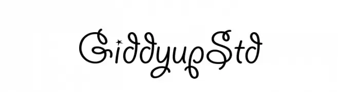
![GiddyupStd フリーフォントのダウンロード]() ダウンロード 3081 ダウンロード数@WebFont
ダウンロード 3081 ダウンロード数@WebFont -
( Fonts by www.blambot.com )
A bold, energetic script font with smooth, flowing curves and a slightly slanted orientation.
![UnmaskedBB-Bold フリーフォントのダウンロード]() ダウンロード 3080 ダウンロード数@WebFont
ダウンロード 3080 ダウンロード数@WebFont -
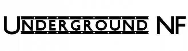
( Fonts by Nick Curtis - www.nicksfonts.com )
A bold, geometric sans-serif font with a modern and clean aesthetic.
![Underground NF フリーフォントのダウンロード]() ダウンロード 3080 ダウンロード数@WebFont
ダウンロード 3080 ダウンロード数@WebFont -
( Fonts by Darrell Flood )
A playful, hand-drawn font with exaggerated serifs and a whimsical style.
![Knick Knack フリーフォントのダウンロード]() ダウンロード 3079 ダウンロード数@WebFont
ダウンロード 3079 ダウンロード数@WebFont -
( Fonts by www.hindson.com.au )
A classic serif font with high contrast and elegant curves, featuring unique musical symbols.
![Tempo Indications Lite フリーフォントのダウンロード]() ダウンロード 3079 ダウンロード数@WebFont
ダウンロード 3079 ダウンロード数@WebFont


今のトップフォントは?
は、クリーンな造形と広い適用範囲で支持を集めています。 ブランディングからランディングページ、ポスターまで活躍します。
ロゴで人気のフォントは?
幾何学系の サンセリフ(例: Poppins、Gotham 系のファミリー)は、スケーラブルでクリーンな印象に最適。 親しみやすさを出すなら スクリプト や手書き系も定番です。 見出しは力強く、本文はニュートラルに──この組み合わせが認知とバランスを高めます。
人気リストはどのくらいの頻度で更新される?
ダウンロード数やエンゲージメントに基づき定期的に更新します。 こまめにチェックして、次に流行るフォントを先取りしましょう。
💡 ヒント: このページをブックマークしておくと便利です。トレンドは速く、今のトップが明日のリブランディングを導くこともあります。