人気フォント セクションへようこそ。ここでは「よくダウンロードされ、よく使われている」実績ある書体をまとめています。 ロゴ、Web、SNS のどれにも使いやすい、外さない選択肢が見つかります。
どの トップフォント も、バランス・可読性・汎用性で高評価です。 モダン・サンセリフ、エレガントなスクリプト、ヴィンテージなセリフ、ミニマルなディスプレイなどを厳選しています。
-
 ダウンロード 193 ダウンロード数@WebFont
 -
( Fonts by Mans Greback - www.mansgreback.com - Personal-use only. For commercial use please contact owner. )
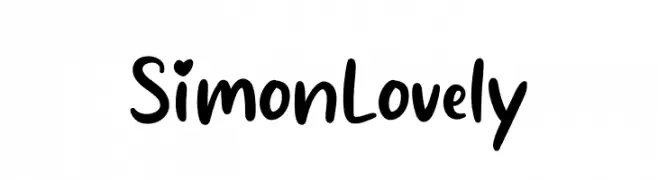
A playful, rounded font with whimsical curves and heart-shaped details.
![Simon Lovely フリーフォントのダウンロード]() ダウンロード 193 ダウンロード数@WebFont
ダウンロード 193 ダウンロード数@WebFont -
( Fonts by Alfredo Marco Pradil - Personal-use only. For commercial use please contact owner. )
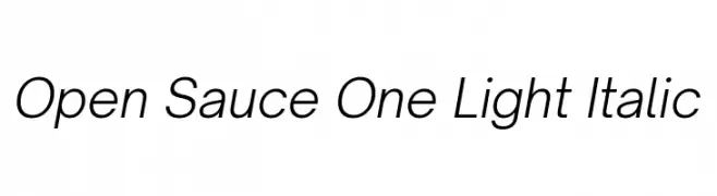
A sleek, modern, light italic font with low contrast and normal spacing.
![Open Sauce One Light Italic フリーフォントのダウンロード]() ダウンロード 193 ダウンロード数@WebFont
ダウンロード 193 ダウンロード数@WebFont -
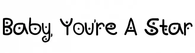
![Baby, You're A Star フリーフォントのダウンロード]() ダウンロード 193 ダウンロード数@WebFont
ダウンロード 193 ダウンロード数@WebFont -
( Fonts by Apostrophic Lab )
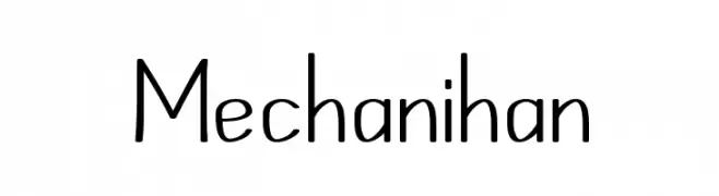
A playful, modern font with rounded curves and a handwritten feel.
![Mechanihan フリーフォントのダウンロード]() ダウンロード 193 ダウンロード数@WebFont
ダウンロード 193 ダウンロード数@WebFont -
-
( Aleksandr Savenkov - asavenkov.com )
A bold, pixelated font with a retro, arcade-inspired design.
![StarseedPro-Regular フリーフォントのダウンロード]() ダウンロード 193 ダウンロード数@WebFont
ダウンロード 193 ダウンロード数@WebFont -
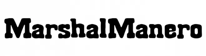
( Fonts by Woodcutter Manero - www.woodcutter.es - Personal-use only. For commercial use please contact owner. )
A bold, rounded font with a vintage Western flair and modern versatility.
![Marshal Manero フリーフォントのダウンロード]() ダウンロード 193 ダウンロード数@WebFont
ダウンロード 193 ダウンロード数@WebFont -
![Banaag Font 1 Medium フリーフォントのダウンロード]() ダウンロード 193 ダウンロード数@WebFont
ダウンロード 193 ダウンロード数@WebFont -
![KonanurKaps Kaps:001.001 フリーフォントのダウンロード]() ダウンロード 193 ダウンロード数@WebFont
ダウンロード 193 ダウンロード数@WebFont -
![Banks Miles Single Line フリーフォントのダウンロード]() ダウンロード 193 ダウンロード数@WebFont
ダウンロード 193 ダウンロード数@WebFont


今のトップフォントは?
は、クリーンな造形と広い適用範囲で支持を集めています。 ブランディングからランディングページ、ポスターまで活躍します。
ロゴで人気のフォントは?
幾何学系の サンセリフ(例: Poppins、Gotham 系のファミリー)は、スケーラブルでクリーンな印象に最適。 親しみやすさを出すなら スクリプト や手書き系も定番です。 見出しは力強く、本文はニュートラルに──この組み合わせが認知とバランスを高めます。
人気リストはどのくらいの頻度で更新される?
ダウンロード数やエンゲージメントに基づき定期的に更新します。 こまめにチェックして、次に流行るフォントを先取りしましょう。
💡 ヒント: このページをブックマークしておくと便利です。トレンドは速く、今のトップが明日のリブランディングを導くこともあります。