人気フォント セクションへようこそ。ここでは「よくダウンロードされ、よく使われている」実績ある書体をまとめています。 ロゴ、Web、SNS のどれにも使いやすい、外さない選択肢が見つかります。
どの トップフォント も、バランス・可読性・汎用性で高評価です。 モダン・サンセリフ、エレガントなスクリプト、ヴィンテージなセリフ、ミニマルなディスプレイなどを厳選しています。
-
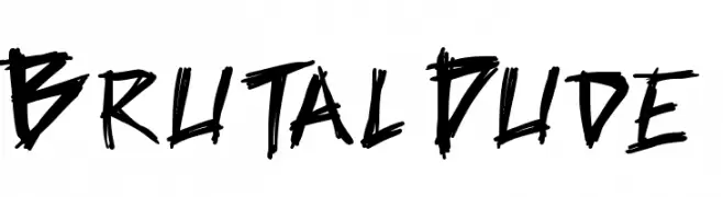
( Fonts by Press Gang Studios - Andeh Pinkard - www.pressgang-studios.com )
A bold, jagged, hand-drawn font with an edgy and energetic style.
 ダウンロード 835 ダウンロード数@WebFont
 -
( Fonts by weknow - Wino S Kadir )
A bold, geometric font with a modern and professional style.
![PROFFESIONAL フリーフォントのダウンロード]() ダウンロード 835 ダウンロード数@WebFont
ダウンロード 835 ダウンロード数@WebFont -
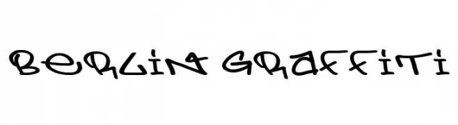
![Berlin Graffiti フリーフォントのダウンロード]() ダウンロード 835 ダウンロード数@WebFont
ダウンロード 835 ダウンロード数@WebFont -
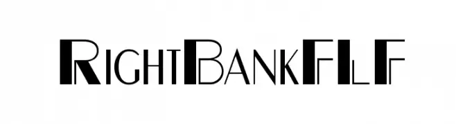
( Fonts by Casady & Greene )
A bold, modern font with high contrast and geometric elements.
![RightBankFLF フリーフォントのダウンロード]() ダウンロード 835 ダウンロード数@WebFont
ダウンロード 835 ダウンロード数@WebFont -
( Fonts by Manfred Klein. Free for private and charity use. Free for commercial with donation to organizations )
A modern, condensed sans-serif font with a clean and professional look.
![SansibarCX-Condensed フリーフォントのダウンロード]() ダウンロード 835 ダウンロード数@WebFont
ダウンロード 835 ダウンロード数@WebFont -
( Fonts by Manfred Klein. Free for private and charity use. Free for commercial with donation to organizations )
A decorative font inspired by prehistoric cave paintings with unique pictograms.
![Prehistoric フリーフォントのダウンロード]() ダウンロード 835 ダウンロード数@WebFont
ダウンロード 835 ダウンロード数@WebFont -
( Paul Lloyd Fonts )
A modern, clean font with balanced spacing and clear characters.
![NewStyle フリーフォントのダウンロード]() ダウンロード 835 ダウンロード数@WebFont
ダウンロード 835 ダウンロード数@WebFont -
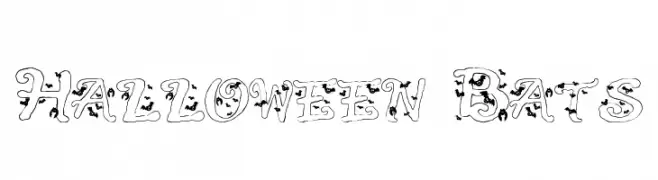
![Halloween Bats フリーフォントのダウンロード]() ダウンロード 835 ダウンロード数@WebFont
ダウンロード 835 ダウンロード数@WebFont -
( Fonts by www.houseoflime.com )
A decorative font with floral embellishments and modern, clean lines.
![Curly Fleur Caps フリーフォントのダウンロード]() ダウンロード 835 ダウンロード数@WebFont
ダウンロード 835 ダウンロード数@WebFont -
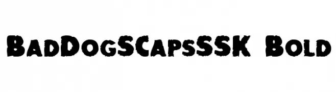
![BadDogSCapsSSK Bold フリーフォントのダウンロード]() ダウンロード 835 ダウンロード数@WebFont
ダウンロード 835 ダウンロード数@WebFont -
( Fonts by Alpaprana Studio )
A bold, playful handwritten font with thick, rounded strokes.
![Windsurf フリーフォントのダウンロード]() ダウンロード 834 ダウンロード数@WebFont
ダウンロード 834 ダウンロード数@WebFont -
( Fonts by Zetafonts - Personal-use only. For commercial use please contact owner. )
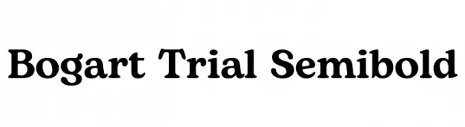
A bold, serif font with a classic and elegant style.
![Bogart Trial Semibold フリーフォントのダウンロード]() ダウンロード 834 ダウンロード数@WebFont
ダウンロード 834 ダウンロード数@WebFont -
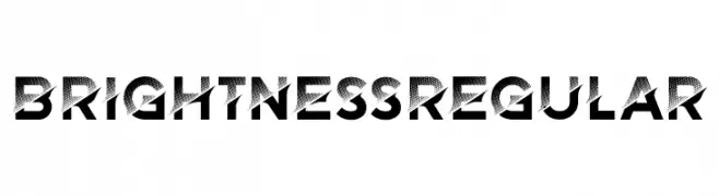
( Fonts by Vladimir Nikolic )
A bold, modern font with a halftone gradient effect and strong geometric shapes.
![Brightness Regular フリーフォントのダウンロード]() ダウンロード 834 ダウンロード数@WebFont
ダウンロード 834 ダウンロード数@WebFont -
![TOPANGA フリーフォントのダウンロード]() ダウンロード 834 ダウンロード数@WebFont
ダウンロード 834 ダウンロード数@WebFont -
![VNI-Comicbook フリーフォントのダウンロード]() ダウンロード 834 ダウンロード数
ダウンロード 834 ダウンロード数 -
( Zetafonts - www.zetafonts.com )
A modern, geometric font with rounded edges and consistent spacing.
![Bubbleboddy ExtraLight フリーフォントのダウンロード]() ダウンロード 834 ダウンロード数@WebFont
ダウンロード 834 ダウンロード数@WebFont -
( Fonts by www.studiotypo.com - Personal-use only. For commercial use please contact owner. )
A bold, modern sans-serif font with clean lines and uniform strokes.
![Widolte Bold Demo フリーフォントのダウンロード]() ダウンロード 834 ダウンロード数@WebFont
ダウンロード 834 ダウンロード数@WebFont -
( Fonts by www.svenpels.com - Personal-use only. For commercial use please contact owner. )
A modern, condensed sans-serif font with a sleek and uniform design.
![The Light Font フリーフォントのダウンロード]() ダウンロード 834 ダウンロード数@WebFont
ダウンロード 834 ダウンロード数@WebFont -
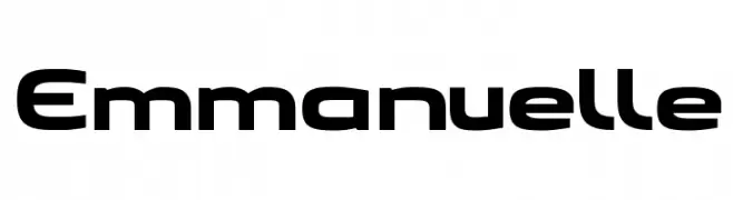
( Fonts by benoitsjoholm.blogspot.com - Benoit Sjoholm - Personal-use only. For commercial use please contact owner. )
A bold, modern font with geometric shapes and consistent stroke width.
![Emmanuelle フリーフォントのダウンロード]() ダウンロード 834 ダウンロード数@WebFont
ダウンロード 834 ダウンロード数@WebFont -
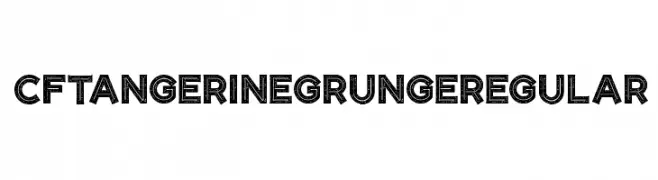
( Fonts by CloutierFontes )
A bold, grunge-style decorative font with a vintage, distressed look.
![CF Tangerine Grunge Regular フリーフォントのダウンロード]() ダウンロード 834 ダウンロード数@WebFont
ダウンロード 834 ダウンロード数@WebFont -
( Fonts by Agathe M.Joyce - www.foundmyfont.com - Personal-use only. For commercial use please contact owner. )
A sophisticated script font with elegant loops and flourishes.
![Motherland フリーフォントのダウンロード]() ダウンロード 834 ダウンロード数@WebFont
ダウンロード 834 ダウンロード数@WebFont -
( Fonts by Andrew McCluskey - nalgames.com. Personal-use only. For commercial use please contact owner. )
A bold, modern font with tall, narrow characters ideal for impactful headlines.
![Casual Hardcore フリーフォントのダウンロード]() ダウンロード 834 ダウンロード数@WebFont
ダウンロード 834 ダウンロード数@WebFont -
![Mauryssel Bold フリーフォントのダウンロード]() ダウンロード 834 ダウンロード数@WebFont
ダウンロード 834 ダウンロード数@WebFont -
( Copyright 2017 The Archivo Black Project Authors (https://github.com/Omnibus-Type/ArchivoBlack) )
A modern, narrow, bold italic font with tight spacing and minimal contrast.
![Archivo Narrow Bold Italic フリーフォントのダウンロード]() ダウンロード 834 ダウンロード数@WebFont
ダウンロード 834 ダウンロード数@WebFont -
![Exposition フリーフォントのダウンロード]() ダウンロード 834 ダウンロード数@WebFont
ダウンロード 834 ダウンロード数@WebFont -
![FHAModernizedIdealClassicNC フリーフォントのダウンロード]() ダウンロード 834 ダウンロード数@WebFont
ダウンロード 834 ダウンロード数@WebFont -
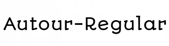
( Copyright (c) 2011 by Sorkin Type Co (www.sorkintype.com), with Reserved Font Name "Autour". )
A playful, rounded font with smooth curves and a friendly appearance.
![Autour-Regular フリーフォントのダウンロード]() ダウンロード 834 ダウンロード数@WebFont
ダウンロード 834 ダウンロード数@WebFont -
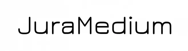
( Copyright (c) 2009, 2010, 2011 Daniel Johnson (
A modern, geometric sans-serif font with clean lines and uniform stroke width.
![JuraMedium フリーフォントのダウンロード]() ダウンロード 834 ダウンロード数@WebFont
ダウンロード 834 ダウンロード数@WebFont -
![VTC-BadTattooHandOne フリーフォントのダウンロード]() ダウンロード 834 ダウンロード数@WebFont
ダウンロード 834 ダウンロード数@WebFont -
![Ecolier_lignes_court フリーフォントのダウンロード]() ダウンロード 834 ダウンロード数@WebFont
ダウンロード 834 ダウンロード数@WebFont -
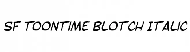
( Fonts by ShyFonts )
A bold, italicized handwritten font with a playful, cartoon-like style.
![SF Toontime Blotch Italic フリーフォントのダウンロード]() ダウンロード 834 ダウンロード数@WebFont
ダウンロード 834 ダウンロード数@WebFont -
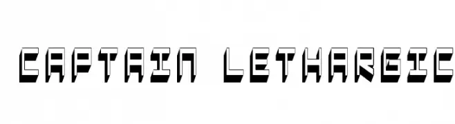
![Captain Lethargic フリーフォントのダウンロード]() ダウンロード 834 ダウンロード数@WebFont
ダウンロード 834 ダウンロード数@WebFont -
![Rabbit Regular フリーフォントのダウンロード]() ダウンロード 834 ダウンロード数@WebFont
ダウンロード 834 ダウンロード数@WebFont -
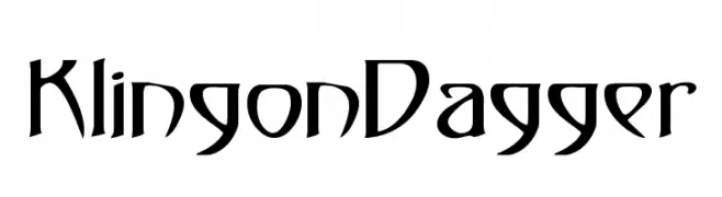
![KlingonDagger フリーフォントのダウンロード]() ダウンロード 834 ダウンロード数@WebFont
ダウンロード 834 ダウンロード数@WebFont -
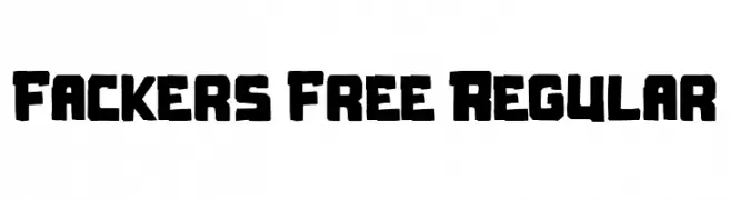
( Fonts by Maulana Creative )
A bold, hand-drawn font with a rugged and organic style.
![Fackers Free Regular フリーフォントのダウンロード]() ダウンロード 833 ダウンロード数@WebFont
ダウンロード 833 ダウンロード数@WebFont


今のトップフォントは?
は、クリーンな造形と広い適用範囲で支持を集めています。 ブランディングからランディングページ、ポスターまで活躍します。
ロゴで人気のフォントは?
幾何学系の サンセリフ(例: Poppins、Gotham 系のファミリー)は、スケーラブルでクリーンな印象に最適。 親しみやすさを出すなら スクリプト や手書き系も定番です。 見出しは力強く、本文はニュートラルに──この組み合わせが認知とバランスを高めます。
人気リストはどのくらいの頻度で更新される?
ダウンロード数やエンゲージメントに基づき定期的に更新します。 こまめにチェックして、次に流行るフォントを先取りしましょう。
💡 ヒント: このページをブックマークしておくと便利です。トレンドは速く、今のトップが明日のリブランディングを導くこともあります。