人気フォント セクションへようこそ。ここでは「よくダウンロードされ、よく使われている」実績ある書体をまとめています。 ロゴ、Web、SNS のどれにも使いやすい、外さない選択肢が見つかります。
どの トップフォント も、バランス・可読性・汎用性で高評価です。 モダン・サンセリフ、エレガントなスクリプト、ヴィンテージなセリフ、ミニマルなディスプレイなどを厳選しています。
-
( Free for a personal use. For a commercial use please visit www.kevinandamanda.com )
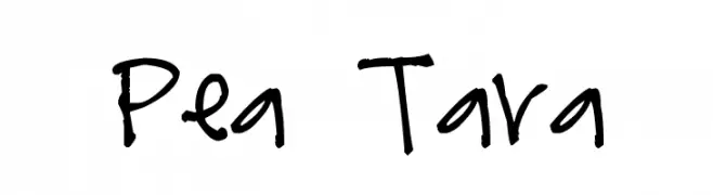
A playful, casual handwritten font with irregular strokes and a lively feel.
 ダウンロード 181 ダウンロード数@WebFont
 -
フォント by spideraysfonts. For commercial use please contact the owner.
( Fonts by spideraysfonts - Personal-use only. For commercial use please contact owner. )
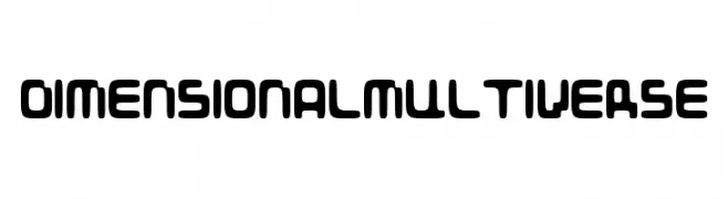
A futuristic, geometric font with rounded edges and uniform strokes.
![DIMENSIONALMULTIVERSE フリーフォントのダウンロード]() ダウンロード 181 ダウンロード数@WebFont
ダウンロード 181 ダウンロード数@WebFont -
( Fonts by Hendrick Rolandez - www.moinzek.com - Personal-use only. For commercial use please contact owner. )
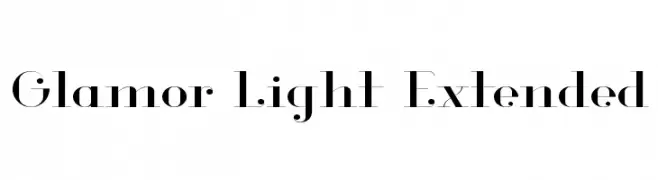
A high-contrast, elegant font with elongated characters and modern flair.
![Glamor Light Extended フリーフォントのダウンロード]() ダウンロード 181 ダウンロード数@WebFont
ダウンロード 181 ダウンロード数@WebFont -
( Fonts by Naharstd - Nanda Hardiansyah - Personal-use only. For commercial use please contact owner. )
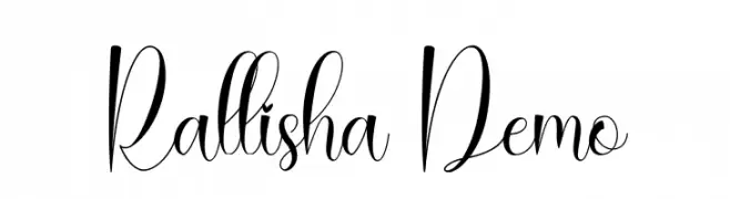
An elegant, flowing script font with graceful curves and sophisticated style.
![Rallisha Demo フリーフォントのダウンロード]() ダウンロード 181 ダウンロード数@WebFont
ダウンロード 181 ダウンロード数@WebFont -
( Fonts by Manfred Klein. Free for private and charity use. Free for commercial with donation to organizations )
A classic blackletter font with ornate, sharp-edged characters and a Gothic aesthetic.
![FrakturaFonteria-Slim フリーフォントのダウンロード]() ダウンロード 181 ダウンロード数@WebFont
ダウンロード 181 ダウンロード数@WebFont -
-
![HiSky フリーフォントのダウンロード]() ダウンロード 181 ダウンロード数@WebFont
ダウンロード 181 ダウンロード数@WebFont -
( Fonts by Zetafonts - Personal-use only. For commercial use please contact owner. )
A classic serif font with semi-bold weight and elegant, sharp serifs.
![Calvino Grande Trial Semibold フリーフォントのダウンロード]() ダウンロード 181 ダウンロード数@WebFont
ダウンロード 181 ダウンロード数@WebFont -
( Fonts by Weape Studio - Wahyu Andi - Personal-use only. For commercial use please contact owner. )
A bold, expressive script font with a handwritten style.
![Forrest フリーフォントのダウンロード]() ダウンロード 181 ダウンロード数@WebFont
ダウンロード 181 ダウンロード数@WebFont -
( Fonts by Nurf Designs )
A playful, bold font with rounded, bubbly characters and a whimsical style.
![BooRush フリーフォントのダウンロード]() ダウンロード 181 ダウンロード数@WebFont
ダウンロード 181 ダウンロード数@WebFont -
( Fonts by Daniel Zadorozny - www.iconian.com - Free for personal use )
A bold, italic, futuristic font with sharp, angular edges and a dynamic style.
![Quark Storm Laser Italic フリーフォントのダウンロード]() ダウンロード 181 ダウンロード数@WebFont
ダウンロード 181 ダウンロード数@WebFont


今のトップフォントは?
は、クリーンな造形と広い適用範囲で支持を集めています。 ブランディングからランディングページ、ポスターまで活躍します。
ロゴで人気のフォントは?
幾何学系の サンセリフ(例: Poppins、Gotham 系のファミリー)は、スケーラブルでクリーンな印象に最適。 親しみやすさを出すなら スクリプト や手書き系も定番です。 見出しは力強く、本文はニュートラルに──この組み合わせが認知とバランスを高めます。
人気リストはどのくらいの頻度で更新される?
ダウンロード数やエンゲージメントに基づき定期的に更新します。 こまめにチェックして、次に流行るフォントを先取りしましょう。
💡 ヒント: このページをブックマークしておくと便利です。トレンドは速く、今のトップが明日のリブランディングを導くこともあります。