人気フォント セクションへようこそ。ここでは「よくダウンロードされ、よく使われている」実績ある書体をまとめています。 ロゴ、Web、SNS のどれにも使いやすい、外さない選択肢が見つかります。
どの トップフォント も、バランス・可読性・汎用性で高評価です。 モダン・サンセリフ、エレガントなスクリプト、ヴィンテージなセリフ、ミニマルなディスプレイなどを厳選しています。
-
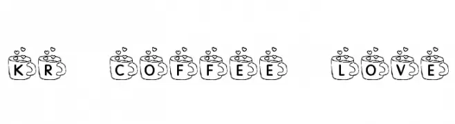
( Fonts by Kat`s Fun Fonts - Personal-use only. For commercial use please contact owner. )
A whimsical font with letters inside coffee cup designs, featuring heart and steam motifs.
 ダウンロード 181 ダウンロード数@WebFont
 -
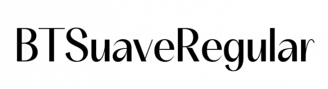
( Fonts by BeauType Studio - beautique.vn - Personal-use only. For commercial use please contact owner. )
A sleek, modern font with high contrast and elegant design.
![BT Suave Regular フリーフォントのダウンロード]() ダウンロード 181 ダウンロード数@WebFont
ダウンロード 181 ダウンロード数@WebFont -
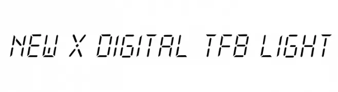
( Free for personal use - truefonts.blogspot.com )
A digital, segmented font with a futuristic and geometric style.
![New X Digital tfb Light フリーフォントのダウンロード]() ダウンロード 181 ダウンロード数@WebFont
ダウンロード 181 ダウンロード数@WebFont -
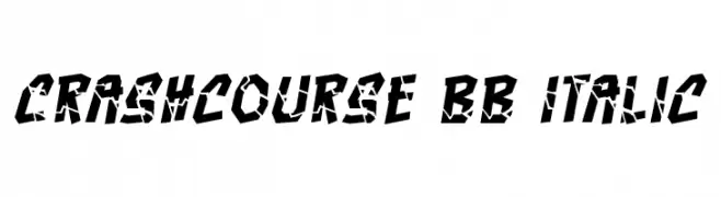
( Fonts by www.blambot.com )
A bold, fragmented font with an italic slant, perfect for dynamic and artistic designs.
![Crashcourse BB Italic フリーフォントのダウンロード]() ダウンロード 181 ダウンロード数@WebFont
ダウンロード 181 ダウンロード数@WebFont -
( Fonts by Kevin Christopher - www.kcfonts.com. Personal-use only. For commercial use please contact owner. )
A bold, textured font with a hand-drawn, brush-like appearance.
![Noises in the Attic フリーフォントのダウンロード]() ダウンロード 181 ダウンロード数@WebFont
ダウンロード 181 ダウンロード数@WebFont -
-
( Fonts by www.gliphmaker.com. Personal-use only. For commercial use please contact owner. )
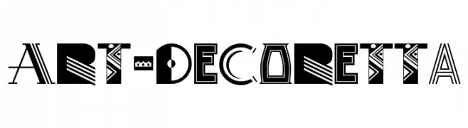
A bold, Art Deco-inspired font with geometric shapes and intricate patterns.
![Art-Decoretta フリーフォントのダウンロード]() ダウンロード 181 ダウンロード数@WebFont
ダウンロード 181 ダウンロード数@WebFont -
( Fonts by weknow - Wino S Kadir )
A modern, dot-based font with a digital and playful aesthetic.
![ANIMEQUEEN フリーフォントのダウンロード]() ダウンロード 181 ダウンロード数@WebFont
ダウンロード 181 ダウンロード数@WebFont -
( Fonts by Leonard Posavec - leosupply.co - Personal-use only. For commercial use please contact owner. )
A distressed, grunge-style font with irregular edges and a textured appearance.
![Electric フリーフォントのダウンロード]() ダウンロード 181 ダウンロード数@WebFont
ダウンロード 181 ダウンロード数@WebFont -
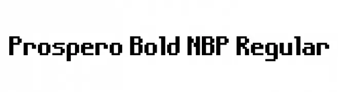
![Prospero Bold NBP Regular フリーフォントのダウンロード]() ダウンロード 181 ダウンロード数@WebFont
ダウンロード 181 ダウンロード数@WebFont -
( Fonts by Syaf Rizal - www.creativefabrica.com/ref/53/ - Personal-use only. For commercial use please contact owner. )
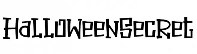
A playful, spooky font with bold, irregular lines and a hand-drawn feel.
![Halloween Secret フリーフォントのダウンロード]() ダウンロード 181 ダウンロード数@WebFont
ダウンロード 181 ダウンロード数@WebFont


今のトップフォントは?
は、クリーンな造形と広い適用範囲で支持を集めています。 ブランディングからランディングページ、ポスターまで活躍します。
ロゴで人気のフォントは?
幾何学系の サンセリフ(例: Poppins、Gotham 系のファミリー)は、スケーラブルでクリーンな印象に最適。 親しみやすさを出すなら スクリプト や手書き系も定番です。 見出しは力強く、本文はニュートラルに──この組み合わせが認知とバランスを高めます。
人気リストはどのくらいの頻度で更新される?
ダウンロード数やエンゲージメントに基づき定期的に更新します。 こまめにチェックして、次に流行るフォントを先取りしましょう。
💡 ヒント: このページをブックマークしておくと便利です。トレンドは速く、今のトップが明日のリブランディングを導くこともあります。