人気フォント セクションへようこそ。ここでは「よくダウンロードされ、よく使われている」実績ある書体をまとめています。 ロゴ、Web、SNS のどれにも使いやすい、外さない選択肢が見つかります。
どの トップフォント も、バランス・可読性・汎用性で高評価です。 モダン・サンセリフ、エレガントなスクリプト、ヴィンテージなセリフ、ミニマルなディスプレイなどを厳選しています。
-
 ダウンロード 791 ダウンロード数@WebFont
 -
( Fonts by a Max Infeld - XEROGRAPHER FONTS - xerographer.blogspot.com . Personal-use only. For commercial use please contact owner. )
A bold, distressed font with a vintage, rugged appearance.
![SummerBlacktop フリーフォントのダウンロード]() ダウンロード 791 ダウンロード数@WebFont
ダウンロード 791 ダウンロード数@WebFont -
( Copyright (c) 2010-2011, Rubén Prol (ipanemagrafica@gmail.com|www.ipanemagrafica.com) )
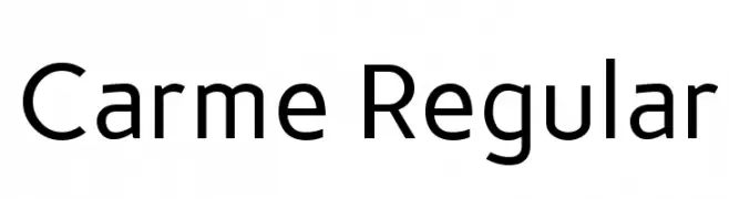
A clean, modern sans-serif font with balanced proportions and consistent stroke width.
![Carme Regular フリーフォントのダウンロード]() ダウンロード 791 ダウンロード数@WebFont
ダウンロード 791 ダウンロード数@WebFont -
( Fonts by www.gust.org.pl )
An elegant italic serif font with smooth, flowing curves and a classic style.
![LMRoman10-Italic フリーフォントのダウンロード]() ダウンロード 791 ダウンロード数@WebFont
ダウンロード 791 ダウンロード数@WebFont -
( Copyright (c) 2010, Danh Hong (khmertype.blogspot.com) )
A modern, geometric sans-serif font with uniform stroke width.
![Battambang フリーフォントのダウンロード]() ダウンロード 791 ダウンロード数@WebFont
ダウンロード 791 ダウンロード数@WebFont -
( Font by kingthingsfonts.co.uk )
A bold, medieval-inspired font with sharp serifs and dramatic angles.
![Kingthings Foundation フリーフォントのダウンロード]() ダウンロード 791 ダウンロード数@WebFont
ダウンロード 791 ダウンロード数@WebFont -
( Fonts by Grzegorz l - www.glukfonts.pl )
A modern, bold sans-serif font with geometric lines and a professional appearance.
![ResagnictoBold フリーフォントのダウンロード]() ダウンロード 791 ダウンロード数@WebFont
ダウンロード 791 ダウンロード数@WebFont -
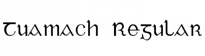
![Tuamach Regular フリーフォントのダウンロード]() ダウンロード 791 ダウンロード数@WebFont
ダウンロード 791 ダウンロード数@WebFont -
( Fonts by Manfred Klein. Free for private and charity use. Free for commercial with donation to organizations )
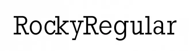
A classic serif font with modern elegance and balanced proportions.
![RockyRegular フリーフォントのダウンロード]() ダウンロード 791 ダウンロード数@WebFont
ダウンロード 791 ダウンロード数@WebFont -
( Fonts by www.peter-wiegel.de. Personal-use only. For commercial use please contact owner. )
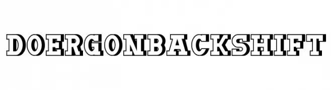
A bold, shadowed font with a vintage, impactful style.
![DoergonBackshift フリーフォントのダウンロード]() ダウンロード 791 ダウンロード数@WebFont
ダウンロード 791 ダウンロード数@WebFont -
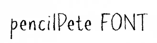
![pencilPete FONT フリーフォントのダウンロード]() ダウンロード 791 ダウンロード数@WebFont
ダウンロード 791 ダウンロード数@WebFont -
( Fonts by Manfred Klein - manfred-klein.ina-mar.com )
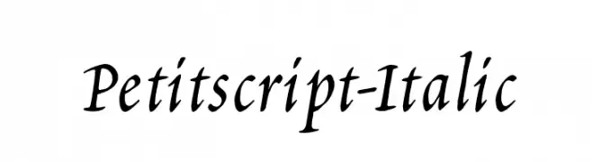
An elegant italic font with flowing curves and moderate contrast, ideal for sophisticated designs.
![Petitscript-Italic フリーフォントのダウンロード]() ダウンロード 791 ダウンロード数@WebFont
ダウンロード 791 ダウンロード数@WebFont -
![Floralis フリーフォントのダウンロード]() ダウンロード 791 ダウンロード数@WebFont
ダウンロード 791 ダウンロード数@WebFont -
![Speed2 フリーフォントのダウンロード]() ダウンロード 791 ダウンロード数@WebFont
ダウンロード 791 ダウンロード数@WebFont -
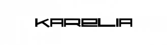
![Karelia フリーフォントのダウンロード]() ダウンロード 791 ダウンロード数@WebFont
ダウンロード 791 ダウンロード数@WebFont -
( Fonts by Ramli Setiadi - Personal-use only. For commercial use please contact owner. )
A cursive, handwritten font with elegant, flowing lines and a romantic style.
![Romantic Signature フリーフォントのダウンロード]() ダウンロード 790 ダウンロード数@WebFont
ダウンロード 790 ダウンロード数@WebFont -
( Fonts by deFharo - Fernando Haro - Personal-use only. For commercial use please contact owner. )
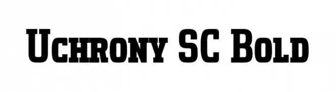
A bold slab serif font with strong, block-like characters and wide spacing.
![Uchrony SC Bold フリーフォントのダウンロード]() ダウンロード 790 ダウンロード数@WebFont
ダウンロード 790 ダウンロード数@WebFont -
( Fonts by Chequered Ink - chequered.ink - Personal-use only. For commercial use please contact owner. )
A bold, geometric font with a modern and cohesive design.
![Doubleplus フリーフォントのダウンロード]() ダウンロード 790 ダウンロード数@WebFont
ダウンロード 790 ダウンロード数@WebFont -
( Fonts by Situjuh Nazara - 7ntypes.com - Personal-use only. For commercial use please contact owner. )
A graceful, cursive font with elegant loops and smooth strokes.
![Anything Better フリーフォントのダウンロード]() ダウンロード 790 ダウンロード数@WebFont
ダウンロード 790 ダウンロード数@WebFont -
( Fonts by NubeFonts - nubefonts.blogspot.com - Personal-use only. For commercial use please contact owner. )
Bold, slanted uppercase font with a modern, dynamic style.
![BumbleBee フリーフォントのダウンロード]() ダウンロード 790 ダウンロード数@WebFont
ダウンロード 790 ダウンロード数@WebFont -
( Copyright (c) 2015, Pablo Impallari, Rodrigo Fuenzalida (Modified by Dan O. Williams and USWDS) (https://github.com/uswds/public-sans) )
A clean, modern sans-serif font with uniform, geometric letterforms and a light weight.
![Public Sans Light フリーフォントのダウンロード]() ダウンロード 790 ダウンロード数@WebFont
ダウンロード 790 ダウンロード数@WebFont -
( Gomarice Font - www.geocities.jp/gomarice_font/ )
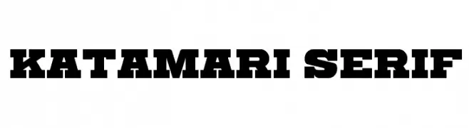
A bold, impactful serif font with strong, block-like serifs and a modern twist.
![Katamari Serif フリーフォントのダウンロード]() ダウンロード 790 ダウンロード数@WebFont
ダウンロード 790 ダウンロード数@WebFont -
( Dan Evans )
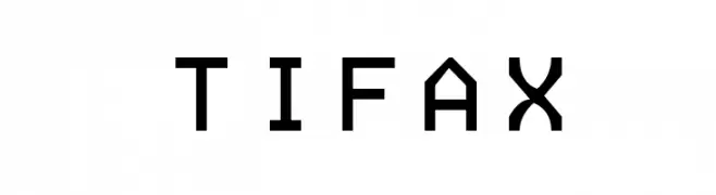
A modern, geometric monospaced font with clean lines and uniform character width.
![TIFAX フリーフォントのダウンロード]() ダウンロード 790 ダウンロード数@WebFont
ダウンロード 790 ダウンロード数@WebFont -
( weknow - Wino S Kadir - www.creativefabrica.com/designer/weknow/ )
A bold, outlined sans-serif font with a neon light effect.
![NEON GLOW Bold フリーフォントのダウンロード]() ダウンロード 790 ダウンロード数@WebFont
ダウンロード 790 ダウンロード数@WebFont -
( LetterStuff Typefoundry )
A playful, hand-drawn font with bold, rounded characters and a whimsical style.
![Kiddos フリーフォントのダウンロード]() ダウンロード 790 ダウンロード数@WebFont
ダウンロード 790 ダウンロード数@WebFont -
( Chung-Deh Tien - www.redbubble.com/people/Kaiju )
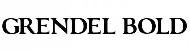
A bold serif font with strong strokes and elegant serifs, perfect for impactful designs.
![GRENDEL BOLD フリーフォントのダウンロード]() ダウンロード 790 ダウンロード数@WebFont
ダウンロード 790 ダウンロード数@WebFont -
( Fonts by Dan P. Lyons - Personal-use only. For commercial use please contact owner. )
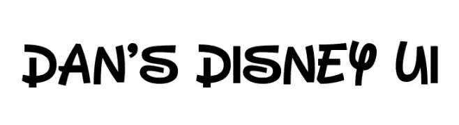
A playful, bold font with rounded characters and a whimsical style.
![Dan's Disney UI フリーフォントのダウンロード]() ダウンロード 790 ダウンロード数@WebFont
ダウンロード 790 ダウンロード数@WebFont -
( Fonts by Wino S Kadir - Personal-use only. For commercial use please contact owner. )
A bold, geometric font with a modern, blocky style.
![SUB URBAN City フリーフォントのダウンロード]() ダウンロード 790 ダウンロード数@WebFont
ダウンロード 790 ダウンロード数@WebFont -
( Fonts by Saridezra )
A lively, expressive handwritten font with fluid, connected letters.
![HelloStranger フリーフォントのダウンロード]() ダウンロード 790 ダウンロード数@WebFont
ダウンロード 790 ダウンロード数@WebFont -
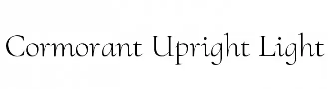
( Copyright (c) 2015, Christian Thalmann and the Cormorant Project Authors (github.com/CatharsisFonts/Cormorant) )
A refined, elegant serif font with thin strokes and a classic touch.
![Cormorant Upright Light フリーフォントのダウンロード]() ダウンロード 790 ダウンロード数@WebFont
ダウンロード 790 ダウンロード数@WebFont -
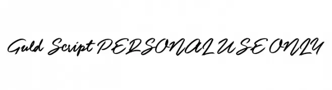
![Guld Script PERSONAL USE ONLY フリーフォントのダウンロード]() ダウンロード 790 ダウンロード数@WebFont
ダウンロード 790 ダウンロード数@WebFont -
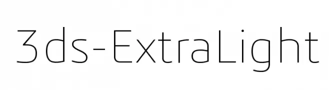
![3ds-ExtraLight フリーフォントのダウンロード]() ダウンロード 790 ダウンロード数@WebFont
ダウンロード 790 ダウンロード数@WebFont -
( Fonts by a kmzero font foundry - www.zetafonts.com. Personal-use only. For commercial use please contact owner. )
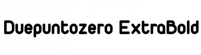
A bold, rounded font with a modern and playful aesthetic.
![Duepuntozero ExtraBold フリーフォントのダウンロード]() ダウンロード 790 ダウンロード数@WebFont
ダウンロード 790 ダウンロード数@WebFont -
( Fonts by junkohanhero )
A bold, distressed font with a vintage, rugged look.
![Walk with me now フリーフォントのダウンロード]() ダウンロード 790 ダウンロード数@WebFont
ダウンロード 790 ダウンロード数@WebFont -
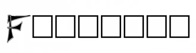
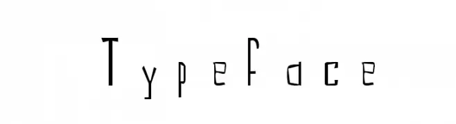
![Typeface フリーフォントのダウンロード]() ダウンロード 790 ダウンロード数@WebFont
ダウンロード 790 ダウンロード数@WebFont


今のトップフォントは?
は、クリーンな造形と広い適用範囲で支持を集めています。 ブランディングからランディングページ、ポスターまで活躍します。
ロゴで人気のフォントは?
幾何学系の サンセリフ(例: Poppins、Gotham 系のファミリー)は、スケーラブルでクリーンな印象に最適。 親しみやすさを出すなら スクリプト や手書き系も定番です。 見出しは力強く、本文はニュートラルに──この組み合わせが認知とバランスを高めます。
人気リストはどのくらいの頻度で更新される?
ダウンロード数やエンゲージメントに基づき定期的に更新します。 こまめにチェックして、次に流行るフォントを先取りしましょう。
💡 ヒント: このページをブックマークしておくと便利です。トレンドは速く、今のトップが明日のリブランディングを導くこともあります。