人気フォント セクションへようこそ。ここでは「よくダウンロードされ、よく使われている」実績ある書体をまとめています。 ロゴ、Web、SNS のどれにも使いやすい、外さない選択肢が見つかります。
どの トップフォント も、バランス・可読性・汎用性で高評価です。 モダン・サンセリフ、エレガントなスクリプト、ヴィンテージなセリフ、ミニマルなディスプレイなどを厳選しています。
-
 ダウンロード 785 ダウンロード数@WebFont
 -
![Game Of Life フリーフォントのダウンロード]() ダウンロード 785 ダウンロード数@WebFont
ダウンロード 785 ダウンロード数@WebFont -
( Fonts by www.gust.org.pl )
A classic serif font with elegant strokes and refined details.
![LMRoman6-Regular フリーフォントのダウンロード]() ダウンロード 785 ダウンロード数@WebFont
ダウンロード 785 ダウンロード数@WebFont -
( Copyright (c) 2011 by Pablo Impallari (www.impallari.com impallari@gmail.com). Igino Marini (www.ikern.com) )
A whimsical, decorative font with a vintage, hand-drawn style.
![Miltonian フリーフォントのダウンロード]() ダウンロード 785 ダウンロード数@WebFont
ダウンロード 785 ダウンロード数@WebFont -
( Fonts by www.DigitalDreamDesign.net )
A bold, geometric font with a futuristic, outlined style.
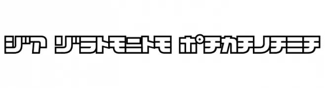
![D3 Cosmism Katakana フリーフォントのダウンロード]() ダウンロード 785 ダウンロード数@WebFont
ダウンロード 785 ダウンロード数@WebFont -
![Addie フリーフォントのダウンロード]() ダウンロード 785 ダウンロード数@WebFont
ダウンロード 785 ダウンロード数@WebFont -
( Fonts by Grzegorz l - www.glukfonts.pl )
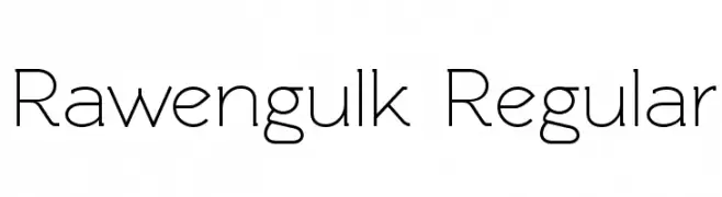
A modern, geometric sans-serif font with clean lines and balanced spacing.
![Rawengulk Regular フリーフォントのダウンロード]() ダウンロード 785 ダウンロード数@WebFont
ダウンロード 785 ダウンロード数@WebFont -
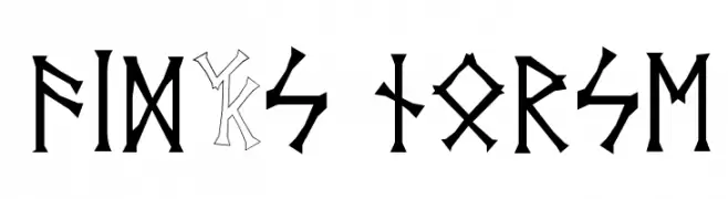
![Vid's Norse フリーフォントのダウンロード]() ダウンロード 785 ダウンロード数@WebFont
ダウンロード 785 ダウンロード数@WebFont -
( Fonts by Kreative Korporation - www.kreativekorp.com )
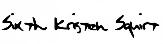
A bold, playful handwritten font with dynamic strokes.
![Sixth Kristen Squirt フリーフォントのダウンロード]() ダウンロード 785 ダウンロード数@WebFont
ダウンロード 785 ダウンロード数@WebFont -
![TAK Enchanted フリーフォントのダウンロード]() ダウンロード 785 ダウンロード数@WebFont
ダウンロード 785 ダウンロード数@WebFont -
![Helloween フリーフォントのダウンロード]() ダウンロード 785 ダウンロード数@WebFont
ダウンロード 785 ダウンロード数@WebFont -
( Fonts by Nick Curtis - www.nicksfonts.com )
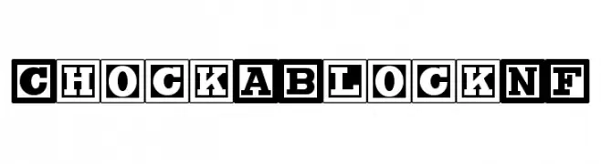
Bold, boxed uppercase font with a vintage-modern style.
![ChockABlockNF フリーフォントのダウンロード]() ダウンロード 785 ダウンロード数@WebFont
ダウンロード 785 ダウンロード数@WebFont -
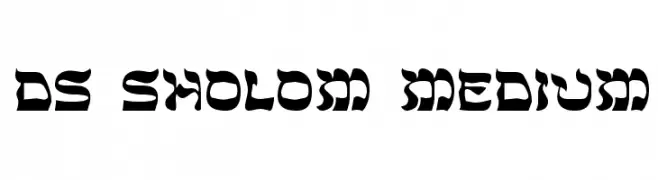
![DS Sholom Medium フリーフォントのダウンロード]() ダウンロード 785 ダウンロード数@WebFont
ダウンロード 785 ダウンロード数@WebFont -
( Fonts by David Rakowski )
Traditional serif font with clear, readable forms.
![Lassus フリーフォントのダウンロード]() ダウンロード 785 ダウンロード数
ダウンロード 785 ダウンロード数 -
![Halo フリーフォントのダウンロード]() ダウンロード 785 ダウンロード数
ダウンロード 785 ダウンロード数 -
( Fonts by Marco Trujillo Lopez - Personal-use only. For commercial use please contact owner. )
A whimsical, hand-drawn font with a playful and enchanting style.
![Alice in Wonderland 1 フリーフォントのダウンロード]() ダウンロード 784 ダウンロード数@WebFont
ダウンロード 784 ダウンロード数@WebFont -
( Fonts by wep - Wahyu Eka Prasetya - Personal-use only. For commercial use please contact owner. )
A bold, modern sans-serif font with clean lines and strong presence.
![Diam フリーフォントのダウンロード]() ダウンロード 784 ダウンロード数@WebFont
ダウンロード 784 ダウンロード数@WebFont -
( Fonts by Khurasan )
A playful, bold font with rounded, thick strokes and a whimsical touch.
![Xomai フリーフォントのダウンロード]() ダウンロード 784 ダウンロード数@WebFont
ダウンロード 784 ダウンロード数@WebFont -
( sugargliderz - www.sugargliderz.com )
A modern, geometric font with clean lines and a minimalist aesthetic.
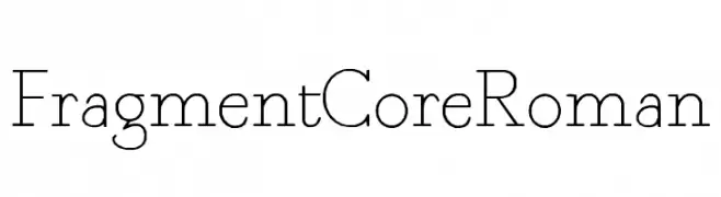
![Fragment Core Roman フリーフォントのダウンロード]() ダウンロード 784 ダウンロード数@WebFont
ダウンロード 784 ダウンロード数@WebFont -
( Copyright 2018 Boutros International. (http://www.boutrosfonts.com) )
A modern, geometric sans-serif font with balanced proportions and clear readability.
![Tajawal-Medium フリーフォントのダウンロード]() ダウンロード 784 ダウンロード数@WebFont
ダウンロード 784 ダウンロード数@WebFont -
( Fonts by Jakob Fischer - www.pizzadude.dk - Personal-use only. For commercial use please contact owner. )
A bold, dynamic font with sharp angles and a hand-drawn, brush-like appearance.
![Chinese Takeaway フリーフォントのダウンロード]() ダウンロード 784 ダウンロード数@WebFont
ダウンロード 784 ダウンロード数@WebFont -
( Fonts by Geronimo Fonts - Personal-use only. For commercial use please contact owner. )
A bold, geometric font with a modern, industrial style.
![Lemons Regular フリーフォントのダウンロード]() ダウンロード 784 ダウンロード数@WebFont
ダウンロード 784 ダウンロード数@WebFont -
( Copyright (c) 2015 Indian Type Foundry (info@indiantypefoundry.com) )
A modern, clean sans-serif typeface with excellent readability and versatility.
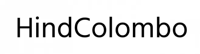
![Hind Colombo フリーフォントのダウンロード]() ダウンロード 784 ダウンロード数@WebFont
ダウンロード 784 ダウンロード数@WebFont -
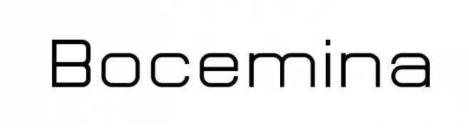
![Bocemina フリーフォントのダウンロード]() ダウンロード 784 ダウンロード数@WebFont
ダウンロード 784 ダウンロード数@WebFont -
( Fonts by www.blambot.com )
A bold, heavy font with a distressed, rugged appearance.
![CryptCreepHeavyBB フリーフォントのダウンロード]() ダウンロード 784 ダウンロード数@WebFont
ダウンロード 784 ダウンロード数@WebFont -
( Fonts by a Neale Davidson - www.pixelsagas.com. Personal-use only. For commercial use please contact owner. )
A sleek, italic font with a futuristic and dynamic design.
![Classic Robot Italic フリーフォントのダウンロード]() ダウンロード 784 ダウンロード数@WebFont
ダウンロード 784 ダウンロード数@WebFont -
( Copyright (c) 2011, Dan Sayers (i@iotic.com) )
A bold, italic font with rounded, smooth characters and a modern yet classic style.
![Averia Libre Bold Italic フリーフォントのダウンロード]() ダウンロード 784 ダウンロード数@WebFont
ダウンロード 784 ダウンロード数@WebFont -
![DiagaNO フリーフォントのダウンロード]() ダウンロード 784 ダウンロード数@WebFont
ダウンロード 784 ダウンロード数@WebFont -
( Fonts by www.kimberlygeswein.com - Kimberly Geswein )
A casual, handwritten font with a friendly and approachable style.
![Janda Everyday Casual フリーフォントのダウンロード]() ダウンロード 784 ダウンロード数@WebFont
ダウンロード 784 ダウンロード数@WebFont -
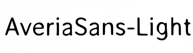
![AveriaSans-Light フリーフォントのダウンロード]() ダウンロード 784 ダウンロード数@WebFont
ダウンロード 784 ダウンロード数@WebFont -
( Fonts by www.abecedarienne.com )
A bold, distressed font with a vintage, textured appearance.
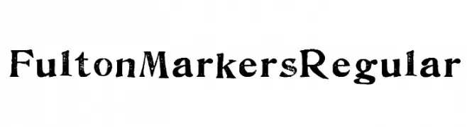
![FultonMarkersRegular フリーフォントのダウンロード]() ダウンロード 784 ダウンロード数@WebFont
ダウンロード 784 ダウンロード数@WebFont -
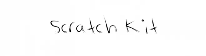
![Scratch Kit フリーフォントのダウンロード]() ダウンロード 784 ダウンロード数@WebFont
ダウンロード 784 ダウンロード数@WebFont -
( Fonts by Dieter Steffmann )
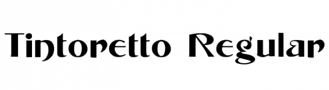
A bold, high-contrast font with sharp serifs and decorative flourishes.
![Tintoretto Regular フリーフォントのダウンロード]() ダウンロード 784 ダウンロード数@WebFont
ダウンロード 784 ダウンロード数@WebFont -
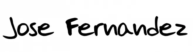
![Jose Fernandez フリーフォントのダウンロード]() ダウンロード 784 ダウンロード数@WebFont
ダウンロード 784 ダウンロード数@WebFont -
( Fonts by Omega Font Labs )
A bold, decorative font with a blackletter influence, featuring ornate curves and sharp angles.
![St Charles フリーフォントのダウンロード]() ダウンロード 784 ダウンロード数@WebFont
ダウンロード 784 ダウンロード数@WebFont


今のトップフォントは?
は、クリーンな造形と広い適用範囲で支持を集めています。 ブランディングからランディングページ、ポスターまで活躍します。
ロゴで人気のフォントは?
幾何学系の サンセリフ(例: Poppins、Gotham 系のファミリー)は、スケーラブルでクリーンな印象に最適。 親しみやすさを出すなら スクリプト や手書き系も定番です。 見出しは力強く、本文はニュートラルに──この組み合わせが認知とバランスを高めます。
人気リストはどのくらいの頻度で更新される?
ダウンロード数やエンゲージメントに基づき定期的に更新します。 こまめにチェックして、次に流行るフォントを先取りしましょう。
💡 ヒント: このページをブックマークしておくと便利です。トレンドは速く、今のトップが明日のリブランディングを導くこともあります。